45

The Cyrillic letter 'т', when italicized, looks like a Latin 'm'. This is illustrated in the image below. The first row is the Cyrillic letter 'т', the second is the Cyrillic letter 'м', and the third is the Latin letter 'm':

Cyrillic Т, Cyrillic М, Latin M

As with most Cyrillic letters, the Cyrillic lowercase 'м' looks like a small capital 'М' in both normal and italic type. The ones that do not look the same at least resemble the uppercase form, as with 'и' and 'и'.

However, for some reason an italic 'т' ('т') looks like a Latin 'm', so that the letter forms seem unrelated. It also seems that it tends be written this way in handwriting. Why is this the case? Is this for historical reasons? A lot of documents say that this is how it is, but I have not found any that explain why.

Artemix
  • 11,331
  • 3
  • 40
  • 84
ctype.h
  • 1,515
  • 4
  • 18
  • 28
  • This actually varies by language. Some other languages written in the Cyrillic script just use a slanted form of the regular shape, I believe Serbian is one of them. Also there are some other letters which change shape in italics and some languages such as Bulgarian which use some variant shapes even when not in italics. – hippietrail Dec 15 '12 at 07:44
  • 2
    Serbian (when written in Cyrillic) and Macedonian have really different italic forms of б, г, п, and т. I decided not to write about that in my answer, because this site deals with Russian. As for Bulgarian, I don't think it uses some special forms, it uses the same forms as Russian. @hippietrail – Yellow Sky Dec 15 '12 at 08:05
  • Yes with Bulgarian it's more just style, for instance instead of the usual shape for л it's often ʌ, even on official things like roadsigns. There's a couple of others too, but I agree it's getting a bit off topic (-; – hippietrail Dec 15 '12 at 11:49
  • 1
    Only in school you must write lowercase 'т' as 'm'. As adult, you are free to handwrite lowercase 'т' as 'т' and uppercase 'T' as 'T' (not as bottom-up 'Ш'). It is also faster and more re – Andrei Dec 21 '12 at 19:23
  • I think M as better, because new T into cyrillic comes in future. Cyrillic lowercase: a6bгдежzийклмhопрсmyфtxμчwщъыьэюя –  Jul 24 '13 at 11:09
  • A very interesting discussion, but no one has explained why or when printers replaced the three-legged "т" with the one-legged version, still less why the three-legged form is unavailable in computer fonts, so that older Russian texts cannot be properly reproduced unless they are shown in cursive script, e.g. for manuscript documents. – Rip Bulkeley Oct 02 '20 at 15:17
  • https://www.textologia.ru/russkiy/alfavit-istoria/istoria-bukv/bukva-t/311/?q=463&n=311 –  Пилум Sep 28 '21 at 18:51

3 Answers3

64

This is for historical reasons, and the form of the Russian italic ‘т’ is, actually, related to both ‘т’ and Latin ‘m’. Before the invention of printing, the typical handwriting style used for writing books in Russia was полуустав, in which the shape of ‘T’ was like this:

Halfustav cyrillic T letter

As you can see, it had long serifs going down from the horizontal bar, and they very often reached the line on which the letters stand, making ‘т’ look like ‘ш’ turned upside down. When book printing began in Russia, the first movable types copied this полуустав. In 1708, Peter the Great commanded a reform of the Russian Cyrillic alphabet, eliminating several letters and changing the shapes of the printed letters, so that they look more like the Dutch Antiqua of that time. He chose the shapes himself (Peter had spent some time in the Netherlands and liked everything Dutch). This reformed alphabet is called “гражданский шрифт” (civil script/font). Now, the Russian alphabet looked like this (the 4 lines at the top are uppercase letters, the rest are lowercase.):

Russian alphabet from Peter The Great

It seemed quite natural to Peter that ‘m’ be the closest Antiqua shape to an upside-down ‘ш’. Here's a detailed article in Russian about the reform. This shape of the letters was used during all the 18th century and the first third of the 19th, only the shape of ‘з’ was used rather early instead of Peter’s “s”, and ‘и’ and ‘й’ were also reintroduced. Later, the modern shape of lowercase ‘т’ was used, but in italics and handwriting we still use the shape that was introduced by Peter the Great and continues the tradition of handwritten books.

CocoPop
  • 8,301
  • 2
  • 17
  • 38
Yellow Sky
  • 26,107
  • 59
  • 102
27

Well, if you look at how we are taught to write in the early days of school, you'll notice that the italicized capital "Т" does resemble its lowercase variant.


The letter in question is in the fifth row, third from the left

Anton Zujev
  • 853
  • 5
  • 11
22

While I believe that both answers provided actually answer your question, there is still some information you may find relevant to the issue.

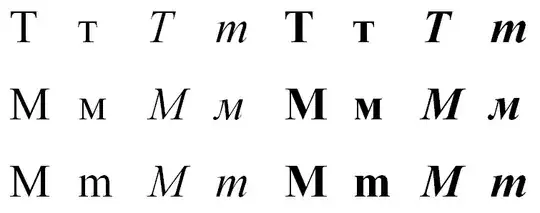
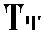
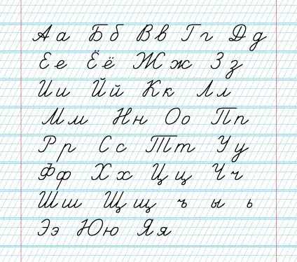
First, the fact that the modern Russian T is homoglyphic to the Latin T should not confuse you. @yellowsky has provided an image of T as it was shaped earlier, before Peter I's reforms. Actually, this is almost the end of the evolution of this letter.

Here's a quote from Wikipedia:

В славянской письменности буква Т имела несколько разновидностей начертания: наряду с обычным т-образным рано возникло трёхногое m-образное; в старопечатных украинских книгах обнаруживается тенденция к орфографическому разграничению этих начертаний (впрочем, до полностью формализованного и обязательного правила не дошедшая). А именно, т писали в начале слов, а m — в середине; но если слово было не славянским, а заимствованным, то и в середине слова ставили т. Сверх того существовало и «высокое» начертание этой буквы, похожее на цифру «7»

Short summary: the three-legged shape happily existed and even co-existed with the one-legged form. In old Ukrainian books one can find that the т-form had been used in initial positions, while m - in the middle of words (except loan-words).

Going even further, there is some evidence that Cyrillic script was at least heavily influenced by (if not a direct ancestor of) the Glagolitic alphabet, and here's what Glagolitic t looked like: Shape of Glagolitic letter "t"

In the Macedonian language, for example, the letter T is still written as:

Macedonian letter T

See, it's basically an inverted form (compared to Russian) with an additional line above - in order to differentiate it from ш.

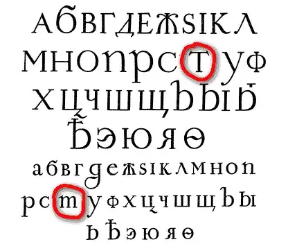
So, actually this three-leggedness is quite common in Cyrillic scripts and quite an old story.

CocoPop
  • 8,301
  • 2
  • 17
  • 38
shabunc
  • 37,983
  • 5
  • 90
  • 152
  • 12
    Elder people in Russia also sometimes write this letter (non-capital) with a line above. – Anixx Sep 27 '13 at 13:54