0

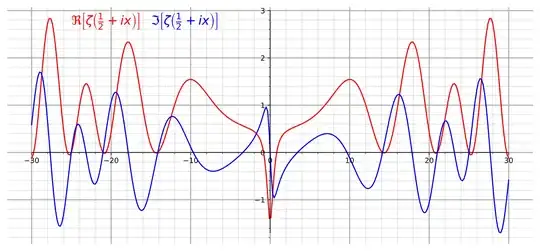
In this question, I have asked How I can plot the critical line of $\zeta(s)$ as the definition of $\zeta (s)$ is valid only for $s\geq 1$. One way to plot is to use $\eta(s)$ $$\eta (s)=(1-2^{1-s})\zeta(s)$$ I used this and the plot of $\zeta(0.5+it)$ $(-40\leq t\leq 40$) looks like this :

enter image description here

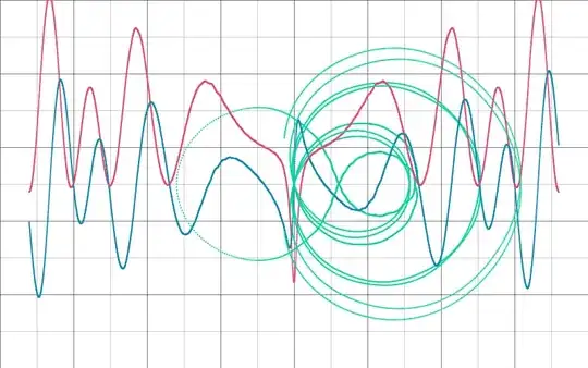
While the zeroes are at the right place, it's different from what is shown here

enter image description here

I wanted to know How come the same function looks different?


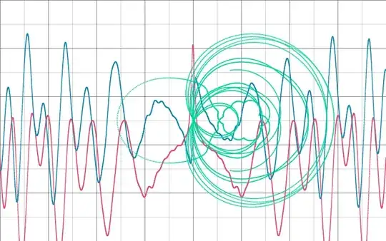
Edit: Thanks to all! The following plot uses $5000$ Terms of the $\eta$
enter image description here

  • 2
    How are you computing $\eta(s)$? E.g., are you just summing some number of terms of the series? It doesn't converge very fast. – Gareth McCaughan Jun 04 '21 at 12:40
  • Yeah! I'm talking about 200 terms. Is it not enough? How come the fluctuations occur only in the middle? – Young Kindaichi Jun 04 '21 at 12:43
  • 1
    Well, the 200th term in the series is $\pm 200^{-s}=\pm 200^{\frac12+it}=\pm\sqrt{200}\omega$ where $|\omega|=1$. That's still pretty big. – Gareth McCaughan Jun 04 '21 at 13:00
  • Why not try computing, say, 1000 terms instead and see how the graph compares to the one you have for 200 terms? – Gareth McCaughan Jun 04 '21 at 13:00
  • @Somos That's very correct, but on Re(s)=1/2 the alternating series used by OP does converge to $\zeta(s)$. – Gareth McCaughan Jun 04 '21 at 13:11
  • 1
    When I plot partial sums (with, say, 200 terms) of the series-based thing, I do get a graph that looks a lot like that of the zeta function; with 200 terms, the approximation is pretty good unless t is fairly small. So I think something must have gone amiss in OP's calculations somehow. – Gareth McCaughan Jun 04 '21 at 13:13
  • (Actually, I think the error is of comparable size for all t, but it's more visible near zero where the function is changing more slowly and the wiggles are therefore more apparent.) – Gareth McCaughan Jun 04 '21 at 13:15
  • @GarethMcCaughan Thanks a lot! I have added a plot and range of $t$ too and some little more mistakes. – Young Kindaichi Jun 04 '21 at 13:22
  • Wait, actually, how different are those plots? The upper one has the wrong sign (easy to do when summing an alternating series), and for some reason although the horizontal "graph paper" lines alternate between thick and thin the actual x-axis is one of the thin lines. And the ratio between x and y scales is quite different for the two. But other than that, I think the graphs are actually very similar. – Gareth McCaughan Jun 04 '21 at 13:27
  • Yeah, I have just seen that I was by mistake used the wrong sign on the red one but now I have corrected it. Apart from this a little bit of scaling has been done, now $-30\leq t \leq 30$. I will add another with 20,000 which looks much smoother. You are right scaling is quite different in the two plot. – Young Kindaichi Jun 04 '21 at 13:32

0 Answers0