1

I found this answer below however I have a 2D data set.

ListPlot with plotmarkers determined by point

The first plot answer by KGLR (answered Jun 24 '12 at 14:40) looks suitable. However, I've a two dimension data set

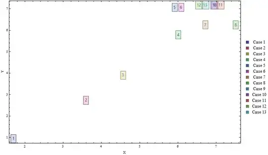
data = {{1.704, 0.931508}, {3.6, 2.7256}, {4.568, 3.89257}, {6.016, 5.77674}, {5.92, 7.05187}, {6.0904, 7.05187}, {6.72, 6.23791}, {7.52, 6.23791}, {6.96, 7.16941}, {6.96, 7.16941}, {7.12, 7.16941}, {6.56, 7.16941}, {6.72, 7.16941}}

This list represents x-axis versus y-axis. I require to adapt the solution to plot the data. I would prefer a different colour scheme to HUE, and also add legend, with x and y axis labels

SPIL
  • 627
  • 3
  • 10

1 Answers1

1

If you don't mind the clutter you can modify the linked answer as follows:

colors = ColorData[1, "ColorList"][[;; Length@data]]; 
labels = Range@Length@data;
legendlabels = "Case " <> ToString@# & /@ labels;

ListPlot[List /@ data, Frame -> True,  ImageSize -> 700,
 PlotMarkers -> (Style[Framed[#], "Panel", #2, Background -> Opacity[.1, #2]] & @@@ 
   Transpose[{labels, colors}]), 
 PlotLegends -> SwatchLegend[legendlabels, LegendLayout -> Grid], 
 FrameLabel -> {"X", "Y"}, PlotRange -> All, PlotRangeClipping -> False]

Mathematica graphics

kglr
  • 394,356
  • 18
  • 477
  • 896
  • .. perhaps new-in -version-10 Callout may be more useful for displaying your data. – kglr Mar 22 '17 at 12:54
  • Perhaps to reduce the clutter, you could you define a different shape marker for each point? Thanks again! – SPIL Mar 22 '17 at 15:15
  • Hi KGLR, Thanks for you efforts. My graph comes out different to yours, with the numbered boxes far larger and overlapping. How do I rescale? Also on the legend, how do I switch to list string "Case 1", "Case 2", "Case 3"......etc instead of the numerical values of the point. – SPIL Mar 22 '17 at 15:18
  • @SPIL, thank you for the accept. Please see the update regarding legend labels. – kglr Mar 22 '17 at 17:53