1

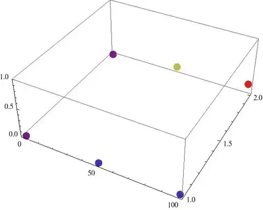
I have a couple of {x,y,z} points

a = {{0, 1, 0.}, {50, 1, 0.018931}, {100, 1, 0.02}, {0, 2, 0.}, {50, 2, 0.131}, {100, 2, 0.2}};

and I'm visualizing them with

ListPointPlot3D[a, PlotLegends -> Automatic, ImageSize -> 400, ColorFunction -> "Rainbow", PlotStyle -> PointSize[0.03], PlotRange -> {0, 1}]

it gives me this view:

graph

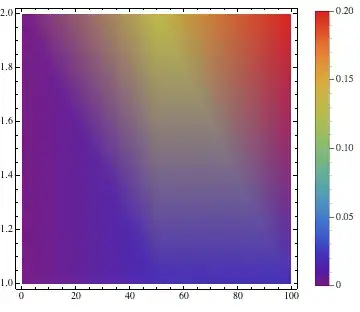
Now I don't need to see this graph in 3D because the color already codes for height. So is there a function that would allow me to see this graph "from above"? Ideally, each {x,y,z} point would be represented by a big square of coordinates {x,y} and of color representing z. I would also like to be able to label all squares with the same y, as they represent different entities (we can imagine the x axis is time (from 0 to 100), and I have recorded sound levels (z) in two conditions "noisy" (y = 0) and "quiet" (y = 1). I would like to label "noisy" and "quiet" close to my data).

So in the end I could get something like this (I took this image on the internet so of course labels are wrong, but it gives this idea of a coloured matrix) :

enter image description here

Sulli
  • 2,185
  • 14
  • 28
  • 1
    Then why don't you just use ArrayPlot? – Federico Mar 26 '13 at 18:02
  • @Federico I'm looking into ArrayPlot right now, just need to reorganize my data a little bit, and see how I can use labels. I just didn't know the name of this function... – Sulli Mar 26 '13 at 18:42

4 Answers4

4
Graphics[{
  PointSize[.025], {Hue[3 #3], Point[{#1, #2}]} & @@@ a, 
  Text["noisy", {0, 1}, {1, 1}], Text["quiet", {0, 2}, {1, 1}]}, 
  AspectRatio -> 1/2]

Mathematica graphics

or

ArrayPlot[1/Array[GCD, {50, 50}],
  ColorFunction -> "Rainbow", ColorFunctionScaling -> True]

Mathematica graphics

Szabolcs
  • 234,956
  • 30
  • 623
  • 1,263
Federico
  • 2,553
  • 16
  • 16
4

I wonder if this gets you something closer to what you'd like:

a = {{0, 1, 0.}, {50, 1, 0.018931}, {100, 1, 0.02}, {0, 2, 0.}, {50,2, 0.131}, {100, 2, 0.2}};
ListDensityPlot[a, PlotLegends -> Automatic, ImageSize -> 400, ColorFunction -> "Rainbow", PlotRange -> {0, 1}]

Mathematica graphics

Wolfram also has some useful data visualization tutorials. See: Visualization: Data Visualization Quick Start

If the points are on a rectangular grid, it is often useful to use InterpolationOrder -> 0 in ListDensityPlot:

Mathematica graphics

Szabolcs
  • 234,956
  • 30
  • 623
  • 1,263
Jagra
  • 14,343
  • 1
  • 39
  • 81
  • I hope you don't mind my edit, please change it further if you like :) I thought this is useful info for this case. – Szabolcs Mar 26 '13 at 21:23
  • @Szabolcs -- I don't mind at all. Thanks. – Jagra Mar 27 '13 at 03:07
  • I explored the ListDensityPlot function before ListPointPlot3D actually but with this function it's not easy to distinguish data for "noisy" and "quiet" conditions. It's better with InterpolationOrder -> 0 but still, the graph doesn't look quite natural, the y axis for example is not continuous in my dataset. I don't know if I'm clear? That's why probably ArrayPlot is better for what I want to do. @Szabolcs – Sulli Mar 27 '13 at 08:38
  • @SullivanOrlean I posted an answer showing how to use matrix plotting functions (MatrixPlot/ArrayPlot/Image/Raster/etc.). Does this help? – Szabolcs Mar 27 '13 at 14:23
  • @Szabolcs yes it helps! – Sulli Mar 27 '13 at 15:14
1

From above is easy:

a = {{0, 1, 0.}, {50, 1, 0.018931}, {100, 1, 0.02}, {0, 2, 0.}, 
 {50, 2, 0.131}, {100, 2, 0.2}};
ListPointPlot3D[a, 
   PlotLegends -> Automatic, 
   ImageSize -> 400, 
   ColorFunction -> "Rainbow", 
   PlotStyle -> PointSize[0.03], 
   PlotRange -> {0, 1}, 
   ViewPoint -> Top]

picture

cormullion
  • 24,243
  • 4
  • 64
  • 133
  • This is from just the top of the bounding box, which still makes it 3D. I think the OP wants a 2D view (a projection), which can be obtained with ViewPoint -> {0, ∞, 0} – rm -rf Mar 26 '13 at 17:59
  • ViewPoint -> {0, 0, ∞}. EDIT: damn 35 seconds late! :D – Federico Mar 26 '13 at 17:59
  • that's the idea a 2D box, but something nicer (like the example in my edited question above) would be easier to read. @rm-rf – Sulli Mar 26 '13 at 18:02
  • Ah, I misunderstood the question... :( – cormullion Mar 26 '13 at 18:03
1

If you would like to use ArrayPlot or MatrixPlot, first you need to convert your data into a matrix format. You can use SparseArray for this. Here's an example:

MatrixPlot[SparseArray[{#1/25 + 1, #2} -> #3 & @@@ a]]

Mathematica graphics

Make sure that the matrix indexes will start from 1, not from 0. I needed to add 1 to the first index for this. I also rescaled the first index by 25 (a random choice) in order not to get a 100 by 2 matrix which would not be that useful to look at. The unspecified elements are taken to be 0 here, but you can specify an alternative, or rescale by 50 so you won't have any empty elements.

Szabolcs
  • 234,956
  • 30
  • 623
  • 1,263