4

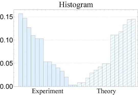
I have the following histogram:

ClearAll[texture]
texture[ms_ : {Black, White}, m_ : 100] := 
Texture@RegionPlot[True, {x, 0, 1}, {y, 0, 1}, 
MeshFunctions -> {# - #2 &}, Mesh -> m, MeshStyle -> None, 
MeshShading -> ms, Frame -> False, Axes -> False, 
PlotRangePadding -> 0, ImagePadding -> 0, BoundaryStyle -> None];

data1 = {0.157, 0.147, 0.127, 0.110, 0.103, 0.103, 0.053, 0.053, 0.047, 0.040, 0.033, 0.020, 0.003, 0.003}; data2 = {0.008, 0.008, 0.018, 0.029, 0.035, 0.042, 0.049, 0.049, 0.111, 0.111, 0.118, 0.133, 0.144, 0.145};

styles1 = {LightBlue, LightBlue, LightBlue, LightBlue, LightBlue, LightBlue, LightBlue, LightBlue, LightBlue, LightBlue, LightBlue, LightBlue, LightBlue, LightBlue}; styles2 = texture /@ Thread[{White, {LightBlue, LightBlue, LightBlue, LightBlue,LightBlue, LightBlue, LightBlue, LightBlue, LightBlue,LightBlue, LightBlue, LightBlue, LightBlue, LightBlue}}];

{sdata1, sdata2} = MapThread[Style, #] & /@ {{data1, styles1}, {data2, styles2}};

BarChart[{sdata1, sdata2}, BarSpacing -> None, PlotTheme -> "Detailed", ChartLabels -> {{Style["Experiment", FontFamily -> "Times"], Style["Theory", FontFamily -> "Times"]}, None}, LabelStyle -> {28, GrayLevel[0]}, ImageSize -> Large, ChartElementFunction -> SystemBarFunctionDumpTextureBar, PlotLabel -> Style["Histogram", FontFamily -> "Times"]]

Which looks like: enter image description here

How can I add the texts: $p_0$, $p_1$, ..., $p_{13}$ above the bins of the histogram in the left side from the left to the right and the same thing for the right histogram from the right to the left?
  • Welcome to Mathematica.SE! I hope you will become a regular contributor. To get started, 1) take the introductory [tour] now, 2) when you see good questions and answers, vote them up by clicking the gray triangles, because the credibility of the system is based on the reputation gained by users sharing their knowledge, 3) remember to accept the answer, if any, that solves your problem, by clicking the checkmark sign, and 4) give help too, by answering questions in your areas of expertise. – bbgodfrey Jun 01 '21 at 19:48
  • 1
    I know the following does not answer your question, but to make a more directly visual comparison of the two sets of relative frequencies, have you considered ListPlot[{data1, Reverse[data2]}, Joined -> True, PlotLegends -> {"Experiment", "Theory"}] ? – JimB Jun 01 '21 at 23:32

1 Answers1

4

Add the options

LabelingFunction -> 
  (Placed[Rotate[Style[#, FontSize -> Scaled[.03]], 90 Degree], Above] &)

and

PlotRangePadding -> {{Automatic, Automatic}, {Automatic, Scaled[.2]}}

to get

enter image description here

To "add $p_0, p_1, \ldots, p_{13}$ from the left bins to the right ones in the left histogram and the same from the right to the left in the right histogram instead of numbers", use

LabelingFunction -> 
  (Placed[Style[Subscript[p, Abs[#2[[2]] -1 - (#2[[1]] - 1) (Length[sdata1] - 1)]], 
     FontSize -> Scaled[.02]], Above] &)

which gives

enter image description here

You might consider PairedBarChart as an alternative visualization of your data:

PairedBarChart[{Style[data1, LightBlue]}, {Style[Reverse@data2, 
   Directive[Lighter@Blue, HatchFilling["Diagonal", 2, 7]]]}, 
 ChartLabels -> {Placed[Style[#, 24, FontFamily -> "Times"] & /@ 
    {"Experiment", "Theory"}, Top], None, 
    Style[Subscript[p, #], 14] & /@ Range[0, 13]}, 
 PlotTheme -> "Detailed", LabelStyle -> {16, GrayLevel[0]}, 
 PlotLabel -> Style["Histogram", 28, FontFamily -> "Times"], 
 ImageSize -> Large] 

enter image description here

kglr
  • 394,356
  • 18
  • 477
  • 896