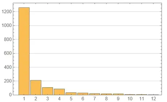
Consider the following code
list = {1258, 208, 108, 86, 34, 27, 19, 17, 14, 7, 6, 3};
BarChart[list, ChartLabels -> Range[Length[list]], Frame -> True,
 GridLines -> Automatic]
Clearly, there is a great disparity between the first bin and the remaining ones. Would it be possible to rescale it so that the distribution for the remaining terms remains clear? What is the best practice here?
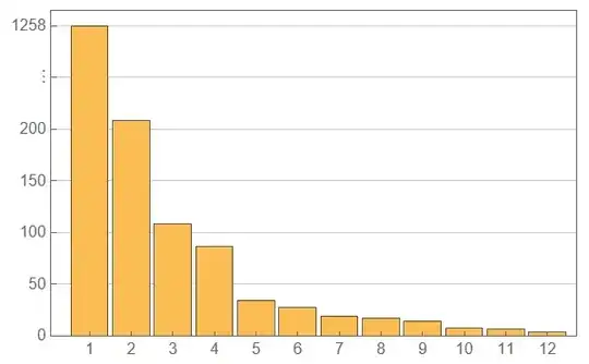
Some thoughts: Log-scaled histograms are not common, and for the untrained eye, I feel they might be confusing. I thought something like the following could be achieved
list = {1258, 208, 108, 86, 34, 27, 19, 17, 14, 7, 6, 3};
list[[1]] = 300;
BarChart[list, ChartLabels -> Range[Length[list]], Frame -> True,
 GridLines -> Automatic, PlotRange -> {0, 315},
 FrameTicks -> {{{0, 50, 100, 150,
     200, {250, \[VerticalEllipsis]}, {300, 1258}}, None}, {Automatic,
     None}}]
But I am also not too sure if it's convenient to show it like this. Can this be done automatically? Any ideas?

