2

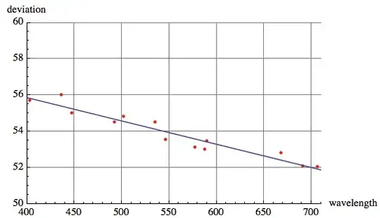
This is what I have done so far. The points are of angles-of-deviation and wavelengths from my physics lab experiment.

V = ListPlot[
  {{589.3, 53.50}, {435.8, 56.02}, {535.4, 54.52}, {546.1, 
    53.57}, {577.0, 53.13}, {690.9, 52.10}, {402.6, 55.72}, {447.2, 
    55.02}, {492.2, 54.53}, {501.6, 54.83}, {587.6, 53.03}, {667.8, 
    52.83}, {706.5, 52.05}
   }, PlotRange -> {{400, 710}, {50, 60}}, 
  AxesLabel -> { wavelength, deviation}, PlotStyle -> Red, 
  GridLines -> Automatic]

this is what i have done so far.

I am trying to find the best fit line of these points. I know it is some type of exponential function. But I can not figure out how to do it. Please help me out.

m_goldberg
  • 107,779
  • 16
  • 103
  • 257
taya
  • 21
  • 1
  • The relation appears to be linear. Why not use regression? – DavidC Nov 12 '13 at 02:35
  • 1
    Which is the dependent and which is the independent variable (or are both independent)? Regression of y with respect to x is not the same as regression of x with respect to y. – geordie Nov 12 '13 at 04:20
  • @geordie. Very good point. That makes me suspect that the (linear) Fit that I used below works differently from regression. – DavidC Nov 12 '13 at 05:17
  • @geordie If the experiment is to calibrate one set of measurements to the other, as taya suggests in a comment to dwa, then the standard measure would presumably correspond the dependent variable. – DavidC Nov 12 '13 at 05:27
  • @DavidCarraher. Given the scatter in both x and y, it seems reasonable to assume there is an uncertainty associated with each measurement - in which case a simple linear regression (least squares, etc.) will produce an unreliable fit. Better methods are available using robust stats. Then again, perhaps I'm over thinking this... – geordie Nov 13 '13 at 01:06
  • Didn't know about robust stats. Btw, there is very little scatter. The Pearson correlation is -.96 – DavidC Nov 13 '13 at 02:31
  • @DavidCarraher. I have to be more careful with my choice of words... the points seem irregularly sampled (not scattered) implying that there is an uncertainty in both x and y. Now I am definitely over thinking this.. – geordie Nov 13 '13 at 22:46

2 Answers2

2

Given the distribution of the data, you should use linear model, unless you have compelling theoretical reasons for believing the model is not linear.

data = {{589.3, 53.50}, {435.8, 56.02}, {535.4, 54.52}, {546.1, 53.57}, {577.0, 53.13},{690.9, 52.10}, {402.6, 55.72}, {447.2, 55.02}, {492.2, 54.53}, {501.6, 54.83}, {587.6,53.03}, {667.8, 52.83}, {706.5, 52.05}};
Show[
  ListPlot[data, PlotRange -> {{400, 710}, {50, 60}}, AxesLabel -> {"wavelength", "deviation"}, 
    PlotStyle -> Red, GridLines -> Automatic], 
  Plot[Evaluate@Fit[data, {1, x}, x], {x, 400, 710}]
     ]

linear

DavidC
  • 16,724
  • 1
  • 42
  • 94
0

It's straightforward, and can get gleaned from the documentation.

After Sort@data,

nfit = NonlinearModelFit[data, a Exp[-t/\[Tau]], {a, \[Tau]}, t]
nfit["AdjustedRSquared"]
Show[{V,
  Plot[nfit[t], {t, 400, 710}]
  }
 ]

will compare your experimental data to an exponential fit. Documentation on NonlinearModelFit gets you a bunch of diagnostics.

Having said that, after looking at \[Tau], why not fit a linear function?

dwa
  • 1,939
  • 14
  • 14
  • in the lab hand out, the professor gave the example graph that the calibration curve should resemble a curve line,,, which i guess it some kind of exponential... – taya Nov 12 '13 at 01:45
  • I see no reason to sort the data. Am I missing something. – DavidC Nov 12 '13 at 02:53
  • No compelling reason, since NonlinearModelFit appears to handle data 'as is'. – dwa Nov 12 '13 at 03:28