Updated with working code (tnx @rasher @mfvonh)
Let’s start by importing Fisher’s classic dataset on Iris flower measurements…
Fisher’s classic paper can be found here….
Needs["MultivariateStatistics`"]

(*Import Data*)
irisData = Import["http://aima.cs.berkeley.edu/data/iris.csv", "CSV"];
plotLabels = {"Sepal.Length", "Sepal.Width", "Petal.Length", "Petal.Width", "Type"};
T= Transpose;
(*Parse Data and Regress, thanks @mfvonh *)

groups = Map[Tuples[Most@#, {2}] &, GatherBy[irisData, Last], {2}];
pairs = (Dimensions@groups)[[3]];
lm = Table[LinearModelFit[groups[[All, All, i]][[#]], {x}, x] & /@ Range[3], {i, 1, pairs}];
plotLabels =Flatten@
ConstantArray[{"Sepal.Length", "Sepal.Width", "Petal.Length", "Petal.Width”},Sqrt@pairs];
Setting up plotting options:
(*Set up plot options *)

DodgerBlue = RGBColor[0.117603`, 0.564699`, 1.`];
CrimsonRed = RGBColor[0.889996`, 0.149998`, 0.209998`];
SeaGreen = RGBColor[0.180395`, 0.545106`, 0.341197`];

SetOptions[{ListPlot, SmoothHistogram}, AspectRatio -> 1,
Frame -> True, ImageSize -> 150,
PlotStyle -> {CrimsonRed, SeaGreen, DodgerBlue},
FrameTicks -> {Automatic, Automatic, None, None},
BaseStyle -> {FontFamily -> "Myriad Pro", FontTracking -> "SemiCondensed",
FontWeight ->"Thin", FontSize -> 10}];
Let’s create some helper functions for the individual plots:
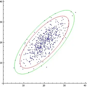
(*Elliptical Insights*)

Clear[regPlot, data, regressions, MinMax];

MinMax[x_] := Flatten[{Min[x], Max[x]}];

ellipseInsight[data_, regressions_, colors_: {CrimsonRed, SeaGreen, DodgerBlue}, ci_: 0.68] :=

Show[ {

  ListPlot[data[[1]], PlotStyle -> Lighter@colors[[1]]]
, ListPlot[data[[2]], PlotStyle -> Lighter@colors[[2]] ]
, ListPlot[data[[3]], PlotStyle -> Lighter@colors[[3]] ]

, Plot[regressions[[1]][x], {x, Min@(T@data[[1]])[[1]], Max@(T@data[[1]])[[1]]}, PlotStyle -> colors[[1]] ]
, Plot[regressions[[2]][x], {x, Min@(T@data[[2]])[[1]], Max@(T@data[[2]])[[1]]}, PlotStyle -> colors[[2]] ]
, Plot[regressions[[3]][x], {x, Min@(T@data[[3]])[[1]], Max@(T@data[[3]])[[1]]}, PlotStyle -> colors[[3]] ]

, Graphics[{colors[[1]] , Quiet@EllipsoidQuantile[data[[1]], ci]}]
, Graphics[{colors[[2]] , Quiet@EllipsoidQuantile[data[[2]], ci]}]
, Graphics[{colors[[3]] , Quiet@EllipsoidQuantile[data[[3]], ci]}]

}
, PlotRange -> Automatic
, FrameTicks -> {False, True, False, False}
, FrameStyle -> Directive[Thin, Gray]
, Axes -> False
, ImagePadding -> {{pad, pad/4}, {pad, pad/4}}
, AspectRatio -> 1]
Let’s generate the plots:
(* Generate Regression Plots *)

plots = Table[ellipseInsight[groups[[All, All, i]], lm[[i]]], {i, 1, pairs}];

(* Generate Histogram Plots For the Diagonal *)

diags = Table[i (1 + Sqrt@pairs) + 1, {i, 0, Sqrt@pairs - 1} ];

histogramsPlots =Table[
Show[MapThread[
 SmoothHistogram[(T@groups[[All, All, i]][[#1]]),
   AspectRatio -> 1, PlotStyle -> #2] &
 , {Range[3], {CrimsonRed, SeaGreen, DodgerBlue}}]
 , PlotRange -> {MinMax @ groups[[All, All, i, 1]], All}
 , ImagePadding -> {{pad, pad/4}, {pad, pad/4}}
 , Frame -> True, FrameStyle -> Directive[Thin, Gray]
 , FrameTicks -> {True, False, False, False}, ImageSize -> 150
 , FrameLabel -> {"", plotLabels[[i]]}, Axes -> False], {i, diags}];


(*Merge Plots*)

Do[plots[[i (1 + Sqrt@pairs) + 1]] = histogramsPlots[[i + 1]], {i, 0, Sqrt@pairs - 1}];


(*Draw the plots*)
plots // Partition[#, 4] & // Grid
And here’s the sample output:


ListPlotwill create the scatters, andLinearModelFitwill regress the data and give you the error information you need to calculate the ellipses. Can you take a stab at implementing the ellipse method described in the paper, or at least spell out the steps? Here's a nudge as far as splitting the data goes:groups = Map[Tuples[Most@#, {2}] &, GatherBy[irisData, Last], {2}]; ListPlot[groups[[All, All, #]]] & /@ Range@16 // Partition[#, 4] & // TableForm– mfvonh Jun 20 '14 at 00:57