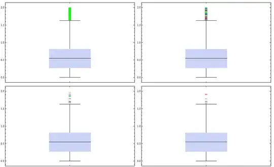
Imagine a larger data set which I want to display using BoxWhiskerChart.
data = Flatten[{RandomReal[1., 10000], RandomReal[2., 2000]}];

BoxWhiskerChart[data, {"Median", {"MedianMarker", 1, Black}, {"Whiskers", Black},
{"Fences", 0.5, Black}, {"Outliers", "o", Black}}]

Since there are a lot of outliers I cannot visualize them properly - the potential reader only sees a thick black line. When I enlarge the outlier marker the whole thing does not get better at all.
BoxWhiskerChart[data, {"Median", {"MedianMarker", 1, Black}, {"Whiskers", Black},
{"Fences", 0.5, Black}, {"Outliers", Style["o", 100], Black}}]

Is there a way to colorize the outlier markers using something like ColorFunction (which did not work for me) in a way that the individual markers can be seen more distinctly (alternating black, gray etc.)?
Or would it even be possible to reduce the number of displayed outliers in a way that one can see/identify them better?
UPDATE
I have decided to display the data using DistributionChart which clearly has advantages of showing the actual value distribution of the data. But with this solution another problem arises (see here).