8

I noticed something weird with MatrixPlot's PlotLegends -> Automatic behavior- here's a minimal example:

MatrixPlot[Table[Exp[-((i - 25)^2 + (j - 25)^2)], {i, 50}, {j, 50}], 
 PlotLegends -> Automatic, ColorFunction -> "ThermometerColors"]

enter image description here

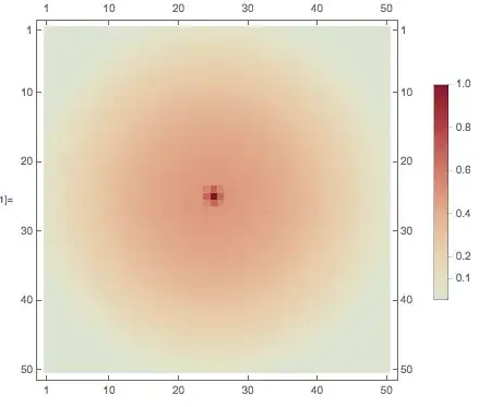
According to the plot legend, there are points with amplitude of roughly 1/2 at coordinates {25, 40}. However, at that point, the value of the matrix is 1/E^225, which means the color scheme is wrong by about one hundred orders of magnitude (!).

This has to be a bug, right? Or is this an oversight of the fact that MatrixPlot seems to use a logarithmic-like color scheme?

DumpsterDoofus
  • 11,857
  • 1
  • 29
  • 49
  • Try using ColorFunctionScaling -> False, it shows correctly all points with the same color, but the middle with a different one. Scaling original values to [0, 1] creates a more homogeneous distribution of colors. – bobknight Oct 16 '14 at 21:12
  • If you're looking for workarounds, have you tried ArrayPlot? –  Oct 17 '14 at 03:10
  • @RahulNarain: Yeah, I was mainly just curious as to why this was occurring in MatrixPlot. – DumpsterDoofus Oct 17 '14 at 12:51

2 Answers2

7

I am continuing to explore this as I can't yet demonstrate exactly what is going on, but first note that ArrayPlot does not experience this problem:

tab = Table[Exp[-((i - 25)^2 + (j - 25)^2)], {i, 50}, {j, 50}];

ArrayPlot[500 * tab, PlotLegends -> Automatic, ColorFunction -> "ThermometerColors"]

enter image description here

Note that I multiplied the original table by 500 specifically to demonstrate that ColorFunctionScaling is being used. Rather what is not being used is the special scaling of MatrixPlot:

With the default setting ColorFunctionScaling->True, scaling is done based on a mixture of relative value and ranking for each matrix element. The final scaled value always lies between 0 and 1, with scaled value 0.5 corresponding to matrix element value 0.

I believe that this special scaling is not being used (properly) in the construction of the legend but the Trace is so complex I am having trouble pinpointing it.

Mr.Wizard
  • 271,378
  • 34
  • 587
  • 1,371
2
MatrixPlot[Table[Exp[-((i - 25)^2 + (j - 25)^2)], {i, 50}, {j, 50}], 
 PlotLegends -> Automatic, ColorFunction -> "ThermometerColors", 
 ColorFunctionScaling -> False]

enter image description here

bobknight
  • 2,037
  • 1
  • 13
  • 15
  • 1
    Thanks so much for the workaround, although I'm still a bit confused. According to the documentation, "ColorFunctionScaling by default Scaling is done so as to make the minimum and maximum values of all variables lie between 0 and 1." But in my example, the values of all datapoints already lie between 0 and 1. Also, it looks like the majority of the plot is blue, which according to the color scheme has a value of -1, but in reality it's roughly zero. What is that caused by? – DumpsterDoofus Oct 16 '14 at 21:21
  • In my interpretation, the original values are into the interval [0, 1] but the main part is very close to zero, that is the blue color in the colorfunction used (why do you think it is -1?). When the values are scaled they are distributed more uniformely inside the same interval, thus the different distribution of colors. Try the following a = Table[Exp[-((i - 25)^2 + (j - 25)^2)], {i, 50}, {j, 50}] // N then Rescale[a] and see the result numerically. – bobknight Oct 16 '14 at 21:46
  • Another detail you can catch from the numeric example: in the original values there is no 0, using Rescale the minimum is transformed to 0, so the difference in the first plot – bobknight Oct 16 '14 at 21:49
  • 1
    I think it is -1 because the plot legend has zero in the center (white), has 1 at the top (in red), and thus by extrapolation has -1 on the bottom (in blue). Also, your numerical example doesn't work: Rescale[a] and a are the same to within machine precision! Indeed, replacing a with Rescale[a] in the original code makes no difference, so that can't be what's causing this to happen. – DumpsterDoofus Oct 16 '14 at 22:47