33

[Disclaimer: I initially posted this question on stackOverflow 2 months ago and think it might be better suited for this forum (link to original question)]

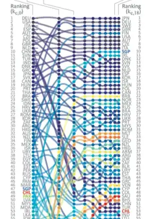
The graph below shows a ranking of countries at 10 different points. The cool thing with this graph is that it allows you to track changes in the ranking over time. I want to create create something similar, but I have no idea how it was created...

My guess is that it was created using some design tool like adobe indesign, but my hope is that there might be some other tools for obtaining such a graphic using Mathematica? (e.g. using Mathematica's table and network functions?)

Any ideas and/or suggestions on where to look would be much appreciated.

Country Ranking Over Time

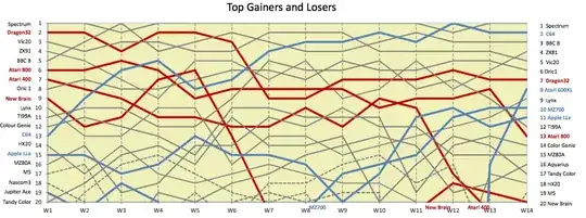
This type of chart is used for many purposes. Here is another example of similar chart: (just for illustration purposes)

Another example

Update: @Dr.belisarius solution still stands strong as a great solution to my question from a few years ago now, but I wanted share the following:

  1. The graph I was looking for has a name and it is a parallel coordinates plot.
  2. For those interested, an alternative earlier Mathematica implementation of this can be found here: http://www.stats.uwo.ca/faculty/aim/2003/mviz/web/notebooks/default.htm
Seb
  • 735
  • 5
  • 10
  • 7
    I'm sure people here could figure out how to make a nice looking plot... but we would need to know where to access the data from which the plot is made. – bill s Nov 25 '14 at 21:41
  • 1
    Related: http://stackoverflow.com/questions/11751062/motorsport-lap-chart-revisited http://stackoverflow.com/questions/5655224/motorsport-lap-chart-using-listlineplot – Dr. belisarius Nov 28 '14 at 12:21

1 Answers1

38

Some function definitions first. AkimaInterpolation[] stolen from here:

AkimaInterpolation[data_] := Module[{dy}, dy = #2/#1 & @@@ Differences[data];
  Interpolation[Transpose[{List /@ data[[All, 1]], data[[All, -1]], 
     With[{wp = Abs[#4 - #3], wm = Abs[#2 - #1]}, 
        If[wp + wm == 0, (#2 + #3)/2, (wp #2 + wm #3)/(wp + wm)]] & @@@
      Partition[Join[{{3,-2},{2,-1}}.Take[dy,2],dy,{{-1,2},{-2,3}}.Take[dy, -2]],4,1]}], 
   InterpolationOrder -> 3, Method -> "Hermite"]]
cfun = Log@# &;

Now a simulation for your data. Please next time include a sample dataset in your question. Finding a "right" shuffle function was the most convoluted part!

c = StringInsert[#, "  ", {1, -1}] & /@ CountryData["SouthAmerica", "UNCode"];
rc = Range@Length@c;
numpoints = 8;
rn = Range@numpoints; 
vals = Most@Reverse@FoldList[
       (While[Max@Abs[#1-(tc= Permute[#1, Cycles[{RandomSample[#1, #2]}]])] > #2]; tc) &,
                             rc, rn];
xcoords = cfun /@ rn;
data = Transpose[Partition[#, 2] & /@ (Riffle[##, {1, -2, 2}] & @@@ 
                                                           Transpose[{vals, xcoords}])];

Finally the plot:

MapIndexed[(h[#2[[1]]] = AkimaInterpolation[#1]) &, data];
cd = (ColorData["Rainbow"][1 - #/Length@rc] & /@ rc);
Show[
 Plot[Evaluate[h[#][x] & /@ rc], {x, cfun@1, cfun@numpoints}, 
  PlotStyle -> ({Opacity[.6], Thickness[.01], #} & /@ cd), 
  PlotRange -> {{cfun@1, cfun@numpoints}, {-1, 16}},
  AxesOrigin -> {cfun@1, 0},
  Method -> {"FrameInFront" -> False},
  FrameTicks -> {{Transpose[{rc, c[[Last[vals]]]}], 
                  Transpose[{rc, c[[First[vals]]]}]}, {None, None}},
  Axes -> False,
  Frame -> {{True, True}, {False, False}}], 
 ListPlot[data,  PlotStyle -> ({Opacity[1], PointSize[.015], #} & /@ cd)], 
PlotRangeClipping -> False]

Mathematica graphics

Dr. belisarius
  • 115,881
  • 13
  • 203
  • 453