5

I have a button containing a single character, generated with, for example

Button["X", Null] 

but that is by default much wider than it should be:

enter image description here

I want the button to be much narrower, like the key of a keyboard; something like

enter image description here

but when I attempt to achieve that with what seems like the obvious approach using

Button["X", Null, ImageSize -> {25, 25}]

I get

enter image description here

which neither has the specified size, nor the shows the specified content correctly.

What am I missing? Options like FrameMargins -> 0, ContentPadding -> False don't do much. How do I get a button sized the way I'm looking for, closely bounding a single character, like a keyboard key?


MacBook Pro Retina (Mid 2014), OS X (10.10.2), Mathematica 10.0.2.0.

orome
  • 12,819
  • 3
  • 52
  • 100

3 Answers3

3

If you're happy with a palette appearance for the Button, you can try this:

niceX = Rasterize[
   TraditionalForm["X"],
   "Image",
   ImageSize -> 10,
   RasterSize -> 75
   ];

Button[
 Style[niceX],
 FrameMargins -> 0,
 Appearance -> "Palette"
 ]

Blockquote

TransferOrbit
  • 3,547
  • 13
  • 26
  • So Button doesn't work with strings? – orome Mar 15 '15 at 12:30
  • Nice solution. (Too bad it seems necessary.) – orome Mar 15 '15 at 12:40
  • Wait, this works also (again if "Palette" is acceptable): Button["X", Null, ImageSize -> {20, 20}, FrameMargins -> 0, Appearance -> "Palette"] – orome Mar 15 '15 at 12:46
  • @raxacoricofallapatorius I think Appearance -> "Palette" is sufficient, even for strings. But buttons are system dependent. (I'm on a Mac.) I can't the default not to have the left and right abutting ends (which may be what they actually are). -- oh, I see you figured out the first part. – Michael E2 Mar 15 '15 at 12:47
  • @MichaelE2: Yes. That seems to work. – orome Mar 15 '15 at 12:51
  • 1
    I added the rasterized x so that the background would be white instead of gray, assuming this would be more preferable to you. But you know what they say about assuming. ;) – TransferOrbit Mar 15 '15 at 14:10
  • @zentient: At this point, I'll take anything! – orome Mar 15 '15 at 15:01
3

These options seem to be undocumented and haven't appeared on the site as far as I can see. So maybe this is a good place to show them, as they could be used as a workaround for the OP and may be useful for others:

Button["X", Null, FrameMargins -> 1, 
 Appearance -> {
   "Default" -> FrontEnd`FileName[{"Ribbons", "Common"}, "GrayButton-Default.9.png"], 
   "Hover" -> FrontEnd`FileName[{"Ribbons", "Common"}, "GrayButton-Hover.9.png"], 
   "Pressed" -> FrontEnd`FileName[{"Ribbons", "Common"}, "GrayButton-Pressed.9.png"]}]

Mathematica graphics

In general, we seem to need a 7 x 28 image. The middle column (of the image data) seems to be used as a tile. I probably don't have the edges quite right, but it produces a button-like button:

buttonImg[col_] := 
 Image[Graphics[{{col, EdgeForm[], 
     Rectangle[{1, 1}, {6, 27}, RoundingRadius -> 2]},
    {Black, Opacity[0.], Rectangle[{0, 27}, {3, 28}], 
     Rectangle[{4, 27}, {7, 28}]},
    {Rectangle[{0, 2}, {2, 26}], 
     Rectangle[{5, 2}, {7, 26}], {Rectangle[{2, 25}, {3, 27}], 
      Rectangle[{3, 26}, {4, 28}], 
      Rectangle[{4, 25}, {5, 27}]}, {Rectangle[{2, 1}, {3, 3}], 
      Rectangle[{3, 0}, {4, 2}], Rectangle[{4, 1}, {5, 3}]}}},
   PlotRangePadding -> None, PlotRange -> {{0, 7}, {0, 28}}], 
  ImageSize -> {7, 28}]

OP's example:

Button["X", Null, FrameMargins -> 1,
 Appearance -> {
   "Default" -> buttonImg[GrayLevel[0.98]], 
   "Hover" -> buttonImg[GrayLevel[0.9]], 
   "Pressed" -> buttonImg[RGBColor[0.5, 0.7, 1.]]}]

Mathematica graphics Mathematica graphics Mathematica graphics

The image is resized, perhaps by tiling the middle of the image:

Button[X^2/(X + 1), Null, FrameMargins -> 1,
 Appearance -> {
   "Default" -> buttonImg[GrayLevel[0.98]], 
   "Hover" -> buttonImg[GrayLevel[0.9]], 
   "Pressed" -> buttonImg[RGBColor[0.5, 0.7, 1.]]}]

Mathematica graphics

Of course, any image may be used:

Button["X", Null,
 Appearance -> {
   "Default" -> Image@Graphics[{Circle[]}], 
   "Hover" -> Image@Graphics[{EdgeForm[Black], LightGray, Disk[]}], 
   "Pressed" -> Image@Graphics[{EdgeForm[Black], Red, Disk[]}]}]

In this case, it seems to resize the image by scaling:

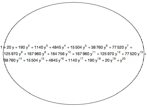
Button[(1 + y)^40 // Expand, Null,
 Appearance -> {
   "Default" -> Image@Graphics[{Circle[]}], 
   "Hover" -> Image@Graphics[{EdgeForm[Black], LightGray, Disk[]}], 
   "Pressed" -> Image@Graphics[{EdgeForm[Black], Red, Disk[]}]}]

Michael E2
  • 235,386
  • 17
  • 334
  • 747
  • Great find. I worry that I won't be able to use undocumented features though. I'm trying to (and near giving up on) build a Wolfram Demonstration that needs quite a bit of text input, but InputField is prohibited in Demonstrations, and I'm experimenting with using a keyboard, which is where the need for buttons comes from. – orome Mar 15 '15 at 15:12
  • @raxacoricofallapatorius Thanks. I think that the "Palette" style would be quite suitable for a keyboard. Or ButtonBar, which shrink-wraps the buttons. – Michael E2 Mar 15 '15 at 15:15
  • Agreed. I'm seeing what I can get going. I'm stuck on how to make use of the string it creates inside Manipulate though (see my last comment here). – orome Mar 15 '15 at 15:18
2

ContentPadding:

ContentPadding
is an option for objects that can be displayed with frames that specifies whether the vertical margins should shrink wrap tightly around the contents.

  • A setting of ContentPadding -> False shrinks the content area tightly around the contents instead of rounding to the next full line height.
Button["X", Null, FrameMargins -> 0, ContentPadding -> False]

enter image description here

compare to

Button["X", Null, FrameMargins -> 0]

enter image description here

kglr
  • 394,356
  • 18
  • 477
  • 896