30

In the 2015 Planck satellite results, they give the latest plot of the temperature power spectrum of the cosmic microwave background, which I show below. (I am only interested in the main plot; you can ignore the residuals at the bottom.)

Notice that there is a dotted vertical line at $\ell=30$, and the x-axis to the right of that line is linear while to the left it is logarithmic.

How close of an approximation to this effect can I create in Mathematica?

Planck 2015 temperature power spectrum

Mr.Wizard
  • 271,378
  • 34
  • 587
  • 1,371
thecommexokid
  • 1,335
  • 8
  • 17
  • 4
    I have this solved in a package I wrote for my needs. It involves plotting f[g[x]] instead of f[x] where g is a Piecewise function that grows logarithmically in one range of x and then linearly in the next. Then you need to manually specify the ticks such that the positions are distorted as the inverse function of g. Once I get to work tomorrow I can post a full answer if someone doesn't come up with one before that. – LLlAMnYP May 04 '15 at 19:35
  • 2
  • 1
    @LLlAMnYP I look forward to your answer. I think that is similar in concept to what I did here: (78708) – Mr.Wizard May 04 '15 at 19:36
  • 1
    @Mr.Wizard, it's actually very simple when using the TickPostTransformation option in CustomTicks. I'll see if I have anything useful on my laptop right now. – LLlAMnYP May 04 '15 at 19:40
  • 1
    @Mr.Wizard, that a very interesting thing with ScalingFunctions you did in your solution. So far, though, they only work with a limited set of plotting functions, right? – LLlAMnYP May 04 '15 at 20:41
  • 1
    @LLlAMnYP Yes, and some of them are not officially supported so the functionality may change or disappear. – Mr.Wizard May 04 '15 at 21:39

2 Answers2

22

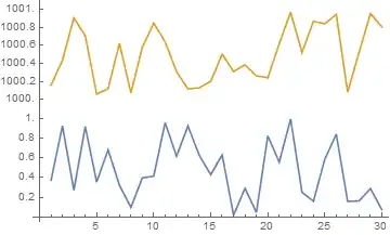
Ok, here's a very brief toy example while I don't have access to my desktop computer at work.

It's easy enough to figure out, that a LogPlot of f is basically the plot of Log[f[x]]. And A LogLinearPlot is the plot of f[Exp[x]]. But we can extend this to arbitrary scalings of the axes.

I start with defining a piecewise function which maps x values between 0 and 1 to the interval from 1 to 10 logarithmically and x values between 1 and 2 to the interval 10 to 100 linearly, as well as the inverse of that.

g[x_] := Piecewise[{{10^x, 0 <= x < 1},
                    {Rescale[x, {1, 2}, {10, 100}], x >= 1}}]
inverseg[x_] := 
 Piecewise[{{Log[10, x], 1 <= x < 10},
            {Rescale[x, {10, 100}, {1, 2}], x >= 10}}]

Then if you have the CustomTicks package:

Needs["CustomTicks`"];
ticks = LinTicks[1, 10, TickPostTransformation -> inverseg]~Join~
   LinTicks[10, 100, TickPostTransformation -> inverseg];

If you don't have it:

ticks = {N@inverseg@#, 
     ToString@#, {0.01, 0}, {}} & /@ (Range[2, 10, 2]~Join~
     Range[20, 100, 20]);

Finally (I show Sin[x] in this toy example):

Plot[Sin[g[x]], {x, 0, 2}, Ticks -> {ticks, Automatic}]

Scaled ticks

Note, how according to the x-y coordinates taken from the axes labels this is just the regular Sin[x] function, but everything is distorted such, that we see the desired log scaling before 10 and linear scaling after.

This plot was generated without using the CustomTicks package, hence lazy and without minor ticks. I'll go into more details tomorrow.

Update 05.05.15

Writing out these piecewise functions by hand is tedious. I've automated this.

Firstly, a function I called MapLog, though logRescale may have been more appropriate. Although, unlike Rescale[x, {x1, x2}, {y1 y2}] where simply swapping the 2nd and 3rd argument gives you the inverse function, with a logarithmic/exponential mapping it's a bit less straightforward.

MapLog[{x1_, x2_, y1_, y2_}, type_String: "Direct"] :=
    Which[
        type == "Direct", (Log[(x2/x1)^(1/(y2 - y1)), #1/x1] + y1 &),
        type == "Inverse", (x1 (x2/x1)^((#1 - y1)/(y2 - y1)) &)]

The default "Direct" form take the interval {x1, x2} and maps it to the interval {y1, y2} logarithmically.

Plot[MapLog[{1, 10, 0, 1}][x], {x, 1, 10}]

MapLog Direct

MapLog[{1,10,0,1}, "Inverse"]

will naturally give the inverse of such an operation.

Next comes the main function AxisBreaks, which handles the construction of the direct and inverse transformation functions for the ticks and coordinates.

Options[AxisBreaks] = {Output -> "Direct"};
AxisBreaks[specs :
             PatternSequence[{{_?NumericQ, _?NumericQ, _?NumericQ, _String : "Lin"} ..}],
           opts : OptionsPattern[]] := 
    Module[{
        fullspecs = (If[Length[#] == 3, Join[#, {"Lin"}], #, #] &) /@ specs,
        ranges2 = Accumulate[specs[[All, 3]]],
        ranges1 = Accumulate[specs[[All, 3]]] - specs[[All, 3]],
        expspecs, dirfunc, invfunc, output
        },
    expspecs = 
     Transpose@{fullspecs[[All, 1]], fullspecs[[All, 2]], ranges1, ranges2, fullspecs[[All, 4]]};

    If[OptionValue[Output] == "Direct",
       dirfunc[x_] :=
       Piecewise[Table[
        {Which[j[[5]] == "Lin", Rescale[x, j[[1 ;; 2]], j[[3 ;; 4]]],
               j[[5]] == "Log", MapLog[j[[1 ;; 4]], "Direct"][x]], 
         j[[1]] <= x <= j[[2]]}, {j, expspecs}]];];

    If[OptionValue[Output] == "Inverse",
       invfunc[x_] := 
       Piecewise[Table[
        {Which[j[[5]] == "Lin", Rescale[x, j[[3 ;; 4]], j[[1 ;; 2]]],
               j[[5]] == "Log", MapLog[j[[1 ;; 4]], "Inverse"][x]], 
         j[[3]] <= x <= j[[4]]}, {j, expspecs}]];];

    Which[OptionValue[Output] == "Direct", output = dirfunc;,
          OptionValue[Output] == "Inverse", output = invfunc;];
    output
    ]

Usage is as follows:

specs = {{1, 30, 1, "Log"}, {30, 500, 4}};
dg = AxisBreaks[specs];
ig = AxisBreaks[specs, Output -> "Inverse"];

Which means in plain English "give me a function, that maps the interval {1, 30} logarithmically to 1 part of the plot and the interval {30, 500} to 4 parts of the plot (specifically, to {0, 1} and {1, 5}, respectively. Also give me the inverse function of this."

Then a little helper to generate the ticks:

makeTicks[func_, major_List, minor_List: {}] := 
({func@#, ToString@#, {0.01, 0}, {}} & /@ major) ~Join~ 
({func@#, "", {0.005, 0}, {}} & /@ minor);

Usage:

major = {2, 10, 30}~Join~Range[100, 500, 100]; (* can't be bothered to make minor ticks *)
ticks = makeTicks[dg, major];

Basically give the transformation function as the first argument, the list of major ticks as the second, minor ticks are an optional third argument.

Now plot f[x], replacing as f[ig[x]] (ig is the inverse transformation), and if you want to plot between x1 and x2, you now need to substitute dg[x1] and dg[x2] (dg is the direct transformation).

Plot[Sin[15/Sqrt[ig@x]], {x, dg[1], dg[500]}, 
 Ticks -> {ticks, Automatic}, PlotRange -> Full]

Plot

Neat examples

This goes beyond the scope of the OP, but AxisBreaks can do a lot more, that I'd like to showcase.

LogLinearPlot for negative values? Negative and positive values? No problem.

specs = {{-1000, -5, 2, "Log"}, {-5, 5, 1}, {5, 1000, 2, "Log"}};
dg = AxisBreaks[specs];
ig = AxisBreaks[specs, Output -> "Inverse"];
ticks = 
 makeTicks[dg,
  {-1000, -300, -100, -30, -10, 10, 30, 100, 300, 1000}~Join~Range[-4, 4, 2]];
Plot[Log[1 + y^2] /. y -> ig[x], {x, dg[-1000], dg[1000]}, 
 Ticks -> {ticks, Automatic}, AxesOrigin -> {dg[0], 0}]

LogLinear

Generating a broken or snipped axis?

The graphical part aside (that's straighforward with Epilog), how to show two datasets like

data1 = RandomReal[{0, 1}, 30];
data2 = RandomReal[{1000, 1001}, 30];

on one graph? Simple, the intervals need not be continuous, just monotonically increasing and log mapping mustn't cross zero.

specs = {{0, 1.1, 1}, {999.9, 1001.1, 1}};
dg = AxisBreaks[specs];
ig = AxisBreaks[specs, Output -> "Inverse"];
ticks = makeTicks[dg, Range[0, 1, .2]~Join~Range[1000, 1001, .2]];
ListPlot[{dg /@ data1, dg /@ data2}, Ticks -> {Automatic, ticks}, 
 Joined -> True]

Different ranges

Note, that as it is now the y-axis being rescaled, I apply the direct transformation to the data (dg, not ig), and I actually don't need the inverse. Also I slightly padded the intervals being remapped, as they aren't continuous.

Both axes at the same time. Say we have four datasets which occupy rather different ranges (smallX, smallY), (smallX, bigY), (bigX, bigY), (bigX, smallY), although with some limitations.

data1 = Transpose@{Range[1, 10], 
    Range[.5, 5, .5] + RandomReal[{0, 0.3}, 10]};
data2 = Transpose@{Range[1000, 1100, 10], 
    Range[5, 0, -.5] + RandomReal[{0, 0.3}, 11]};
data3 = Transpose@{Range[1000, 1100, 10], 
    Range[500, 1500, 100] + RandomReal[{0, 10}, 11]};
data4 = Transpose@{Range[1, 10], 
    Range[1500, 600, -100] + RandomReal[{0, 10}, 10]};
specsx = {{0, 11, 1}, {990, 1110, 1}};
specsy = {{0, 6, 1}, {500, 1600, 1}};
dgx = AxisBreaks[specsx];
dgy = AxisBreaks[specsy];
ticksx = makeTicks[dgx, Range[1, 10]~Join~Range[1000, 1100, 20]];
ticksy = makeTicks[dgy, Range[1, 5]~Join~Range[500, 1500, 200]];
ListPlot[Map[{dgx[#[[1]]], dgy[#[[2]]]} &, {data1, data2, data3, 
   data4}, {2}], Ticks -> {ticksx, ticksy}]

Four sets

In the case of ListPlot where data are given as x-y pairs, we apply the direct transform to the x coordinate too. The inverse is again not needed.

Feel free to suggest further examples.

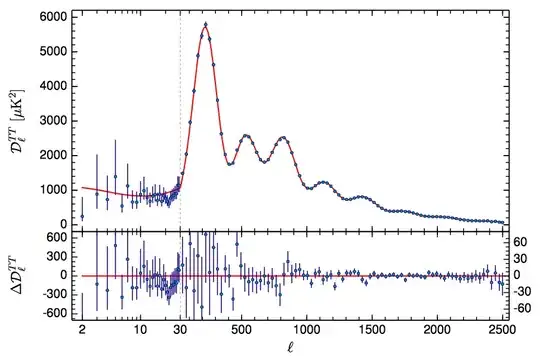
Bonus - reproduction of the graph in OP

Simply load the definitions of AxisBreaks and MapLog and run below code to get

specs = {{2, 30, 2, "Log"}, {30, 2500, 4}};
dg = AxisBreaks[specs, Output -> "Direct"];
ig = AxisBreaks[specs, Output -> "Inverse"];
makeTicks[func_, major_List, 
   minor_List: {}] := ({func@#, ToString@#, {0.02, 0}, {}} & /@ 
     major)~Join~({func@#, "", {0.01, 0}, {}} & /@ minor);
major = {2, 10, 30}~Join~Range[500, 2500, 500];
minor = Range[3, 9]~Join~{20}~Join~Range[100, 2400, 100];
ticks = makeTicks[dg, major, minor];
func[x_] := 
 Total@Thread[((#2 #3 x^2)/(#3^2 x^2 + (-x^2 + #1^2)^2) &)
     [{2, 250, 600, 800, 1500}, {2, 100, 40, 40, 40}, {30, 200, 200, 200, 1000}]]
 Plot[10^4 func[ig[x]], {x, dg[2], dg[2500]}, FrameStyle -> Thick, 
 ImageSize -> 600, BaseStyle -> 16, Frame -> True, 
 FrameTicks -> {ticks, Automatic}, 
 Epilog -> {Gray, Dashed, Line[{{dg[30], -200}, {dg[30], 5500}}]}]

Planck data

LLlAMnYP
  • 11,486
  • 26
  • 65
  • similarly you can do ParametricPlot[{inverseg[x], Sin[x]}, {x, 1, 100}, .. (perhaps preferable for readability sake ) – george2079 May 04 '15 at 20:34
  • Also true, but the salt and pepper lies in modifying the ticks. But you're right, that that way you can actually specify the true range for x. Similarly, for plot there's always the option of {x, inverseg[1], inverseg[100]} – LLlAMnYP May 04 '15 at 20:37
  • Okay. So, in order to understand what you are doing here, I am trying to generalize this to the case where I want my plot range to go from a to c, switching from logarithmic to linear at an intermediate value b. (In your example, a=1, b=10, and c=100.) I have successfully rewritten the first part: g[x_] := Piecewise[{{10^x, Log10[a] <= x < Log10[b]}, {Rescale[x, {Log10[b], Log10[c]}, {b, c}], x >= Log10[b]}}] and inverseg[x_] := Piecewise[{{Log10[x], a <= x < b}, {Rescale[x, {b, c}, {Log10[b], Log10[c]}], x >= Log10[b]}}]. But I don't know what's going on in the ticks = line. – thecommexokid May 04 '15 at 20:48
  • (Your second option—I don't have the CustomTicks package on hand.) – thecommexokid May 04 '15 at 20:48
  • 2
    Well, if everything's properly defined, you simply need to adjust the Range[...] properly. In my example I figured I want a major tick in steps of 2 at the log-scale part and in steps of 20 at the linear scale part and the x-values there were ranging from 1 to 10 and 10 to 100, respectively. So I wrote Range[2,10,2] and Range[20,100,20]. You want something along the lines of Range[a,b,stepsize1] and Range[b,c,stepsize2], then fine-tune according to your plot. – LLlAMnYP May 04 '15 at 20:52
  • What is the {0.01, 0} part doing? – thecommexokid May 04 '15 at 20:53
  • 2
    These are tick length specifications. I'd refer you to the documentation for Ticks which explains in detail, how ticks are specified and such. If you're comfortable with shorthand notations in Mathematica, such as &/@ which I used a lot of, then after studying the docs for the Ticks option you should have no problem understanding what's going on in my ticks = ... assignment. – LLlAMnYP May 04 '15 at 20:55
  • 1
    Happy 1K rep! :D – Michael E2 May 05 '15 at 01:11
  • Thanks! It feels undeserved, in lieu of an update the Wizard's answer is so much cleaner :-) – LLlAMnYP May 05 '15 at 01:13
  • 1K is based on a lot more than a single answer. Besides we've all received undeserved upvotes. It's part of the SE model. ;P Also, see this: http://meta.mathematica.stackexchange.com/questions/987/im-getting-close-to-5000-points-on-mathematica-stack-exchange/ – Michael E2 May 05 '15 at 02:25
  • 1
    As promised, the updated and improved code in the edit. – LLlAMnYP May 05 '15 at 10:06
  • 3
    And I threw in an attempt to reproduce your plot. I'm almost certain you can get arbitrarily close, as that plot looks like it's also been made in Mathematica. – LLlAMnYP May 05 '15 at 14:31
  • Wow, you leave things unattended for a few hours and they just spiral out of control! Thanks for all the additional work. Not particularly related to the topic at hand, but I'm very curious regarding the process by which you constructed func in your attempt to reproduce my plot. – thecommexokid May 05 '15 at 18:35
  • 3
    func is simply a sum of five lorentzians - terms with the following dependence on frequency: Im[f/(f0^2-f^2-I g f)]. As this seems to be a spectrum of some sort, I figured it's an appropriate term. I constructed a pure function for the above expression and threaded it over a list of 5 frequencies (for the peak position), 5 amplitudes, 5 widths (that's the g). Apologies though, the func in my code has only 3 lorentzians, but the plot was generated with 5. Will update in a moment. – LLlAMnYP May 05 '15 at 18:42
  • 1
    Wonderful answer. I won't be disappointed if I lose the Accept to this. :-) – Mr.Wizard May 06 '15 at 00:51
  • I feel bad that I can't upvote more than once. This looks all fantastic! – J. M.'s missing motivation May 06 '15 at 01:00
  • Thanks, I really appreciate the positive response. There is just one thing I still can't fully automate and it is the generation of "nice" tick positions, which I have so far done manually in every example. In my own package it is partially automated with some help from CustomTicks (and as it it's an external package, I didn't include code for it here), but it works properly only for the linear sections and can cause ugliness where two intervals meet. – LLlAMnYP May 06 '15 at 08:52
  • Your update is of course amazing, but thanks also for your initial response, which was highly pedagogical and which in some ways I like even better for its straightforwardness. (Of course, I say that, but you can still be sure the code I'm actually using right now is the update!) – thecommexokid May 06 '15 at 17:02
  • Thanks for the accept! For sure, I decided to keep the initial response up at the top, as it really is the underlying explanation of how this is done (or rather, how my approach works). – LLlAMnYP May 06 '15 at 17:05
21

If you are comfortable using undocumented and unsupported functionality we can do this with a ScalingFunctions option as I did for ListLogLinearPlot for the whole real numbers.

(* listability *)
(self :    fn[off_, scale_])[x_List] := self /@ x
(self : invfn[off_, scale_])[x_List] := self /@ x

fn[off_, scale_][x_?NumericQ] :=
  If[x < off, Log[x], x/scale + (Log[off] - off/scale)]

invfn[off_, scale_][x_?NumericQ] := 
  If[x < Log[off], Exp[x], off + x scale - scale Log[off]]

splitlog[n_, scale_: 10] := {fn[n, scale], invfn[n, scale]}

To use it:

Plot[Sin[15/x], {x, 1, 50},
 PlotRange -> All,
 ScalingFunctions -> {splitlog[9], None},
 GridLines -> {{9}}
]

enter image description here

The first parameter is the x point at which to switch from log to linear. The second (optional) parameter of splitlog controls relative scale of the two halves of the plot:

Table[
  Plot[Sin[15/x], {x, 1, 50},
    PlotRange -> All,
    ScalingFunctions -> {splitlog[point, scale], None},
    GridLines -> {{point}},
    ImageSize -> 180
  ],
  {point, {3, 15, 35}},
  {scale, {2, 10, 30}}
] // GraphicsGrid

enter image description here

Mr.Wizard
  • 271,378
  • 34
  • 587
  • 1,371
  • 3
    That is neat! So what's up with the ticks and labels? M seems to be a bit arbitrary in generating them and it seems to only be dependent on scale – LLlAMnYP May 04 '15 at 23:19
  • 2
    @LLlAMnYP I agree the generation seems a bit random but it is likely a rather complex problem to handle generally. You can use one of the tools from (1742) to peer at the definitions of Charting`ScaledTicks, Charting`FindTicks, Charting`FindLogTicks etc. to see the process. Ultimately manual generation may be needed for the best visual result. – Mr.Wizard May 05 '15 at 00:19
  • Thank you sir, this is pure gold. When I was fiddling around, trying to build custom tick functions, these would always come up in error messages... – LLlAMnYP May 05 '15 at 00:59
  • 1
    In Mathematica 9, I don't see quite the same behavior. In particular, I have to draw the GridLine at Log[9] rather than just 9 for it to appear at the place labeled 9 in the plot. – thecommexokid May 05 '15 at 18:24
  • Also, what exactly is the section you labeled (* listability *) doing? In particular, how does it differ from SetAttributes[{fn, invfn}, Listable]? – thecommexokid May 05 '15 at 18:26
  • 3
    @thecommexokid regarding grid line at Log[9] that is indication of further development of this function which is encouraging, but also indication that one cannot expect it to remain unchanged. Because I chose SubValues notation for fn I cannot use Listable itself as that would only thread over off and scale rather than x_List; this is my workaround. – Mr.Wizard May 05 '15 at 23:04