This has really turned into a statistical question, but here are some quick insights Mathematica can provide.
First, let's import the data (from a downloaded copy) and plot their supports (that is, their point locations in $(x,y)$ coordinates):
nk = Import["F:/temp/nk.mtp"];
{y, x, z} = First /@ nk /. nk (* Note the x-y reversal to match the map *);
data = Transpose[{x, y, z}];
ListPlot[Most /@ data]

The sparseness of the points at the right (large $x$ value) and their concentrations at the top and bottom (extreme $y$ values) indicate first, that any interpolation in the middle right will be uncertain; and second, that preliminary re-expressions of the coordinates are likely to help in the analysis. To accomplish this, let's look at their distributions:
TableForm[{Histogram /@ {x, y, z}}]

There are rigorous ways to identify good re-expressions, but experience and a little experimentation suggest a cube root will work well for the first and third variables and a scaled arcsine for the second. The objective is to obtain distributions that are somewhere between uniform and symmetric unimodal:
TableForm[{Histogram /@ {x0 = x^(1/3), y0 = ArcSin[(y - 5.5)/110], z0 = z^(1/3)}}]

That's about as good as we could hope for, absent any indication of what these variables mean or what their natural ranges might be. From now on, the analyses will be conducted in terms of the re-expressed variables. (The results can always be cast back into the original variables, because all three re-expressions are monotonic, one-to-one transformations.)
With these (conventional, necessary) preliminaries out of the way, let's start looking at these data in three dimensions. But no contouring yet: we need to see the data.
pointPlot = ListPointPlot3D[Transpose[{x0, y0, z0}],
                ColorFunction -> Function[{x, y, z}, Hue[z, .8, .8]], AxesLabel -> {"x", "y", "z"}]
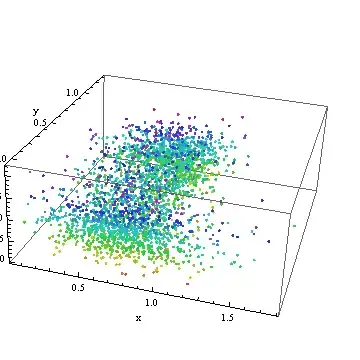
How about that! The contour plot has papered over a truly large and messy scatter of the data.
This plot has been saved for later: it will show up again below.
What we need now is some heavy-duty statistical modeling. One of the best approaches (ultimately) would be a Generalized Additive Model. I don't believe Mathematica is quite at that level, so at this point--just to make a little progress--I dropped the data into R for further analysis:
Export["F:/temp/nk.csv", Transpose[{x0, y0, z0}]];
For the record, in R I used a quick-and-dirty local smoother that acts much like a GAM; here are the commands to get the data in, process them, and write them back out for further work in Mathematica.
data <- read.table("f:/temp/nk.csv", sep=",", col.names=c("x","y","z"))
fit <- loess(z ~ x + y, data=data, span=.25)
write.table(fit$fitted, "f:/temp/fit.csv", row.names=FALSE, col.names=FALSE)
To display more detail, I reduced the default value of span from $0.75$ to $0.25$: this causes the smooth to follow the "local wiggles" in the data more closely. (Usually, one experiments with the amount of smoothing to explore possible patterns in the data; the default is only a start, not a guide.)
Let's get this back into Mathematica and visualize it. Because the smooth is a set of points (with the same support as the original data) intended to represent a continuous surface, a different approach to visualization is appropriate.
fit = Transpose[Import["F:/temp/fit.csv"]] // First;
fitPlot = ListSurfacePlot3D[Transpose[{x0, y0, fit}],
  ColorFunction -> Function[{x, y, z}, Hue[z, .8, .8]],
  MeshStyle -> Opacity[.1], PlotStyle -> Opacity[.8], AxesLabel -> {"x", "y", "z"}]
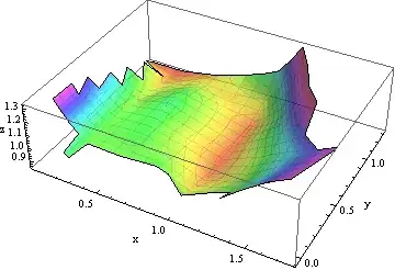
This is one of infinitely many ways to approximate, interpolate, or otherwise model these data. It makes little sense on its own: it needs to be understood in the context of the original points. We saved a plot of them earlier, so let's show the data together with their smooth:
Show[pointPlot, fitPlot]

It is now evident that the apparent rise in $z$ values for larger $x$ is relatively small compared to the scatter of the $z$ values themselves. As we saw at the outset, this rise is not supported by many points at all: it would be prudent to view it as merely suggestive of an actual trend and possibly as a spurious artifact.
There are many directions in which this analysis could now go, but they depend on knowing what these data mean and the purposes of the analysis. Because these are not mentioned in the question (which is probably appropriate, because this site is not devoted to statistical questions), here is a good place to stop. I hope this short introductory tour of some of Mathematica's visualization capabilities has helped with the present question and will help future readers with similar inquiries.
The original Z data is continuous as well.– Dr. belisarius Jul 29 '12 at 21:53