I want to draw the Lemniscate of Bernoulli. Its polar equation is r^2=a^2\cos(2\theta), so it should be quite straightforward to plot. Choosing a=2, I tried with the following
\documentclass{standalone}
\usepackage{pgfplots}
\usepgfplotslibrary{polar}
\pgfplotsset{compat=1.10}
\begin{document}
\begin{tikzpicture}
  \begin{polaraxis}[style=black!10,grid style=black!10,ticklabel style=black!50,enlargelimits=false, xticklabel=$\pgfmathprintnumber{\tick}^\circ$]
    \addplot [thick, red, domain=0:360, samples=100] {2sqrt(cos(2x))};
\end{polaraxis}
\end{tikzpicture}
\end{document}
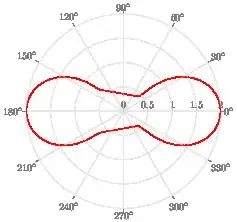
but the result is
which is not nice at all. Moreover, I also get a lot of errors similar to
NOTE: coordinate (1Y2.3272287e2],3Y0.0e0]) has been dropped because it is unbounded (in y). (see also unbounded coords=jump).
I can improve the look of the plot by increasing the samples, but this increases compilation time and the number of errors without ever getting smooth enough.
I don't understand what is going on.
As a workaround, I can get a better looking figure using
\documentclass{standalone}
\usepackage{pgfplots}
\usepgfplotslibrary{polar}
\pgfplotsset{compat=1.10}
\begin{document}
\begin{tikzpicture}
  \begin{polaraxis}[style=black!10,grid style=black!10,ticklabel style=black!50,enlargelimits=false, xticklabel=$\pgfmathprintnumber{\tick}^\circ$]
    \addplot [thick, green, domain=-45:45, samples=100] {2cos(2x)};
    \addplot [thick, green, domain=135:225, samples=100] {2cos(2x)};
\end{polaraxis}
\end{tikzpicture}
\end{document}
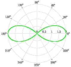
which produces the figure
From a qualitative point of view this is the same, but from the mathematical point of view it is a completely different thing and this is not satisfying.
Note that this figure compiles without errors and is quite smooth even with a small number of samples.


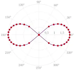
samples=361and you'll have it. – Juan Castaño Jan 11 '22 at 11:21samples=81,smoothlooks also fine. – Stefan Pinnow Jan 11 '22 at 11:31cosof 90° to 270° is negative and the square route of a negative number is not defined (except in a complex plane) ... – Stefan Pinnow Jan 11 '22 at 11:41domain=-45:45and the second withdomain=135:225, then it compiles without errors. Is there a way to have a unique line (i.e., a domain which is the union of the two domains)? – brad Jan 11 '22 at 11:55\addplot [thick, red, domain=-45:45, samples=100] {2*sqrt(cos(2*x))};then the figure is always smooth regardless of the samples number (provided they are enough...) – brad Jan 11 '22 at 11:57samples at={-45,-40,-35,...,45,135,140,...,225}instead ofdomain/samples. But to always get a smooth curve, you should add the optionsmoothas well. – Stefan Pinnow Jan 11 '22 at 12:09\addplot+(instead of\addplot) for debugging, i.e. to see where the samples are. From that you get a good idea what might be "wrong"/can be improved. When the plot is finished, you can remove the markers (again), if you don't need them. That would have helped you to find out why your first image looks that "distorted". – Stefan Pinnow Jan 11 '22 at 12:13