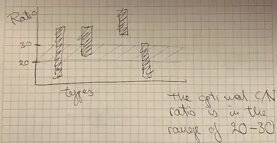
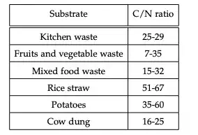
so I would like to plot a bar plot of the values indicated in the table, I just don't know how to do it. I have an optimal range that I would like to highlight (20-30) and show with bars which of the substrates are within, above and below the optimal range. I'm adding the table and a sketch for reference, hope somebody can help me out, thank you!

Asked
Active
Viewed 334 times
0
Stefan Pinnow
- 29,535
Gerda
- 19
-
1Please clarify your specific problem or provide additional details to highlight exactly what you need. As it's currently written, it's hard to tell exactly what you're asking. – Community Mar 17 '22 at 09:26
-
This is a similar concept: https://tex.stackexchange.com/a/147024/586 It has horizontal bars instead of vertical ones, so one has to swap x and y throughout. – Torbjørn T. Mar 17 '22 at 16:45
1 Answers
0
Making bar plot is not that difficult and it requires Tikz library usage. Here is the guide of how to make this: https://www.overleaf.com/learn/latex/Pgfplots_package#Plotting_mathematical_expressions So, you need to use these packages:
\documentclass{article}
\usepackage[margin=0.25in]{geometry}
\usepackage{pgfplots}
\pgfplotsset{width=10cm,compat=1.9}
% We will externalize the figures
\usepgfplotslibrary{external}
\tikzexternalize
at the top of your code listing and your plot data inside the the \begin{tikzpicture} \end{tikzpicture} environment to start making your plot
like described in the example in overleaf help that I gave reference of:
\begin{axis}[
    x tick label style={
        /pgf/number format/1000 sep=},
    ylabel=Year,
    enlargelimits=0.05,
    legend style={at={(0.5,-0.1)},
    anchor=north,legend columns=-1},
    ybar interval=0.7,
]
\addplot
    coordinates {(2012,408184) (2011,408348)
         (2010,414870) (2009,412156)};
\addplot
    coordinates {(2012,388950) (2011,393007)
        (2010,398449) (2009,395972)};
\legend{Men,Women}
\end{axis}
So, insted of men &women you'll write types and insted of year you'll write ratio
Programmer1988
- 129
-
1If I may nitpick a bit :) Strictly speaking, TikZ isn't required to make bar plots, there are other options. And you're using
pgfplots, which is not the same as TikZ, though it does use it. And the externalization isn't needed. Finally though, this doesn't actually answer the question as I understand it. The OP wants a bar that goes from a to b, your example has bars that start at zero. – Torbjørn T. Mar 17 '22 at 16:42 -
Exactly, this does not answer the question. I know how to make usual bar plots. I do not know how to make a bar plot with bars going from a to b while highlighting certain range which was from 20-30. – Gerda Mar 17 '22 at 17:14
-
1@Gerda oh...sure, may you provide your code it'll be easier for community to work with it – Programmer1988 Mar 18 '22 at 06:49
