2

Here is my code:

\begin{tikzpicture} 
    [
        scale=1.05,
        declare function=
        {
            funcc(\x)=
            %(\x<-0.6) * (\x)+
            (\x<-0.6) * (0.7285067873303168+2.058823529411765*\x+2.1606334841628962*\x^2 + 0.7918552036199096*\x^3)+
            and(\x>=-0.6,\x<-0.4) * (1.1411764705882352+ 4.294117647058823*\x + 6.029411764705881*\x^2 + 
            2.941176470588235*\x^3)+
            and(\x>=-0.4,\x < -0.2) * (0.5*(2 + 6*\x + 5*\x^2))+
            and(\x>=-0.2,\x <0) * (1 +1*\x - 12.5*\x^2 - 25*\x^3)+
            and(\x>=0,\x <0.2) * (1 - 1*\x - 12.5*\x^2 +25*\x^3)+
            add(\x>=0.2,\x < 0.4) * (0.5*(2 - 6*\x + 5*\x^2))+
            and(\x>=0.4 ,\x<0.6) * (1.14118 - 4.29412*\x + 6.02941*\x^2 - 2.94118*\x^3) +
            %(\x>=0.6) * (\x^3);
            (\x>=0.6) * (0.728507 - 2.05882*\x + 2.16063*\x^2 - 0.791855*\x^3);
        },
    ]
\begin{axis}
    [
    title = {},%\quad The distribution of the points and the line of regression},
    axis lines = middle,
    legend pos=outer north east,
    xlabel={$x$},
    ylabel={$y$},
    xmin=-2, xmax=2,
    ymin=-2, ymax=2,
    ]
    \addplot%S 10
    [
    domain = -1:1,
    legend pos=outer north east,
    color=yellow,
    samples = 1000
    ]
    {
        (\x<-0.6) * (0.7285067873303168+2.058823529411765*\x+2.1606334841628962*\x^2 + 0.7918552036199096*\x^3)+
            and(\x>=-0.6,\x<-0.4) * (1.1411764705882352+ 4.294117647058823*\x + 6.029411764705881*\x^2 + 
            2.941176470588235*\x^3)+
            and(\x>=-0.4,\x < -0.2) * (0.5*(2 + 6*\x + 5*\x^2))+
            and(\x>=-0.2,\x <0) * (1 +1*\x - 12.5*\x^2 - 25*\x^3)+
            and(\x>=0,\x <0.2) * (1 - 1*\x - 12.5*\x^2 +25*\x^3)+
            add(\x>=0.2,\x < 0.4) * (0.5*(2 - 6*\x + 5*\x^2))+
            and(\x>=0.4 ,\x<0.6) * (1.14118 - 4.29412*\x + 6.02941*\x^2 - 2.94118*\x^3) +
            %(\x>=0.6) * (\x^3);
            (\x>=0.6) * (0.728507 - 2.05882*\x + 2.16063*\x^2 - 0.791855*\x^3)
    };
\addplot %N 10
[
domain = -1:1,
legend pos=outer north east,
color=green,
samples = 1000
]
{
    -220.942*x^10+494.91*x^8-381.434*x^6+123.36*x^4-16.8552*x^2+1.
};
\addplot %N_{5}
[
domain = -1:1,
legend pos=outer north east,
color=blue,
samples = 1000
]
{
    1.20192*x^4-1.73077*x^2+0.567308
};
%\addlegendentry{$N_{5}(x)$}
\addplot %f(x)
[
domain = -1:1,
legend pos=outer north east,
color=red,
samples = 1000
]
{
    1 /(1+25*x^2)
};
%\addlegendentry{$f(x) = \frac{1}{1+25x^{2}}$}
\legend{$S_{10}(x)$,$N_{10}(x)$,$N_{5}(x)$,$f(x) = \frac{1}{1+25x^{2}}$};
\end{axis}

\end{tikzpicture}

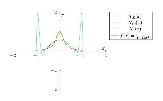
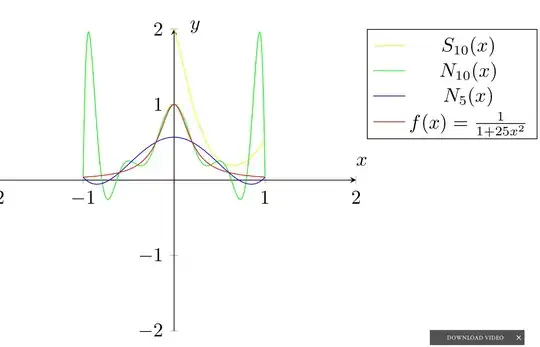
The result is below :

enter image description here

The yellow line should be nearly equal to the red line, but the difference is too big.

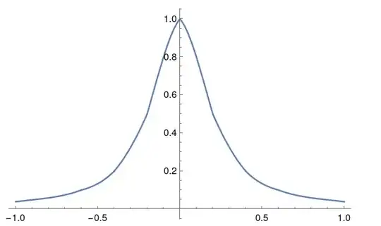
The correct result of the yellow line I got from Mathematica is below:

enter image description here

I can't find my mistake anyway so I think that the problem is from pdgplots itself.By the way, I had taken about a night to fix my code, but it seems to be all right.
Henri Menke
  • 109,596
  • Try using Lua as the calculation engine for improved accuracy: follow the guide in https://tex.stackexchange.com/questions/611573/pgfplots-strange-bump-in-tanh-function/611646#611646 – user202729 Apr 10 '22 at 17:34
  • 2
    Welcome to TeX.SX! Please make your code compilable (if possible), or at least complete it with \documentclass{...}, the required \usepackage's, \begin{document}, and \end{document}. That may seem tedious to you, but think of the extra work it represents for TeX.SX users willing to give you a hand. Help them help you: remove that one hurdle between you and a solution to your problem. – hpekristiansen Apr 10 '22 at 17:35
  • 1
  • 4
    Please change the title to something more neutral. Most probably, you did not find a bug, but is doing something wrong or you meat the limits of LaTeX/PGFPlots. – hpekristiansen Apr 10 '22 at 17:36
  • Well there is a bug somewhere, and one could argue that the question allows for the possibility that the bug is in the posted code. But I do agree, the title is, at least, not very clear. – David Z Apr 11 '22 at 01:46

1 Answers1

7

Changing all add to and gives:

\documentclass[border=1cm]{standalone}
\usepackage{pgfplots}
\pgfplotsset{compat=1.18}
\begin{document}
\begin{tikzpicture} 
    [
        scale=1.05,
        declare function=
        {
            funcc(\x)=
            %(\x<-0.6) * (\x)+
            (\x<-0.6) * (0.7285067873303168+2.058823529411765*\x+2.1606334841628962*\x^2 + 0.7918552036199096*\x^3)+
            and(\x>=-0.6,\x<-0.4) * (1.1411764705882352+ 4.294117647058823*\x + 6.029411764705881*\x^2 + 
            2.941176470588235*\x^3)+
            and(\x>=-0.4,\x < -0.2) * (0.5*(2 + 6*\x + 5*\x^2))+
            and(\x>=-0.2,\x <0) * (1 +1*\x - 12.5*\x^2 - 25*\x^3)+
            and(\x>=0,\x <0.2) * (1 - 1*\x - 12.5*\x^2 +25*\x^3)+
            and(\x>=0.2,\x < 0.4) * (0.5*(2 - 6*\x + 5*\x^2))+
            and(\x>=0.4 ,\x<0.6) * (1.14118 - 4.29412*\x + 6.02941*\x^2 - 2.94118*\x^3) +
            %(\x>=0.6) * (\x^3);
            (\x>=0.6) * (0.728507 - 2.05882*\x + 2.16063*\x^2 - 0.791855*\x^3);
        },
    ]
\begin{axis}
    [
    title = {},%\quad The distribution of the points and the line of regression},
    axis lines = middle,
    legend pos=outer north east,
    xlabel={$x$},
    ylabel={$y$},
    xmin=-2, xmax=2,
    ymin=-2, ymax=2,
    ]
    \addplot%S 10
    [
    domain = -1:1,
    legend pos=outer north east,
    color=yellow,
    samples = 100
    ]
    {
        (\x<-0.6) * (0.7285067873303168+2.058823529411765*\x+2.1606334841628962*\x^2 + 0.7918552036199096*\x^3)+
            and(\x>=-0.6,\x<-0.4) * (1.1411764705882352+ 4.294117647058823*\x + 6.029411764705881*\x^2 + 
            2.941176470588235*\x^3)+
            and(\x>=-0.4,\x < -0.2) * (0.5*(2 + 6*\x + 5*\x^2))+
            and(\x>=-0.2,\x <0) * (1 +1*\x - 12.5*\x^2 - 25*\x^3)+
            and(\x>=0,\x <0.2) * (1 - 1*\x - 12.5*\x^2 +25*\x^3)+
            and(\x>=0.2,\x < 0.4) * (0.5*(2 - 6*\x + 5*\x^2))+
            and(\x>=0.4 ,\x<0.6) * (1.14118 - 4.29412*\x + 6.02941*\x^2 - 2.94118*\x^3) +
            %(\x>=0.6) * (\x^3);
            (\x>=0.6) * (0.728507 - 2.05882*\x + 2.16063*\x^2 - 0.791855*\x^3)
    };
\addplot %N 10
[
domain = -1:1,
legend pos=outer north east,
color=green,
samples = 100
]
{
    -220.942*x^10+494.91*x^8-381.434*x^6+123.36*x^4-16.8552*x^2+1.
};
\addplot %N_{5}
[
domain = -1:1,
legend pos=outer north east,
color=blue,
samples = 100
]
{
    1.20192*x^4-1.73077*x^2+0.567308
};
%\addlegendentry{$N_{5}(x)$}
\addplot %f(x)
[
domain = -1:1,
legend pos=outer north east,
color=red,
samples = 100
]
{
    1 /(1+25*x^2)
};
%\addlegendentry{$f(x) = \frac{1}{1+25x^{2}}$}
\legend{$S_{10}(x)$,$N_{10}(x)$,$N_{5}(x)$,$f(x) = \frac{1}{1+25x^{2}}$};
\end{axis}

\end{tikzpicture}
\end{document}

Several plots

Where yellow plot is near red plot. Obviously, I do not know what you try to do, but it seems more likely that you made this mistake than this is due to a bug.