3

I am plotting a fairly simple function over a specific range. The function is just f(x) = 0.12 * sqrt(x). Here's my gnuplot "code" so far:

set border linewidth 1.5
set style line 1 linecolor rgb '#0060ad' linetype 1 linewidth 2

set xrange [0:12000] set yrange [0:13] set xlabel 'Hours' offset 0,0.5 set ylabel 'Level' offset 1,0 set ytics 1 set xtics 2000 set tics scale 0.75 set key bottom right set grid

f(x) = 0.12 * sqrt(x)

set terminal svg size 1920,1080 font 'Fira Code Nerd Font Mono,20' set output 'sqrt.svg' plot f(x) title 'Example Function' with lines linestyle 1

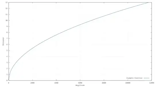
If you take a look at the svg (or even just use the default qt output) the function is a straight line from 0 to about 200 on the x-axis (look in the very bottom-left of the plot), even though this function is not a straight line. This causes some points I am adding to be offset in that area, requiring me to just manually change the data to get them to look right.

Version:

$ gnuplot --version
gnuplot 5.4 patchlevel 3

I have no idea why it's doing this, and especially why it's only doing it for small values of x.

Here's the image I'm getting, just in case someone else can't reproduce it (I've converted the svg to png and added a background layer, but the plot itself isn't different in the svg):
Plot

Aurelius
  • 133
  • 1
    Welcome to TeX.SE! – Mensch Apr 18 '22 at 07:50
  • @Mensch thanks :) I'm on quite a few other SEs, but despite the fact I use LaTeX and gnuplot quite a bit, never had to come here before! – Aurelius Apr 18 '22 at 07:54
  • 2
    Can't test now but I'd say sample size. – campa Apr 18 '22 at 07:59
  • I feel like the MWE before the edit gave a better inside. You might want to undo your changes. – Hoerbii3 Apr 18 '22 at 08:28
  • 3
    Because there's no (La)TeX connection here, I think this is actually off topic. That said, I also suspect that @campa is correct. The documentation says the number of samples defaults to 100, so I guess Gnuplot takes 100 equally spaced points in the given domain, and connects the function values at those points with straight lines. – Torbjørn T. Apr 18 '22 at 08:31
  • @TorbjørnT.there's a gnuplot topic here -- if it's off-topic here where should it go? – Aurelius Apr 18 '22 at 09:21
  • The fact that there is is a Gnuplot tag here, doesn't mean all Gnuplot questions are on-topic :) We also have tags about Mac OS and Matlab for example, but there has to be a connection to TeX. I honestly don't know which SE-site is most appropriate. My first guess would be [so], but I haven't checked. – Torbjørn T. Apr 19 '22 at 05:32

2 Answers2

3

This is a different application, but the same problem as Weird looking square root on pgfplots.

The sqrt(x) function has a vertical tangent at 0, showing a discontinuity when you sample it with equally spaced x steps. You can have a better approximation (unless you zoom in) by setting, for example, set samples 1000 (default is 100, show samples will tell you).

Unfortunately, in Gnuplot you can't apply smooth to function plotting, for what I know, so that is not a solution. In pgfplots you can get away with spline smoothing, which does almost the right thing.

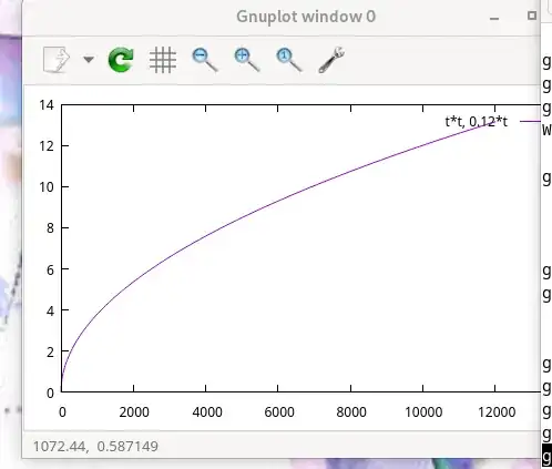
Or plotting it parametrically so that you have equally spaced y steps, as in, for example

gnuplot> set parametric
gnuplot> set trange[0:sqrt(12000)]
gnuplot> plot t*t, 0.12*t

parametric plot with default samples

Rmano
  • 40,848
  • 3
  • 64
  • 125
  • Boom! Setting samples to 10000 made a beautiful curve. I didn't even know about that option in gnuplot! Cheers :) – Aurelius Apr 18 '22 at 09:24
  • You're welcome! But notice that setting the samples to 10k will result in an awfully big and slow svg/eps/pdf... the parametric approach above is much better unless you save it in a bitmap format. – Rmano Apr 18 '22 at 16:16
  • 1
    eh, it doesn't seem to cause any difference on my machine, and it gets converted to png anyway. – Aurelius Apr 18 '22 at 18:14
1

Like @campa said, my guess would also be sample size, especially at the start (0...1000 or so). The Computer can only calculate discrete values and interpolate the rest, hence the straight line. So this would effect the start (the point with the highest changes) the most.
You could test it by manually increasing the resolution of the first x values.
Before your edit on the post, you showed us not only the xrange but also the samples for x, which is a critical part. With both values you can calculate the distance between the points and calculate the first x value after 0. Comparing this one to your graph will show you if the sample size is the problem.

Hoerbii3
  • 148