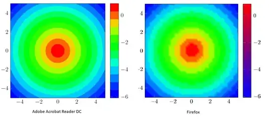
I figured out, that only using Adobe Acrobat Reader I get a proper result for the code below. In other viewers, the result looks washed out, the colorbar has a wrong colorcode and the value of samples does not have an influence. Is there a way to fix this? Here, it was reported that in free viewers some features are missing, citing the PGFPlots manual: Filled contour plot from data set
Code for reproduction:
\documentclass{article}
\usepackage{pgfplots}
\pgfplotsset{compat=newest}
\newcommand\paraviewRainbowColormap{
colormap={paraview}{   rgb=(0,0,1)
                       rgb=(0,0.168,1)
                       rgb=(0,0.431373,1)
                       rgb=(0,0.733333,1)
                       rgb=(0,1,0.933333)
                       rgb=(0,1,0.54902)
                       rgb=(0,1,0.137255)
                       rgb=(0,1,0)
                       rgb=(0.282353,1,0)
                       rgb=(0.74902,1,0)
                       rgb=(1,0.784314,0)
                       rgb=(1,0.34902,0)
                       rgb=(1,0,0)
                   }
}
\begin{document}
\begin{tikzpicture}
    \begin{axis}[
        view={0}{90},
        unit vector ratio*=1 1 1,
        colorbar,
        \paraviewRainbowColormap,
        samples=50,
        ]
        \addplot3[contour filled={number=12}] {1-sqrt((x^2+y^2))};
    \end{axis}
\end{tikzpicture}
\end{document}
Result:
