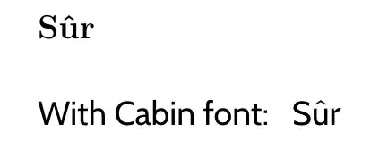
With certain fonts (e.g., Cabin), I have noticed a difference in the relative positioning of certain accent marks---to the point where sometimes, it seems to me that an adjustment is in order.
Consider, for instance, the circumflex accent (^) in the following MWE:
\documentclass[12pt]{article}
\usepackage{cabin}
\begin{document}
\thispagestyle{empty}
\Huge
\textbf{S^ur}
\vspace*{35pt}
\cabin
With Cabin font: , S^ur
\end{document}
which produces
QUESTION: How may I adjust the height of the said accent mark so that (in this case) it appears closer to the associated letter? I am retyping an Introduction to a book in which the circumflex accent appears very close to the letter in the French component of the Introduction. Is there a general way to accomplish this height adjustment? Otherwise, is there a way to modify the height of the accent when using the Cabin font? Thank you.

LuaLaTeX) you could writeSûrdirectly, and the (accented) character in your document would be exactly what the font designer intended. – Ingmar May 26 '22 at 20:32