3

So i have a scatter diagram and generated a regression line. There are some outliner that heavily influence that line. I would like them to be ignored for the calculation of the linear regression. It should be done based on their Y values.

There is already a similar question. But the answer there is to skip the first few X values. Unfortunately that is not what I need.

So that is my current code:

\documentclass{article}
\usepackage{pgfplots}
\pgfplotsset{compat=1.18}
\usepackage{pgfplotstable}

\begin{document} \begin{tikzpicture} \begin{axis}[scatter/classes={a={mark=*,draw=black}}] \pgfplotstableread{ a b 0 0.5 1 48 2 1.4 3 37 4 3.4 5 6.8 6 4.5 7 3.9 8 10 9 13 }\datatable

        \addplot[scatter, only marks, scatter src=explicit symbolic]
        table[
            x=a,
            y=b,
        ] {\datatable};

        \addplot[
            thick,
            %% y filter/.expression={y<35 ? y : nan},
        ]
        table [
            x = a,
            %% y expr = {(\thisrow{b} > 35 ? nan : \thisrow{b} )},
            y = {create col/linear regression={y=b}},
        ] {\datatable};
    \end{axis}
\end{tikzpicture}

\end{document}

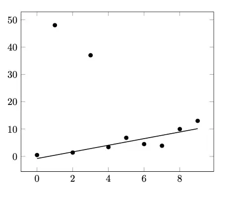
That code generates into this:

enter image description here

I already tried the y filter and y expr, but that doesn't really work.

I also thought about split the outliner into a several file. But as my real graph has 4 regression lines and I would end up having ~8 files. That doesn't seem practical for me.

So my question: How can I ignore Y values over 30 for the calculation of the linear regression?
Marcel
  • 31
  • Welcome to SE. Always provide a Minimal Working Example so that people can copy-paste it, test it and suggest modifications. Thank you. – Miyase Jun 29 '22 at 14:35
  • Sorry, I forgot about begin/end document. I thought that is already an MWE, but your right. Thank you! – Marcel Jun 29 '22 at 14:56
  • You could split the dataset: one contains regular data, which you do fit, the other one has the outliers, which you plot. You can do this manually inline or via external files. – MS-SPO Jun 29 '22 at 15:26

1 Answers1

1

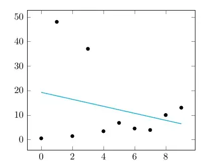
You do not wish to filter the output coordinates of your line. I do know if there is a better way, but one way is to set the variance of the unwanted points high(the default value is 1 and 1000 will mean that they are almost not used) like this:

\documentclass{article}
\usepackage{pgfplots}
\pgfplotsset{compat=1.18}
\usepackage{pgfplotstable}

\begin{document} \begin{tikzpicture} \begin{axis}[scatter/classes={a={mark=*,draw=black}}] \pgfplotstableread{ a b 0 0.5 1 48 2 1.4 3 37 4 3.4 5 6.8 6 4.5 7 3.9 8 10 9 13 }\datatable

        \addplot[scatter, only marks, scatter src=explicit symbolic]
        table[
            x=a,
            y=b,
        ] {\datatable};

        \addplot[
            thick,
        ]
        table [
            x = a,
            y = {create col/linear regression={y=b, variance={create col/expr={\thisrow{b}<30?1:1000}}}},
        ] {\datatable};
    \end{axis}
\end{tikzpicture}

\end{document}

Graph with outliers and linear fit

  • Scientifically, this looks highly dodgy/dubious. – Aubrey Blumsohn Jun 30 '22 at 21:23
  • @AubreyBlumsohn: No it does not. There can and will be objective reasons to consider specific data points outliers and not to include them in any analysis. Anyway this site is not about good/bad science - it is about LaTeX and friends. – hpekristiansen Jun 30 '22 at 22:01