1

From https://tex.stackexchange.com/a/659813/127048 ; I have been recommended to use newtx

If you use IEEEtran, I recommend using newtx in order to get Times font also in math

When I add \usepackage{newtx} into following template (2n line) the font format changes for the text inside \section{*} and \subsection{*} also for \lstinputlisting[] , it becomes much bolder. I am not sure those changes would be accepted by the corresponding journal.

Is it possible to prevent newtx to change font format for the \section{} and \subsection{}?

Template Link: https://ieeecs-media.computer.org/assets/tar/ieeetran-final_sub.tar ; comments removed version:

\documentclass[10pt,journal,compsoc]{IEEEtran}
\begin{document}
\title{Bare Demo of IEEEtran.cls for\\ IEEE Computer Society Journals}
\author{alper}
\markboth{Journal of \LaTeX\ Class Files,~Vol.~14, No.~8, August~2015}%
{Shell \MakeLowercase{\textit{et al.}}: Bare Demo of IEEEtran.cls for Computer Society Journals}
\IEEEtitleabstractindextext{%
\begin{abstract}
The abstract goes here.
\end{abstract}
\begin{IEEEkeywords}
Computer Society, IEEE, IEEEtran, journal, \LaTeX, paper, template.
\end{IEEEkeywords}}
\maketitle
\IEEEdisplaynontitleabstractindextext
\IEEEpeerreviewmaketitle
\IEEEraisesectionheading{\section{Introduction}\label{sec:introduction}}
\IEEEPARstart{T}{his} demo file is intended to serve as a ``starter file''
for IEEE Computer Society journal papers produced under \LaTeX\ using
IEEEtran.cls version 1.8b and later.
I wish you the best of success.
\hfill mds
\hfill August 26, 2015
\subsection{Subsection Heading Here}
Subsection text here.
\subsubsection{Subsubsection Heading Here}
Subsubsection text here.
\section{Conclusion}
The conclusion goes here.
\appendices
\section{Proof of the First Zonklar Equation}
Appendix one text goes here.
\section{}
Appendix two text goes here.
\ifCLASSOPTIONcompsoc
  \section*{Acknowledgments}
\else
  \section*{Acknowledgment}
\fi
The authors would like to thank...
\ifCLASSOPTIONcaptionsoff
  \newpage
\fi
\begin{thebibliography}{1}
\bibitem{IEEEhowto:kopka}
H.~Kopka and P.~W. Daly, \emph{A Guide to \LaTeX}, 3rd~ed.\hskip 1em plus
  0.5em minus 0.4em\relax Harlow, England: Addison-Wesley, 1999.
\end{thebibliography}
\end{document}
alper
  • 1,389
  • 2
    newtx (better to use \usepackage{newtxtext,ewtxmath} changes the font for the entire document from computer modern to a Times clone, not just headings. It does not change the heading code at all. Times is darker than Computer Modern, if you don't want that don't use the font – David Carlisle Sep 29 '22 at 11:21
  • sorry missing n should be newtxmath – David Carlisle Sep 29 '22 at 11:44
  • Is it recommended only to use \usepackage{newtxmath}? to keep the changes only for the math-mode text? – alper Sep 29 '22 at 11:58
  • You get a true smallcaps font, instead of the faked one, where smallcaps are too thin and don't blend with capital letters. – egreg Sep 29 '22 at 12:20
  • @egreg Is it possible to prevent this behavior for the capital letters? or have better style for the capital letters. I got lost what should I do at this point.. – alper Sep 29 '22 at 12:25
  • @alper What behavior? I cannot understand. With newtx you get a better output. – egreg Sep 29 '22 at 12:58

1 Answers1

1

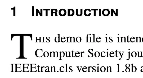
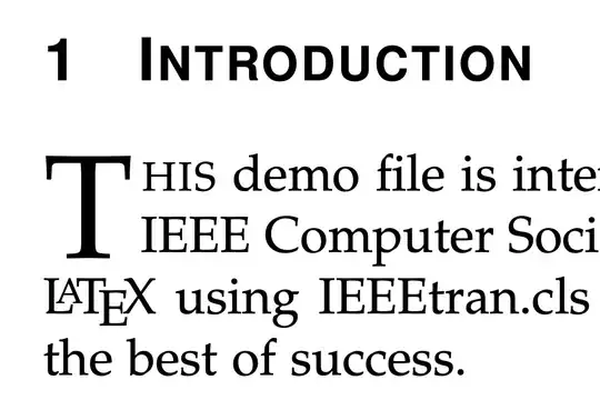
Compare what you get from IEEEtran without and with newtx.

without newtx

with newtx

You can clearly see that the in the top image the smallcaps letters are obtained by scaling uppercase, which makes the vertical strokes thinner than in capital letters. This doesn't happen in the bottom picture, where a true smallcaps font is used and you can see that the vertical strokes have the same width.

The same for the smallcaps near the dropcap letter.

Anyway, if you prefer the inferior output, just do

\usepackage{newtxmath}

that will only make math compatible with Times and fix the unsightly default behavior of IEEEtran that uses Computer Modern for math, which is visually clashing with Times.

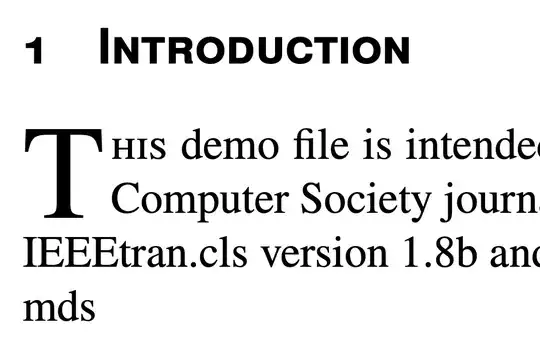
Slightly more complicated is to get lining numbers in the \section headers.

\documentclass[10pt,journal,compsoc]{IEEEtran}
\usepackage{newtx}

\makeatletter % standard way to add commands for printing the section number \renewcommand{@seccntformat}[1]{% % if \numberfont@<level> is defined, use it in a group \ifcsname numberfont@#1\endcsname % if \numberfont@<level> is defined, use it in a group {@nameuse{numberfont@#1}@nameuse{the#1}}% \else % otherwise do the standard @nameuse{the#1}% \fi % add the standard space \quad } \newcommand{\definenumberfont}[2]{% @namedef{numberfont@#1}{#2}% } \makeatother

% we want to add \upshape for the \section level, so the figures are lining \definenumberfont{section}{\upshape}

\begin{document}

\title{Bare Demo of IEEEtran.cls for\ IEEE Computer Society Journals} \author{alper}

\markboth{Journal of \LaTeX\ Class Files,~Vol.~14, No.~8, August~2015}% {Shell \MakeLowercase{\textit{et al.}}: Bare Demo of IEEEtran.cls for Computer Society Journals} \IEEEtitleabstractindextext{%

\begin{abstract} The abstract goes here. \end{abstract}

\begin{IEEEkeywords} Computer Society, IEEE, IEEEtran, journal, \LaTeX, paper, template. \end{IEEEkeywords}}

\maketitle

\IEEEdisplaynontitleabstractindextext \IEEEpeerreviewmaketitle \IEEEraisesectionheading{\section{Introduction}\label{sec:introduction}} \IEEEPARstart{T}{his} demo file is intended to serve as a ``starter file'' for IEEE Computer Society journal papers produced under \LaTeX\ using IEEEtran.cls version 1.8b and later. I wish you the best of success. \hfill mds \hfill August 26, 2015

\subsection{Subsection Heading Here}

Subsection text here. \subsubsection{Subsubsection Heading Here} Subsubsection text here. \section{Conclusion} The conclusion goes here. \appendices \section{Proof of the First Zonklar Equation} Appendix one text goes here. \section{} Appendix two text goes here. \ifCLASSOPTIONcompsoc \section{Acknowledgments} \else \section{Acknowledgment} \fi The authors would like to thank... \ifCLASSOPTIONcaptionsoff \newpage \fi \begin{thebibliography}{1} \bibitem{IEEEhowto:kopka} H.~Kopka and P.~W. Daly, \emph{A Guide to \LaTeX}, 3rd~ed.\hskip 1em plus 0.5em minus 0.4em\relax Harlow, England: Addison-Wesley, 1999. \end{thebibliography} \end{document}
enter image description here

egreg
  • 1,121,712
  • Thanks newtx I get better output; I just wanted to use newtx but keep the output of 1 as shown on the first figure in the second figure (while newtx is used), since 1 gets much smaller – alper Sep 29 '22 at 14:11
  • @alper That's a slightly different problem. I added a possible solution. – egreg Sep 29 '22 at 14:50
  • Thanks I appreciated your added solution. I had a 13 papers of paper and when I use newtx like a magic I get 1 page of free space :-) – alper Sep 29 '22 at 14:54
  • 1
    @alper Yes, NewTX is less space hungry than the standard font used by IEEEtran, particularly if you have math. – egreg Sep 29 '22 at 14:56
  • Thanks you saved my work :-) I was just lost hope to gain more space and with one line I gain 1 page with better style :-) – alper Sep 29 '22 at 15:06