What you have is the correct representation of the graph, so I am not sure what there is to be fixed here...
If you allow the plotting of the axis ticks labels, you can see that your gaussian has values in the [0..1] range and the straight line in the [-5..7+] range (I didn't calculate precisely; remember that the default domain is -5..5). You can limit the domain for everything, but still, the graph will be in scale.
\documentclass[12pt]{article}
\usepackage{tikz}
\usetikzlibrary{arrows.meta}
\usepackage{pgfplots}
\pgfplotsset{compat=1.18}
\pgfmathdeclarefunction{gauss}{2}{%
  \pgfmathparse{1/(#2*sqrt(2*pi))*exp(-((x-#1)^2)/(2*#2^2))}%
}
\begin{document}
\begin{figure}
    \centering
    \begin{tikzpicture}
        \begin{axis}[
            %yticklabels=\empty, xticklabels=\empty,
            width=8cm,
            height=6cm,
            domain=-2:3,
            %xtick=\empty, ytick=\empty,
            clip mode=individual,
            xlabel={$T$}, ylabel={$\Delta T$},
            ]
            \addplot[smooth,red,samples=50]{gauss(1,0.75)};
            \addplot[smooth,blue]{x*1.33 + 1.36};
        \end{axis}
    \end{tikzpicture}
\end{figure}
\end{document}
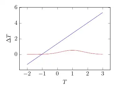
If you want a quantitative (correct) graph and have a better vertical resolution for the bell curve, you can use a different axis for one of them.
The other option, if you want only a qualitative graph, is to scale one of the two, for example, multiply the Gaussian by, say, 8:
\documentclass[12pt]{article}
\usepackage{tikz}
\usetikzlibrary{arrows.meta}
\usepackage{pgfplots}
\pgfplotsset{compat=1.18}
\pgfmathdeclarefunction{gauss}{2}{%
  \pgfmathparse{1/(#2*sqrt(2*pi))*exp(-((x-#1)^2)/(2*#2^2))}%
}
\begin{document}
\begin{figure}
    \centering
    \begin{tikzpicture}
        \begin{axis}[
            yticklabels=\empty, xticklabels=\empty,
            width=8cm,
            height=6cm,
            domain=-2:3,
            xtick=\empty, ytick=\empty,
            clip mode=individual,
            xlabel={$T$}, ylabel={$\Delta T$},
            ]
            \addplot[smooth,red,samples=50]{8 * gauss(1,0.75)};
            \addplot[smooth,blue]{x*1.33 + 1.36};
        \end{axis}
    \end{tikzpicture}
\end{figure}
\end{document}
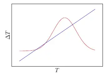
...but pgfplots will show you the actual values of the functions, always.


