1

How can I show the coordinates of the listed points on a Pgfplots log-log diagram?

Also, how can I label each graph given by a table with a different name?

\begin{tikzpicture}
\begin{axis}[
xmode=log, 
ymode=log, 
xlabel=Processors, 
ylabel=Speedup
]

\addplot table { 1 1 2 1.99892449476752 4 3.96674166623464 8 7.88161642065569 16 15.4344468776274 32 12.4017223883252 64 24.0354227021333 };

\addplot table { 1 1 2 1.99804684248206 4 5.34549214847199 8 7.94496112836762 16 15.7551224031058 32 22.774653408508 64 40.4820003069663 };

\addplot table { 1 1 2 2.00359505426647 4 3.87681649751088 8 7.94921166729328 16 15.7830470707627 32 28.9132497101297 64 56.1481274839776 };

\addplot table { 1 1 2 1.99397507855784 4 3.98192544925128 8 7.98048783262623 16 15.8061179993891 32 30.4545364844811 64 59.9506057736665 }; \end{axis} \end{tikzpicture}

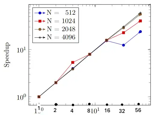
Here is an example on the coordinates marked in the x axis:

enter image description here

Ideally something similar should be achieved in the y axis but I'm not sure if the points are two close it will be difficult to make the difference.
  • 1
    Are you after some version of nodes near coords? As for the labeling, I don't really understand what you mean at all. – Torbjørn T. Nov 02 '22 at 18:35
  • @TorbjørnT. the diagram plots different tables, the idea is put a name to each of the graphs representing these tables. – user1868607 Nov 02 '22 at 19:59
  • @TorbjørnT. nodes near coords seems to show points on the graph, I want the points on the axis themselves – user1868607 Nov 02 '22 at 20:06
  • For the labeling, sounds like you're after a legend. For example add \legend{a,b,c,d} inside the axis environment, and possibly legend pos=north west in the axis options. See manual for details. For the other, perhaps I'm slow, but how exactly do you want this to look? Perhaps a quick sketch made in Paint or similar would help. – Torbjørn T. Nov 02 '22 at 21:55
  • @TorbjørnT. I added an example with the coordinates marked on the x axis. – user1868607 Nov 03 '22 at 08:27

1 Answers1

1

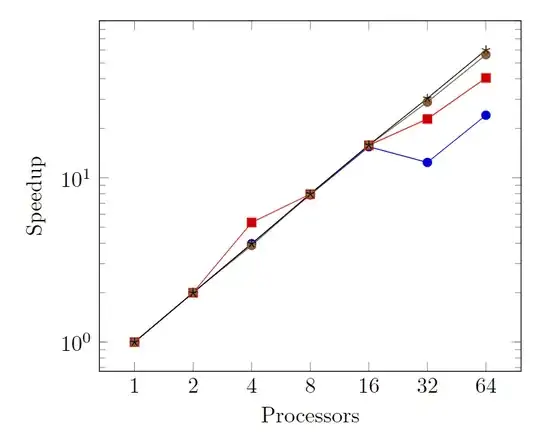
I don't know whether there exists an easier way than that suggested in this nice answer, but using this approach you can do:

\documentclass[border=10pt]{standalone}
\usepackage{pgfplots}
\pgfplotsset{compat=1.18}

\begin{document}

\begin{tikzpicture} \begin{axis}[ xmode=log, ymode=log, xlabel=Processors, ylabel=Speedup, xtick={data}, xticklabel={% \pgfkeys{/pgf/fpu=true}% \pgfmathparse{exp(\tick)}% \pgfmathprintnumber[fixed relative, precision=3]{\pgfmathresult}% \pgfkeys{/pgf/fpu=false}% }, ]

\addplot table { 1 1 2 1.99892449476752 4 3.96674166623464 8 7.88161642065569 16 15.4344468776274 32 12.4017223883252 64 24.0354227021333 };

\addplot table { 1 1 2 1.99804684248206 4 5.34549214847199 8 7.94496112836762 16 15.7551224031058 32 22.774653408508 64 40.4820003069663 };

\addplot table { 1 1 2 2.00359505426647 4 3.87681649751088 8 7.94921166729328 16 15.7830470707627 32 28.9132497101297 64 56.1481274839776 };

\addplot table { 1 1 2 1.99397507855784 4 3.98192544925128 8 7.98048783262623 16 15.8061179993891 32 30.4545364844811 64 59.9506057736665 }; \end{axis} \end{tikzpicture}

\end{document}

enter image description here