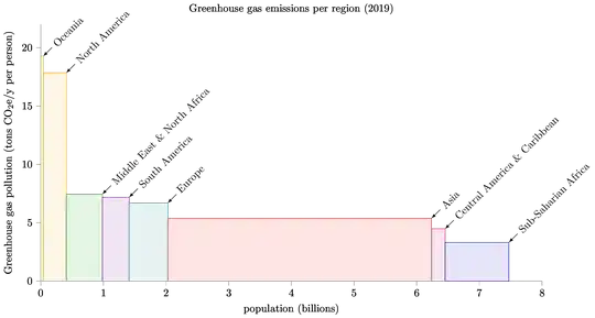
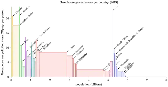
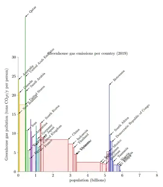
I'd like to use tikz to generate an updated version of figures 10 and 11, from the superb book "Sustainable Energy -- without the hot air" by the late David JC MacKay.
These plots represent the per-capita greenhouse-gas emissions per geographical region (Figure 10) and per country (Figure 11). In the first plot each region is represented as a box whose width is proportional to the population of the region and whose height is the per-capita emissions in that region. The second plot is analogous, except that boxes represent countries instead of regions. All the updated information we need is available in .csv form (year 2019, see code below).
After quite some effort, I managed to generate the first plot (per geographical region):
\documentclass[tikz]{standalone}
\usepackage{pgf,pgfmath,pgfplots}
\usepackage{csvsimple}
\pgfplotsset{compat=1.16}
% Predefined colors per geographical area
\definecolor{oceania}{HTML}{C9C900}
\definecolor{northamerica}{HTML}{FF9900}
\definecolor{europe}{HTML}{008080}
\definecolor{mena}{HTML}{009900}
\definecolor{southamerica}{HTML}{660099}
\definecolor{centralamerica}{HTML}{b2004c}
\definecolor{asia}{HTML}{ff0000}
\definecolor{ssafrica}{HTML}{0000cd}
\def\colorarray{{
    "oceania",
    "northamerica",
    "mena",      % Middle East and North Africa
    "southamerica",
    "europe",
    "asia",
    "centralamerica",
    "ssafrica"    % Sub-Saharian Africa
}}
\begin{document}
% From https://github.com/owid/co2-data
\begin{filecontents}{ghg.csv}
georegion,ghg,population,ghgcapita
Oceania,793.46,0.041140448,19.286615449593548
North America,6545.29,0.366475936,17.86008126874666
Middle East & North Africa,4297.4,0.576254789,7.457465138740912
South America,3068.67,0.426905228,7.188176201018555
Europe,4133.15,0.6170150040000001,6.698621546000524
Asia,22687.52,4.2099891210000004,5.38897354552095
Central America & Caribbean,970.36,0.216568944,4.4806054925400565
Sub-Saharian Africa,3379.61,1.017936199,3.320060730053672
\end{filecontents}
\begin{tikzpicture}
    \csvreader[head to column names,
               late after head=\xdef\offset{0},%
               after line=\xdef\offset{\offset + \population}]{ghg.csv}{}{%
        \begin{axis}
            [
            title=Greenhouse gas emissions per region (2019),
            clip=false,
            width=18cm,
            height=10cm,
            axis line style={gray, very thin},
            enlarge x limits=0,
            enlarge y limits=0,
            xmin=0,
            xmax=8,
            ymin=0,
            ymax=22,
            axis y line=left,
            axis x line=bottom,
            xtick distance=1,
            ytick distance=5,
            xtick align=outside,
            ytick align=outside,
            xlabel=population (billions),
            ylabel=Greenhouse gas pollution (tons $\mathrm{CO_2e/y}$ per person)            ]
            \pgfmathsetmacro{\currcolor}{\colorarray[\thecsvrow - 1]}
            \draw[\currcolor,fill=\currcolor!10] (\offset, 0) rectangle
                +(\population, \ghgcapita) coordinate (corner);
            \draw[<-,latex-] (corner) -- +(45:4mm) node[anchor=west, rotate=45] {\georegion};
        \end{axis}
    }
\end{tikzpicture}
\end{document}
which generates what I had in mind:
Note that I arranged the order in \colorarray so that it coincides with the order in the data (i.e., the first color is "oceania" because "Oceania" appears in the first row). Of course the colors assigned to each region are arbitrary, but I want to keep consistency between the color and regions names, and with the colorschemes used in the book. This order arrangement is clearly not very elegant.
Now, for the plot per country we have data in the form (sampling only three countries per region, for the sake of space):
georegion,country,population,ghg_per_capita
Asia,Turkmenistan,0.005942094,26.477
Asia,Brunei,0.000433296,22.225
Asia,Mongolia,0.0032251660000000002,18.34
Central America and Caribbean,Grenada,0.000112002,21.339
Central America and Caribbean,Trinidad and Tobago,0.001394969,20.409
Central America and Caribbean,Belize,0.00039035100000000004,17.548
Europe,Luxembourg,0.00061573,16.566
Europe,Ireland,0.004882498,12.018
Europe,Estonia,0.0013256490000000001,11.187
Middle East and North Africa,Qatar,0.0028320710000000002,40.522
Middle East and North Africa,Bahrain,0.001641164,33.153
Middle East and North Africa,Kuwait,0.004207077,32.49
North America,Canada,0.03741104,20.697
North America,United States,0.329064896,17.538
Oceania,Solomon Islands,0.000669821,69.213
Oceania,Australia,0.025203200000000002,24.143
Oceania,Palau,1.8001000000000003e-05,16.11
South America,Guyana,0.0007827750000000001,25.295
South America,Suriname,0.000581363,23.789
South America,Paraguay,0.007044639,13.713
Sub-Saharian Africa,Botswana,0.0023037030000000003,22.72
Sub-Saharian Africa,Equatorial Guinea,0.0013559820000000002,11.239
Sub-Saharian Africa,Central African Republic,0.004745179,9.816
What is the best way to enforce that all the countries of the same region are plotted in the same color, according to the palette defined in the previous plot? The most sensible solution for me would be to define a map structure (a dict in python) that links each region to a color
"Asia" -> asia  % the color defined above
"Central America and Caribbean" -> centralamerica  % a color
...
And then pick the color according to the value of column georegion. But I have no clue how to do that.
Any help will be appreciated. Thanks in advance!
EDIT
I managed to generate the figure, although I gave up on using a map structure. Also the solution is far from satisfactory.
The trick was to take advantage of the fact that countries are grouped by region in the csv, so we can switch color by detecting any change in the georegion field.
Posting the code in case anyone is interested (plotting only a subsample of countries to avoid cluttering):
\documentclass[10pt,tikz]{standalone}
\usepackage{pgf,pgfmath,pgfplots}
\usepackage{csvsimple}
\usepackage{ifthen}
\pgfplotsset{compat=1.16}
\usepgflibrary{fpu}
\usetikzlibrary{math}
% Predefined colors per geographical area.
% Use original mappings.
\definecolor{oceania}{HTML}{C9C900}
\definecolor{northamerica}{HTML}{FF9900}
\definecolor{europe}{HTML}{008080}
\definecolor{mena}{HTML}{009900}
\definecolor{southamerica}{HTML}{660099}
\definecolor{centralamerica}{HTML}{b2004c}
\definecolor{asia}{HTML}{ff0000}
\definecolor{ssafrica}{HTML}{0000cd}
\def\colorarray{{
    "oceania",
    "northamerica",
    "mena",      % Middle East and North Africa
    "southamerica",
    "europe",
    "asia",
    "centralamerica",
    "ssafrica"    % Sub-Saharian Africa
}}
\begin{filecontents}{ghg_countries.csv}
georegion,country,population,ghgcapita
Oceania,Australia,0.025203200000000002,24.143
Oceania,New Zealand,0.004783062,15.176
Oceania,Papua New Guinea,0.008776119,7.232
North America,Canada,0.03741104,20.697
North America,United States,0.329064896,17.538
Middle East and North Africa,Qatar,0.0028320710000000002,40.522
Middle East and North Africa,United Arab Emirates,0.009770526,24.927
Middle East and North Africa,Saudi Arabia,0.034268528,21.102
Middle East and North Africa,Iran,0.082913888,10.78
Middle East and North Africa,Turkey,0.083429608,5.512
Middle East and North Africa,Egypt,0.10038808,3.506
South America,Paraguay,0.007044639,13.713
South America,Venezuela,0.028515828000000003,10.506
South America,Argentina,0.044780676000000005,8.908
South America,Brazil,0.21104952000000002,6.878
South America,Chile,0.018952036000000002,2.919
Europe,Ireland,0.004882498,12.018
Europe,Netherlands,0.017097124000000002,10.153
Europe,Germany,0.08351704800000001,8.624
Europe,United Kingdom,0.067530168,6.355
Europe,France,0.06512973200000001,5.406
Asia,South Korea,0.051225320000000005,12.741
Asia,Japan,0.126860296,8.943
Asia,China,1.433783808,8.408
Asia,Indonesia,0.27062556800000004,7.241
Asia,Thailand,0.06962557600000001,6.279
Asia,Vietnam,0.096462112,4.542
Asia,Myanmar,0.054045420000000004,4.495
Asia,India,1.366417792,2.462
Asia,Philippines,0.10811662400000001,2.19
Asia,Pakistan,0.216565312,2.029
Asia,Afghanistan,0.038041756,0.757
Central America and Caribbean,Mexico,0.12757552800000002,5.258
Central America and Caribbean,Cuba,0.011333484000000001,3.37
Central America and Caribbean,Haiti,0.011263079,0.988
Sub-Saharian Africa,Botswana,0.0023037030000000003,22.72
Sub-Saharian Africa,South Africa,0.058558264000000006,9.601
Sub-Saharian Africa,Zimbabwe,0.014645473,8.054
Sub-Saharian Africa,Democratic Republic of Congo,0.086790568,7.83
Sub-Saharian Africa,Mozambique,0.030366042000000003,3.515
Sub-Saharian Africa,Tanzania,0.05800546,2.67
Sub-Saharian Africa,Nigeria,0.200963616,1.763
Sub-Saharian Africa,Ethiopia,0.112078728,1.636
Sub-Saharian Africa,Kenya,0.052573968000000006,1.396
Sub-Saharian Africa,Ghana,0.030417858000000002,0.419
\end{filecontents}
\begin{document}
\newcounter{colorindex}
\begin{tikzpicture}
    \csvreader[head to column names,
        late after head=\xdef\offset{0}\xdef\currregion{Oceania},
        after line=\xdef\offset{\offset + \population}
        ]{ghg_per_capita_sorted.csv}{}{%
        \begin{axis}
            [
            title=Greenhouse gas emissions per country (2019),
            width=20cm,
            height=10cm,
            axis line style={gray, very thin},
            enlarge x limits=0,
            enlarge y limits=0,
            xmin=0,
            xmax=8,
            ymin=0,
            ymax=22,
            axis y line=left,
            axis x line=bottom,
            xtick distance=1,
            ytick distance=5,
            xtick align=outside,
            ytick align=outside,
            xlabel=population (billions),
            ylabel=Greenhouse gas pollution (tons $\mathrm{CO_2e/y}$ per person)
            ]
            \ifthenelse{\equal{\georegion}{\currregion}}{}{%
                \stepcounter{colorindex}
                \xdef\currregion{\georegion}
            }
            \pgfmathsetmacro{\currcolor}{\colorarray[\thecolorindex]}
            \draw[\currcolor,fill=\currcolor!10] (\offset, 0) rectangle +(\population, \ghgcapita) coordinate (corner);
            \tikzmath{
                if {\population > 4e-2 || \ghgcapita > 15} then {
                    {\draw[<-,latex-] (corner) -- +(45:4mm)
                        node[anchor=west, rotate=45] {\footnotesize\country}; };
                };
            }
        \end{axis}
    }
\end{tikzpicture}
\end{document}
Other problems with this solution:
- Everything defined in the axes environment is plotted every time a new rectangle (country) is added. Adding the
\csvreadercall inside the axis environment does not seem to work (see this comment on a related question.). - Annotations are occluded by rectangles.


