2

Let take my favorite symbol „equals by definition“, ≝.

Here's what I tried so far to get a short and a long version of this symbol (yes, I wish to have both in the same document):

\documentclass{article}
\pagestyle{empty}
\usepackage[math-style=ISO]{unicode-math}
\setmainfont[Ligatures=TeX]{TeX Gyre Termes}
\setsansfont{TeX Gyre Heros}[Scale=0.88]%%% Somewhat ok scaling.
\setmonofont{TeX Gyre Cursor}%%% No explicit turning on ligatures for the monospaced font.
\setmathfont[Ligatures=TeX]{TeX Gyre Termes Math}
\setmathfont[Ligatures=TeX,Extension=.otf,range={"2A3E},BoldFont=XITSMath-Bold]{XITSMath-Regular}%%% The fat semicolon comes from XITS.
\newcommand*{\longDefiningEquals}{\mathrel{\text{\setmathfont{latinmodern-math.otf}[Ligatures=TeX,Extension=.otf,range={"225D}]$≝$}}}%%% long equality symbol that is used to define stuff
\begin{document}
\begin{gather*}
  R⨾\ ≝ \{ (,) \mid ∃ \colon (,) ∈  ∧ (,) ∈ \}\\
  R⨾\ \longDefiningEquals\ \{ (,) \mid ∃ \colon (,) ∈  ∧ (,) ∈ \}\\
\end{gather*}
\end{document}

The output (here, from lualatex)

output

looks o.k., but the input looks cumbersome: to get a single math symbol in an alternative font, we switch to text mode, change the math font, switch to math mode again, and finally issue the symbol itself. Further, in the symbol happens to be needed as a relation, we stuff all this junk into \mathrel{…}. How can be input (in particular, the macro defining the alternative glyph for the symbol) be conceptually or textually simplified (for the purpose of getting an alternative glyph for a symbol already used)?

  • well it looks bad imho. Apart from this: Try {\tracingmacros=1 $\longDefiningEquals$} and then check the length of the log (and try also $a\longDefiningEquals b$ $a\longDefiningEquals b$ $a\longDefiningEquals b$ – Ulrike Fischer Feb 11 '23 at 22:13
  • Off-topic: The option Ligatures=TeX is enabled by default. No need to specify it unless your TeX distribution is truly ancient. – Mico Feb 11 '23 at 22:39
  • @Mico Even on the monospaced fonts? –  Feb 12 '23 at 23:53
  • @AlbertNash - Ligatures=TeX is enabled by default for \setmainfont and \setmonofont, i.e., right where you are setting the option explicitly. FWIW, setting Ligatures=TeX for a \setmathfont directive makes no sense. – Mico Feb 12 '23 at 23:57
  • @Mico For monospaced font, I don't wish any ligatures. I haven't set this option above. –  Feb 13 '23 at 23:02
  • @Mico Off-topic: Is Ligatures=TeX also default for \babelfont? –  Feb 13 '23 at 23:08
  • 1
    @AlbertNash - Sorry, I just noticed that I mistyped my earlier comment. I meant to write that Ligatures=TeX is enabled by default for \setmainfont and \setsansfont; the option is not enabled by default for \setmonofont. My bad. I'm afraid I have no knowledge of \setbabelfont's defaults. – Mico Feb 13 '23 at 23:10
  • @Mico Ok; thanks anyway! –  Feb 13 '23 at 23:16

2 Answers2

2

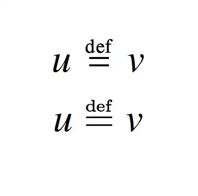
There is no need to setup again and again a math font only to access a character in a font.

\documentclass{article}

\usepackage[math-style=ISO]{unicode-math} \setmainfont{TeX Gyre Termes} \setsansfont{TeX Gyre Heros}[Scale=MatchLowercase] \setmonofont{TeX Gyre Cursor}[Scale=MatchLowercase]

\setmathfont{TeX Gyre Termes Math} \setmathfont{XITS Math}[range={"2A3E},BoldFont=XITSMath-Bold]

\newfontface\latinmath{latinmodern-math.otf}
\newcommand*{\longDefiningEqualsB}{% \mathrel{{\mbox{\latinmath ≝}}}}

\begin{document} \begin{gather} u≝v \ u\longDefiningEqualsB v \ \end{gather} \end{document}

enter image description here

Ulrike Fischer
  • 327,261
1

I can't see a reason for using both in the same document, but certainly the way is not with \setmathfont, which does an awful lot of things.

Trusting on (but not endorsing) your judgment of having two copies of the same symbol in different styles, your idea of using \text is good, but you just need to choose a text font and nothing prevents you from declaring a math font as a text one. The converse is problematic: in order to be useful for math, an OpenType/TrueType font must have special tables in it.

The appropriate command is \newfontface.

Note that you almost never want Ligatures=TeX, which the default except for monospaced fonts. Stick to one style for the options when loading fonts. The preferred way is options after the font name.

\documentclass{article}

\usepackage[math-style=ISO]{unicode-math}

\setmainfont{TeX Gyre Termes} \setsansfont{TeX Gyre Heros}[Scale=0.88] \setmonofont{TeX Gyre Cursor} \setmathfont{TeX Gyre Termes Math}

\setmathfont{XITSMath-Regular}[ Extension=.otf, range={"2A3E}, BoldFont=XITSMath-Bold, ]

\newfontface{\latinmodernmath}{latinmodern-math.otf}

\newcommand*{\longDefiningEquals}{\mathrel{\text{\latinmodernmath\symbol{"225D}}}}

\begin{document}

\texttt{``aa''}% see? No ligatures $A\longDefiningEquals B$ $\scriptstyle A\longDefiningEquals B$ % scales! \begin{gather} R⨾\ ≝ { (,) \mid ∃ \colon (,) ∈ ∧ (,) ∈ }\ R⨾ \longDefiningEquals { (,) \mid ∃ \colon (,) ∈ ∧ (,) ∈ }\ \end{gather}

\end{document}

enter image description here

egreg
  • 1,121,712
  • Thx! The long ≝ is the preferred symbol: having “def” and “=” of the same width visually pleases us. However, sometimes we simply don't have enough horizontal space on the line (e.g., in narrow columns, in a table, in a long formula, in the margins); in such cases we choose the short ≝. –  Feb 12 '23 at 19:09
  • 1
    @AlbertNash Mathematicians have dispensed with that symbol for centuries; next came computer scientists… – egreg Feb 12 '23 at 20:44
  • Well, certain comp.sci. folks tend to disambiguate stuff. The symbol "=" can mean lots of things, especially if you deal with program logics. –  Feb 12 '23 at 23:57