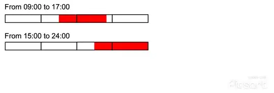
Problem
I would like to indicate the time duration of an event as a colored patch inside a horizontal bar, the latest representing a 24-hour timeline (i.e. a 24 units long bar), that should help the reader just as a "reference" bar for the time in a day. Then, I would like to add both the patch and the 24-hour timeline bar inside a cell of a table.
My desired output would be something similar to the figure here below. As an example, I drew 2 red patches indicating the time duration of two distinct events and two "reference" timeline bars of 24 hours length (with reference ticks every 6 hours, i.e. at 00:00, at 06:00, at 12:00, at 18:00 and at 24:00). The best would be to draw these two figures just giving the start and the end hours of an event as inputs.
How to draw both the patch and the "reference" bar representing a 24-hour timeline?
My starting point (MWE)
I tried to start working on the method presented in Is it possible to create a barchart in a table?, but I do not know how to continue...
\documentclass{article}
\usepackage{xfp}
\usepackage{color}
\begin{document}
% (1) define the 24 hours bar
\def\mybar#1{
   {\color{black}\rule{\fpeval{#1/\myscale*\barwidth} cm}{\barheight}} #1
}
\newcommand{\barwidth}{5} % cm max bar widths
\newcommand{\barheight}{4pt} % height of each bar
\newcommand{\myscale}{24} % max scale for hours bars
% (2) draw the 24 hours bar
\mybar{24}
\end{document}
Which produces this bar:


