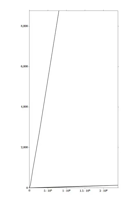
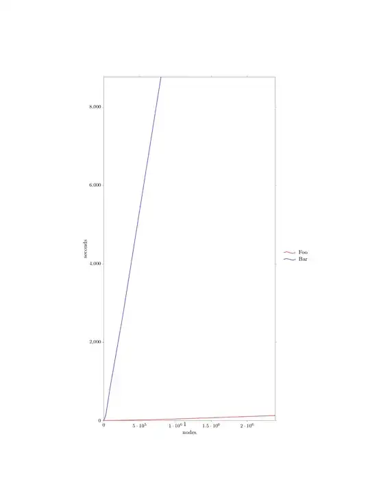
I would like to add some information to this graph and I am failing. More specifically,
- I want the X axis to have the label "nodes" and the Y axis to be seconds
- I also want the first data set to be called "static" and the second data set to be called "dynamic", perhaps using a red and blue color.
I had to make the graph very vertical to make the "linear" data more visible. I appreciate any help or feedback.
Thank you.
\documentclass{article}
\usepackage{tikz}
\usetikzlibrary{datavisualization} %for graphs and pictures
\usetikzlibrary{datavisualization.formats.functions} %for graphs and pictures
\begin{document}
\begin{figure}[htbp]
\centering
\begin{tikzpicture}
\datavisualization [scientific axes,
                          x axis={attribute=nodes, length=10cm},
                          y axis={attribute=seconds, length=20cm},
                          visualize as line]
  data {
    nodes, seconds
    3,0.009
    30,0.003
    111,0.005
    354,0.019
    1083,0.097
    3270,0.044
    9831,0.064
    29514,0.501
    88563,2.276
    265710,7.439
    797151,27.578
    2391474,128.611
  }
  data {
    nodes, seconds
    3,0.091
    30,0.495
    111,2.789
    354,3.390
    1083,5.021
    3270,20.149
    9831,48.015
    29514,158.442
    88563,857.381
    265710,2693.862
    797151,8771.571
  };
\end{tikzpicture}
\end{figure}
\end{document}


pgfplots? I think that it's much easier with it... – Rmano May 22 '23 at 19:44