1

I would like to locally override style sheet color and have:

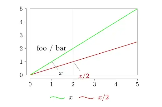
  • pin data the same color as the data set drawed
  • be able to access the data set color in the "info" section

Currently I've got: result

  • wrong color for pin data for the data set "foo" ("x" is in black instead of green)
  • wrong color in legend ("x" is black instead of green)
  • no idea on how to set the text "foo / bar" to the desired color (foo in green and bar in red)
\documentclass{book}

\usepackage{tikz} \usetikzlibrary {datavisualization.formats.functions} \begin{document}

\tikz \datavisualization[ scientific axes={clean}, visualize as smooth line/.list={foo,bar}, x axis={ grid={major also at=2} }, every data set label/.append style={text colored}, style sheet=strong colors, foo={ style=green, label in legend={text=$x$}, pin in data={text'=$x$, when=y is 1}, }, bar={ label in legend={text=$x/2$}, pin in data={text'=$x/2$, when=y is 1}, }, legend={below},
] data [set=foo,format=function] { var x : interval [0:5] samples 100; func y = \value{x}; } data [set=bar,format=function] { var x : interval [0:5] samples 100; func y = 0.5 * \value{x}; } info { \node at (visualization cs: x=1, y=2) { foo / bar }; };

\end{document}
1 Answers1

0

This answer is maybe a bit late, but you could try the following.

\documentclass{book}

\usepackage{tikz} \usetikzlibrary {datavisualization.formats.functions} \begin{document}

\tikz
\datavisualization[
scientific axes={clean},
visualize as smooth line/.list={foo,bar},
x axis={ grid={major also at=2} },
every data set label/.append style={text colored},
/pgf/data visualization/style sheets/strong colors/1/.style={visualizer color=green},
style sheet=strong colors,
foo={
    label in legend={text=$x$},
    pin in data={text'=$x$, when=y is 1},
},
bar={
    label in legend={text=$x/2$},
    pin in data={text'=$x/2$, when=y is 1},
},
legend={below},      
]
data [set=foo,format=function] {
    var x : interval [0:5] samples 100;
    func y =   \value{x};
}
data [set=bar,format=function] {
    var x : interval [0:5] samples 100;
    func y =   0.5 *  \value{x};
}
info {
    \node at (visualization cs: x=1, y=2) {
        foo / bar
    };
};


\end{document}

This solution modifies the standard color sheet strong colors and I'm not sure if this has any unwanted side effects. However it seems to work in your example.

I don't know if it is possible to get the colors of the data visualizers into the info section directly.

In my opinion it would be better any way to define your own style sheet for what you are trying to do. This way you have full control over the colors used and can refer to them for example via normal macros.

Cybtron
  • 36
  • 4