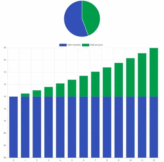
I would like to create a pack of graphics to highlight the simple interest rate gain like below. The blue, or any color available, would be the initial capital and the green the gain month by month. Hopefully coming from a math formula but not required to be, it can be static also. How can it be done? The pie chart is not big deal but the histogram with two colors is the hard one to me.
Asked
Active
Viewed 44 times
1
-
2Have a look at pgfplots – samcarter_is_at_topanswers.xyz Nov 24 '23 at 12:52
-
This was my first search, then here. That is why I am asking. Did not see anything like that in Latex, only using Python I saw something like that. – Daniel Ferreira Castro Nov 24 '23 at 13:13
-
Search for "4.5.9 Stacked Plots" in the user manual – samcarter_is_at_topanswers.xyz Nov 24 '23 at 13:14
-
https://tikz.dev/pgfplots/reference-2dplots#autosec-1622 found – Daniel Ferreira Castro Nov 24 '23 at 13:23
