3

The vertical spacing above rho in the denominator here is off. I'm not sure if it's caused by the descender in the numerator, or if that only exaggerates the issue. I think both 2/μ and μ/2 look alright, but I'm not a typographer. How can I make it look proper?

enter image description here

\documentclass{article}
\begin{document}
\begin{equation}
  \sqrt{\frac2\rho} + \sqrt{\frac\mu\rho} + \sqrt{\frac\mu2}
\end{equation}
\end{document}
Anna
  • 811
  • 1
    rho is kind of small but the design is such that normal fractions all have a standard minimum size even if empty \frac{1}{2} and \frac{1}{} are the same height even though it is all space in the denominator, you see the same in the numerator where the reason for the gap under 2 is to allow y or \mu on the same baseline. So it looks as intended now, I would not change it. – David Carlisle Jan 17 '24 at 12:10
  • Thanks @DavidCarlisle. What can I do to make it look good, except for \rho^{-1}? – Anna Jan 17 '24 at 12:11
  • retrain your expectations then what you show will look good. If you reduce the gap by raising rho or lowering the bar of the fraction, the formula as a whole will look inconsistent and a mess. – David Carlisle Jan 17 '24 at 12:12
  • @DavidCarlisle I just included this sum to compare the fractions, my actual equation is very simple: c_\text{sh}=\sqrt{\frac\mu\rho}. Do you think adjusting the spacing would make it look like an inconsistent mess even when there's just a single fraction? – Anna Jan 17 '24 at 12:16
  • I wouldn't change it, you see the problem everywhere baselines of paragraphs are spaced to allow accented capital letters so if you have no accents or all lowercase it's often bigger than needed, but you don't want different baselines for different paragraphs, but if a document is almost all lowercase you may squeeze the spacing a bit even if it makes capital letters look very tight the spacing for the denominator is fontdimen11 https://tex.stackexchange.com/questions/88991/what-do-different-fontdimennum-mean/88993#88993 you could experiment with it but.... – David Carlisle Jan 17 '24 at 12:23
  • Well, I'd say the middle fraction looks bad. Do you agree that it looks bad but that I should not hope for better with LaTeX, or that it looks good? I also didn't quite understand your response, maybe I was unclear. This is a single display equation. I don't want to change the look of anything else in my document. – Anna Jan 17 '24 at 12:29
  • I guess it is the small height of the \mu in the numerator that in combination with the large depth of the \rho that causes this. Maybe you want \sqrt{\frac{\vphantom{2}\mu}{\rho}}? (Since you seem to be fine with the left version.) – mickep Jan 17 '24 at 12:56

2 Answers2

4

You can raise the \rho, but I wouldn't. making one isolated term look "better" at the expense of losing consistent baselines is not usually a good trade, but...

enter image description here

\documentclass{article}
\begin{document}
\begin{equation}
  \sqrt{\frac{2}{\rho}} +
  \sqrt{\frac{\mu}{\rho}} +
  \sqrt{\frac{\mu}{\raisebox{2pt}[0pt]{$\rho$}}} +
  \sqrt{\frac{\mu}{2}}
\end{equation}
\end{document}
David Carlisle
  • 757,742
2

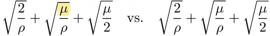
In the OP's code, the three square root symbols don't have the same height (and depth too, for that matter). IMNSHO, the sum would look a whole lot better if the three square root symbols had the same size. I suggest you change of numerator of the middle term from \mu to \mu\vphantom{2}.

enter image description here

\documentclass{article}
\begin{document}
\[
\sqrt{\frac{2}{\rho}} + \sqrt{\frac{\mu}{\rho}} + \sqrt{\frac{\mu}{2}}
\quad{\mbox{vs.}}\quad
\sqrt{\frac{2}{\rho}} + \sqrt{\frac{\mu\vphantom{2}}{\rho}} + \sqrt{\frac{\mu}{2}}
\]
\end{document}

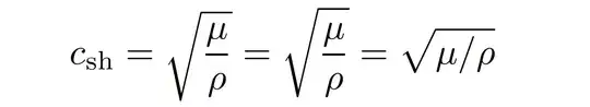
Addendum: The OP has provided a comment with information about the "real" expression of interest, viz., c_\text{sh}=\sqrt{\frac\mu\rho}, and has asked what kind of placement corrections (if any) I'd apply to this expression.

  • My main recommendation would be to switch from \frac notation to inline-fraction notation, i.e., to write \sqrt{\mu/\rho}. This works especially well because \mu and \rho happen to have the same height and depth.

  • If \frac notation cannot be avoided, I'd say that it's the vertical placement of the square root symbol that's the real issue here, rather than the placement of the denominator term in the fraction. Compare \sqrt{\frac{\mu}{\rho}} against \sqrt{\frac{\mu}{\smash[b]{\rho}}}: IMNSHO, the latter expression looks better because while the tall square root symbols have the same overall size in both cases, the square root symbols is placed a bit higher in the latter case, leading to better overall proportions.

Oh, and I'd write c_{\mathrm{sh}} rather than c_{\text{sh}}.

enter image description here

\documentclass{article}
\usepackage{amsmath} % for \smash[b] macro
\begin{document}
\[
c_{\mathrm{sh}}=\sqrt{\frac{\mu}{\rho}}
               =\sqrt{\frac{\mu}{\smash[b]{\rho}}}
               =\sqrt{\mu/\rho}
\]
\end{document}
Mico
  • 506,678
  • Thank you! In fact, I used the sum only for comparison -- apologies for not putting my actual case in the question, which is simpler: c_\text{sh}=\sqrt{\frac\mu\rho}. Would you adjust the spacing in that case? – Anna Jan 17 '24 at 14:40
  • @Anna - Please see the addendum I just posted. – Mico Jan 17 '24 at 15:08
  • Thank you @Mico! Can I just ask, what is the reason to prefer mathrm? – Anna Jan 17 '24 at 15:48
  • 1
    @Anna \text is italic in an italic context, mathrm is always upright. And assuming that _\text always works is also bad – daleif Jan 17 '24 at 16:37