0

I made a plot with 2 y-axis on the same x-axis. One one the left, one on the right. enter image description here
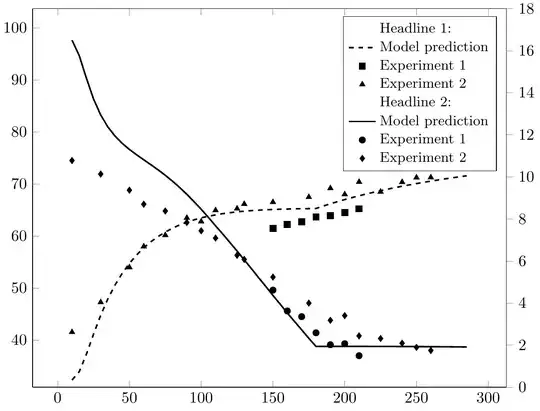
Thats the Code I used:

\documentclass{standalone}

\usepackage{siunitx}
\usepackage{pgfplots} \usetikzlibrary{pgfplots.groupplots} \usepackage{tikz} \usetikzlibrary{arrows,shapes} \pgfplotsset{width=10cm,compat=1.3} \begin{document} \begin{tikzpicture} \begin{axis}[ /pgf/number format/1000 sep={}, axis y line*=left, width = \textwidth, height = 10 cm, xlabel={Something}, ylabel={Something},
grid=none, major grid style={gray!95}, ]% % \addplot [line width=1pt, solid,color=black, mark=none] table[x=x,y=y, col sep=comma] {Data1.csv}; \label{Plot1}

        \addplot [color=black, mark=*, only marks,mark size=2pt]
        table[x=x,y=y, col sep=comma] {Data2.csv};
        \label{Plot2}

        \addplot [color=black, mark=diamond*, only marks,mark size=2pt]
        table[x=x,y=y, col sep=comma] {Data3.csv};
        \label{Plot3}

    \end{axis}
    \begin{axis}[
        %   /pgf/number format/000 sep={},
        axis y line*=right,
        axis x line = none,
        width = \textwidth,
        height =  10 cm,
        ylabel={Something else},            
        ymin = 0,
        ymax = 18,
        ytick align = outside,
        ytick pos = right,
        ylabel near ticks,
        grid=none,
        major grid style={gray!95},
        legend style={font=\small},
        legend columns=1,
        legend cell align={left},
        ]%
        \addlegendimage{empty legend}\addlegendentryexpanded{Headline 1:}
        \addplot[line width=1pt,dashed,color=black, mark=none]
        table[x=x,y=y, col sep=comma] {Data4.csv};
        \addlegendentry{Model prediction}

        \addplot[color=black, mark=square*, only marks,mark size=2pt]
        table[x=x,y=y, col sep=comma] {Data5.csv};
        \addlegendentry{Experiment 1}

        \addplot[color=black, mark=triangle*, only marks,mark size=2pt]
        table[x=x,y=ý, col sep=comma] {Data6.csv};
        \addlegendentry{Experiment 2}

        \addlegendimage{empty legend}\addlegendentryexpanded{Headline 2:}
        \addlegendimage{/pgfplots/refstyle=Plot1}\addlegendentryexpanded{Model prediction}
        \addlegendimage{/pgfplots/refstyle=Plot2}\addlegendentryexpanded{Experiment 1}
        \addlegendimage{/pgfplots/refstyle=Plot3}\addlegendentryexpanded{Experiment 2}
    \end{axis}
    \end{tikzpicture}
\end{document}

What bothers me is the alignment of the headlines in the legend. I am aware, that the "empty entry" takes the space I what the text to be. But is there a way to shift the headline entry in the legend to the left?

FYI: Not using the \addlegendimage{empty entry} before the \addlegendentryexpanded causes the order to mix up, and the Headline gets assigned a marker from the actual data.
DoDo
  • 3
  • 2
  • Please make your code compilable (if possible), or at least complete it with \documentclass{...}, the required \usepackage's, \begin{document}, and \end{document}. That may seem tedious to you, but think of the extra work it represents for the users willing to give you a hand. Help them help you: remove that one hurdle between you and a solution to your problem. – samcarter_is_at_topanswers.xyz Feb 12 '24 at 13:28
  • Thanks for updating your question! Unfortunately we can't compile your code as we don't have your custom .csv files. – samcarter_is_at_topanswers.xyz Feb 12 '24 at 13:52

1 Answers1

0

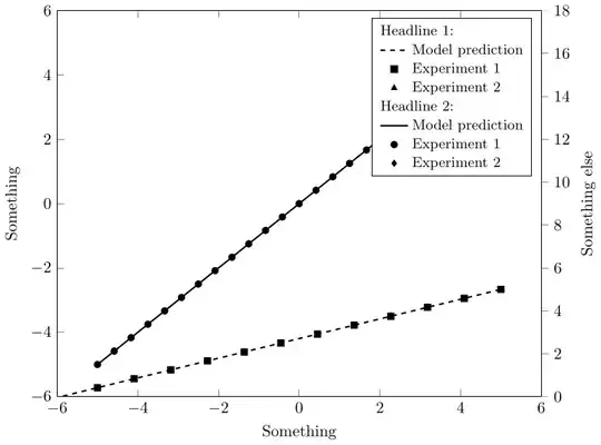
You could use the trick from https://tex.stackexchange.com/a/204519/36296 to add your headline instead of the legend image:

\documentclass{standalone}

\usepackage{siunitx}
\usepackage{pgfplots} \usetikzlibrary{pgfplots.groupplots} \usepackage{tikz} \usetikzlibrary{arrows,shapes} \pgfplotsset{width=10cm,compat=1.3}

\pgfplotsset{ legend image with text/.style={ legend image code/.code={% \node[anchor=center] at (0.0cm,0cm) {#1}; } }, }

\begin{document}
    \begin{tikzpicture}
    \begin{axis}[
        /pgf/number format/1000 sep={},
        axis y line*=left,
        width = \textwidth,
        height =  10 cm,
        xlabel={Something},
        ylabel={Something},         
        grid=none,
        major grid style={gray!95},
        ]%
        %
        \addplot [line width=1pt, solid,color=black, mark=none]
        {x};
        \label{Plot1}

        \addplot [color=black, mark=*, only marks,mark size=2pt]
        {x};
        \label{Plot2}

        \addplot [color=black, mark=diamond*, only marks,mark size=2pt]
        {x};
        \label{Plot3}

    \end{axis}
    \begin{axis}[
        %   /pgf/number format/000 sep={},
        axis y line*=right,
        axis x line = none,
        width = \textwidth,
        height =  10 cm,
        ylabel={Something else},            
        ymin = 0,
        ymax = 18,
        ytick align = outside,
        ytick pos = right,
        ylabel near ticks,
        grid=none,
        major grid style={gray!95},
        legend style={font=\small},
        legend columns=1,
        legend cell align={left},
        ]%
        \addlegendimage{legend image with text=\makebox[0pt][l]{Headline 1:}}
        \addlegendentry{}
        \addplot[line width=1pt,dashed,color=black, mark=none]
        {x};
        \addlegendentry{Model prediction}

        \addplot[color=black, mark=square*, only marks,mark size=2pt]
        {x};
        \addlegendentry{Experiment 1}

        \addplot[color=black, mark=triangle*, only marks,mark size=2pt]
        {x};
        \addlegendentry{Experiment 2}

        \addlegendimage{legend image with text=\makebox[0pt][l]{Headline 2:}}
        \addlegendentry{}
        \addlegendimage{/pgfplots/refstyle=Plot1}\addlegendentryexpanded{Model prediction}
        \addlegendimage{/pgfplots/refstyle=Plot2}\addlegendentryexpanded{Experiment 1}
        \addlegendimage{/pgfplots/refstyle=Plot3}\addlegendentryexpanded{Experiment 2}
    \end{axis}
    \end{tikzpicture}
\end{document}

enter image description here