I would like to construct what Unicode calls "white curly brackets" that are in addition scalable. They look like ⦃ (≈{|) and ⦄ (≈|}) and have Unicode codepoints U+2983 and U+2984.
unicode-math has them as \lBrace and \rBrace, but (1) I don't presently use XeTeX or LuaTeX and (2) their design (shown in unimath-symbols.pdf on pages 3-4) is not to my liking: the brace part is too fat for my taste, and I would like the vertical bar to not leave any protrusions. I am trying to have them visually match the parentheses \llparenthesis, \rrparenthesis, \llbracket, and \rrbracket from stmaryrd.
Right now I am using a makeshift definition, which is sufficient for now, but the symbols don't scale (in general or with \left/\right). Here is sample code:
\documentclass{article}
\usepackage{amsmath}
\usepackage[only,llbracket,rrbracket,llparenthesis,rrparenthesis]{stmaryrd} % for comparison with 4 similar parenthesis symbols
\usepackage{accsupp} % for ensuring the right Unicode codepoint upon pasting
\newcommand*{\llbrace}{%
\BeginAccSupp{method=hex,unicode,ActualText=2983}%
\textnormal{\usefont{OMS}{lmr}{m}{n}\char102}%
\mathchoice{\mkern-4.05mu}{\mkern-4.05mu}{\mkern-4.3mu}{\mkern-4.8mu}%
\textnormal{\usefont{OMS}{lmr}{m}{n}\char106}%
\EndAccSupp{}%
}
\newcommand*{\rrbrace}{%
\BeginAccSupp{method=hex,unicode,ActualText=2984}%
\textnormal{\usefont{OMS}{lmr}{m}{n}\char106}%
\mathchoice{\mkern-4.05mu}{\mkern-4.05mu}{\mkern-4.3mu}{\mkern-4.8mu}%
\textnormal{\usefont{OMS}{lmr}{m}{n}\char103}%
\EndAccSupp{}%
}
\begin{document}
\noindent
ok:
\(\displaystyle\llbrace abc \rrbrace\)
\(\textstyle\llbrace abc \rrbrace\)
\(\scriptstyle\llbrace abc \rrbrace\)
\(\scriptscriptstyle\llbrace abc \rrbrace\)
\noindent
ok:
\(\displaystyle \llbrace \frac{a}{b} \rrbrace\)
\(\textstyle\llbrace \frac{a}{b} \rrbrace\)
\(\scriptstyle\llbrace \frac{a}{b} \rrbrace\)
\(\scriptscriptstyle\llbrace \frac{a}{b} \rrbrace\)
\noindent
incorrectly scaled (\verb|\scriptsize|): {\scriptsize\(\llbrace abc \rrbrace\)} (large magnification required)
\noindent
incorrectly scaled (\verb|\tiny|): {\tiny\(\llbrace abc \rrbrace\)}
\noindent
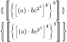
\verb|\left| and \verb|\right| not possible before \verb|\llbrace| and \verb|\rrbrace|: \\
\indent \(\llbrace \left\llbracket\left\{\left[(a) \cdot bc^{2^3}\right]^4\right\}^5\right\rrbracket \rrbrace\)
% Note: This is also not possible with \llparenthesis and \rrparenthesis from stmaryrd.
\noindent
for comparison: \(\llparenthesis x \rrparenthesis, \llbracket x \rrbracket, \llbrace x \rrbrace; (x), [x], \{x\}\)
\end{document}
Lines 1 and 2 look just right with the present setup. Lines 3 and 4 demonstrate that my definitions don't scale. Lines 5a/b gives an example of where I would like to be able to use \left and \right. Line 6 juxtaposes different types of parentheses for visual comparison.
Is there an easy way to scale the glyphs I have constructed myself? Or is designing new glyphs the only way? While the vertical part of my glyphs doesn't leave any protrusions, the "brace part being too fat" part of my problem isn't being addressed by my code. With this in mind: I recognize that it might not be that easy to make the brace part of the glyph thinner (though if you can, more power to you), but I think that any solution that addresses the scaling problem for any manually constructed glyph cluster will be a valuable contribution to the community.
For a slightly different setup (original example code) with
\RequirePackage{fix-cm}
\documentclass[12pt]{memoir}
\usepackage{fixltx2e}[2006/09/13]
\usepackage{amsmath}
\usepackage{txfonts}
\usepackage[only,llbracket,rrbracket,llparenthesis,rrparenthesis]{stmaryrd}
\usepackage{accsupp}
in the preamble, one needs \mkern-5.7mu in the fourth argument to \mathchoice for "correct" scaling. To see what goes wrong in that case, it's best to include a line such as discontinuous small symbols in a footnote\footnote{\(\scriptscriptstyle\llbrace \frac{a}{b} \rrbrace\)}. This might help a potential answerer test things out.


:-)Or are there particular reasons why all these packages are relevant to your problem? – Hendrik Vogt Mar 05 '13 at 07:34\mkern-..mu-values in my present document, you really think I should try recalibrating things just to be able to write\documentclass{article}?memoiris a tasteful class, and usingfix-cmandfixltx2eis good practice anyways (this can be relevant depending on the font tricks you're using). Withoutamsmaththe glyph positioning already looks different (try it out).[12pt]can be done away with (again, at the cost of different letter positioning), but I don't think there is value in omitting this now just for saving 4 letters. – Lover of Structure Mar 05 '13 at 07:56accsupp(using it here would be useful and good practice) or other lines, I very much and strongly encourage you to make the necessary constructive edits ... As indicated, the sample code is showing one possible way to get the two symbols approximately right. A possible solution that manages to scale just those two symbols will or should be independent anyways; and if the only solution is to stick together glyphs in a totally different way, this will be so even more so. – Lover of Structure Mar 05 '13 at 08:07accsupp: It's definitely not relevant to your problem, but I'm happy that I learned from you about that package and its usage:-)Still, the point about an MWE is not to show good practice. You can omit thefixes, thetxfonts, and you can also replacememoirwitharticle- no need to recalibrate anything, just try it! – Hendrik Vogt Mar 05 '13 at 08:53Memoiris a standard class, it is a bit larger than article but other usescrbookwithout getting any complaint.accsupcould be relevant to the problem: Its use could affect the spacing.fix-cmdoes contain settings which affects math fonts (OMS + OML) encoding. Imho the example is quite good. – Ulrike Fischer Mar 05 '13 at 09:11@Lover:Oh, wow, I completely missed the different spacing for the smaller sizes!! By the way I do like your question a lot. @Ulrike: OK, maybe I was a bit misled by my MikTeX installation asking to download several missing packages. – Hendrik Vogt Mar 05 '13 at 09:24