I create a tikzpicture in standalone mode (see code below). Then import the resultant .pdf file into my document via \includegraphics (see pic). However the axis labels are cut off and part of the ytick when using [trim axis left, trim axis right]. If I don't use that command it looks fine but is not centered any more. Any thoughts?
PS this is a duplicate but perhaps more concise of this Pgfplot figure off-center because of axis label
\documentclass[tikz,border=12pt]{standalone}
\usepackage{pgfplots}
\pgfplotsset{compat=newest}
\usetikzlibrary{plotmarks}
\begin{document}
\definecolor{mycolor1}{rgb}{0.0416666666666667,0,0}
\begin{tikzpicture}[trim axis left, trim axis right]
\begin{axis}[%
width=6.17578125in,
height=2.23276041666667in,
area legend,
scale only axis,
xmin=0.5,
xmax=5.5,
xtick={1,2,3,4,5},
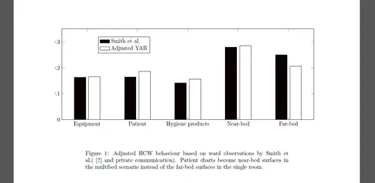
xticklabels={Equipment,Patient,{Hygiene products},Near-bed,Far-bed},
ymin=0,
ymax=0.35,
ytick={ 0, 0.1, 0.2, 0.3, 0.4},
ylabel={Probability density},yticklabel style={/pgf/number format/fixed},
legend style={at={(0.143572984749455,0.733206590621038)},anchor=south west,draw=black,fill=white,legend cell align=left}
]
\addplot[ybar,bar width=0.282321428571429in,bar shift=-0.176450892857143in,fill=mycolor1,draw=black] plot coordinates{(1,0.163793103)
(2,0.164367816)
(3,0.141954023)
(4,0.279310345)
(5,0.250574713)};
\addlegendentry{Smith et al.};
\addplot [
color=black,
solid,
forget plot
]
table[row sep=crcr]{
0.5 0\\
5.5 0\\
};
\addplot[ybar,bar width=0.282321428571429in,bar shift=0.176450892857143in,fill=white,draw=black] plot coordinates{(1,0.165289256)
(2,0.185950413)
(3,0.157024793)
(4,0.285123967)
(5,0.20661157)};
\addlegendentry{Adjusted YAB};
\end{axis}
\end{tikzpicture}%
\end{document}
[trim axis left, trim axis right]. Myborder={38pt 12pt}then adds a 38pt border to the left and right equally, which keeps the graph centred, whichever numbers are used. I just came up with 38pt by trial and error. – John Wickerson May 03 '13 at 12:13xtick pos=leftandytick pos=leftin your axis options. (The default isboth.) – John Wickerson May 04 '13 at 07:00