11

The accepted answer in this question shows a neat redefinition of \textvisiblespace, which I like to use because it doesn't produce a warning in math mode.

However, I use it with monospace in an equation, and it doesn't look perfect: the symbol is too close to its right neighbour. Here's an MWE:

\documentclass{article}

\newcommand\vartextvisiblespace[1][.3em]{%
  \mbox{\kern.1em\vrule height.3ex}%
  \vbox{\hrule width#1}%
  \hbox{\vrule height.3ex}
}

\begin{document}

A formula with visible space in it:
\begin{equation}
  s = \mathtt{a\vartextvisiblespace string\vartextvisiblespace sequence}
\end{equation}

\end{document}

What is a clean way to make it look better?

lenz
  • 401

2 Answers2

9

The glyph you're building is wider than letters in a monospaced font; use 0.5em as width and simplify the definition:

\documentclass{article}

\newcommand\vartextvisiblespace[1][.5em]{%
  \makebox[#1]{%
    \kern.07em
    \vrule height.3ex
    \hrulefill
    \vrule height.3ex
    \kern.07em
  }% <-- don't forget this one!
}

\begin{document}

A formula with visible space in it:

$s = \mathtt{a\vartextvisiblespace string\vartextvisiblespace sequence}$

\ttfamily
a\vartextvisiblespace\vartextvisiblespace\vartextvisiblespace a

abcde

\end{document}

enter image description here

You can fine tune the width with \vartextvisiblespace[.3em] or similar.

egreg
  • 1,121,712
5

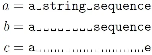
Just add a small \kern on the right-hand side (equivalent to that the left-hand side):

enter image description here

\documentclass{article}
\usepackage{amsmath}% http://ctan.org/pkg/amsmath

\newsavebox{\textvisiblespacebox}
\savebox{\textvisiblespacebox}{\texttt{a}}
\newcommand\vartextvisiblespace[1][\wd\textvisiblespacebox]{%
  \makebox[#1]{\kern.1em\rule{.4pt}{.3ex}%
  \hrulefill%
  \rule{.4pt}{.3ex}\kern.1em}%
}

\newcommand{\x}{\vartextvisiblespace}% For ease-of-use
\begin{document}

\begin{align*}
  a &= \mathtt{a\x string\x sequence} \\
  b &= \mathtt{a\x\x\x\x\x\x\x\x sequence} \\
  c &= \mathtt{a\x\x\x\x\x\x\x\x\x\x\x\x\x\x\x e}
\end{align*}

\end{document}

I've also updated the construction of \vartextvisiblespace to be more LaTeX2e-y. It measures the width of a regular typewriter font character, and uses it to place establish the box width of the visible space.

Moriambar
  • 11,466
Werner
  • 603,163
  • looks nice, but what happens when two such monospace strings are aligned one above another, with offset visible spaces? – barbara beeton Jun 20 '13 at 14:26
  • @barbarabeeton: I don't understand. They look the same in terms of the horizontal spacing. – Werner Jun 20 '13 at 16:45
  • if you put several lines in an align environment, and use \x for the name of the space (irrelevant except that i want to include the code here), add these two lines to the display: s &= \mathtt{another\x such\x string}\\ s &= \mathtt{\x\x\x\x\x\x\x\x one\x more} and take a look. the letters in successive lines that should be lined up are just slightly offset from one another, so the effect is not truly that of a monospace font. (i've made this mistake so many times myself that i tend to anticipate it. i did test.) – barbara beeton Jun 20 '13 at 17:34
  • @barbarabeeton: I see now what you mean. I assume this is addressed in egreg's answer based on the fact that he's using a wider space (0.5em as opposed to 0.3em). – Werner Jun 20 '13 at 17:47
  • i didn't do the calculation, but the really important thing is that the width of the \mbox must be precisely the width of a letter in the monospace font. egreg has used \hrulefill which adjusts the width of the rule rather than possibly modifying the width of the box. – barbara beeton Jun 20 '13 at 17:53
  • @barbarabeeton: Okay, I've updated it now. Even 0.5em as in egreg's answer is too short... – Werner Jun 20 '13 at 18:02
  • good now. i'm pretty sure that computer modern tt font sets the character width to .5em (well, half the nominal point size), so i'm not surprised that egreg used that. but measuring the actual width is never a bad idea (although it would need adjusting if the type size changes mid-document). – barbara beeton Jun 20 '13 at 18:30
  • @barbarabeeton: I agree. For the presentation, I thought recalculating it at the start of every usage might be a bit much. – Werner Jun 20 '13 at 18:32