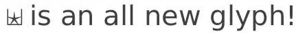
Suppose I need some crazy custom symbol for personal use.
e.g.
when I write \foobar, LaTeX should show the symbol.
How do I achieve this?
Suppose I need some crazy custom symbol for personal use.
e.g.
when I write \foobar, LaTeX should show the symbol.
How do I achieve this?
As TH mentioned, you can create a graphic in an external program and include it as a picture. Preferably you would use a vector drawing software such as adobe illustrator or the (free) software inkscape. This way scaling the image will not change the quality (don't use raster graphics such as jpg).
Of course you can also use a code based approach e.g. with the tikz or pstricks package
\documentclass{scrartcl}

\usepackage{tikz}

\newcommand{\foo}[1]{%
\begin{tikzpicture}[#1]%
\draw (0,0) -- (1ex,1ex);%
\draw (0.5ex,0) -- (1.3ex,0.8ex);%
\end{tikzpicture}%
}
\begin{document}
Some text and the symbol \foo{} or scaled \foo{scale=2}
\end{document}

\Implies and \Iff to make them a bit larger and longer for presentations.
– Andrew Stacey
Mar 16 '11 at 10:31
\savebox to store the rendered picture and reuse it. This way it is only drawn once.
– Martin Scharrer
Mar 16 '11 at 13:14
Simplest way would be to save it as a pdf (or eps if you're using latex) and then define
\newcommand*\foobar{\includegraphics{crazycustomsymbol}}
crazycustomsymbol.png instead of crazycustomsymbol.pdf?
– Pratik Deoghare
Mar 16 '11 at 10:01
\newcommand*\foobar{\vcenter{\hbox{\includegraphics{xxxx.png}}}}
so that the new symbol is aligned with text.
– Yan King Yin
May 19 '15 at 04:24
Yet another way of including custom symbols is by composing new ones through superimposing glyphs, which is demonstrated in the symbols-a4 manual on page 103.
Here's an example:
\newcommand{\starcup}{$\sqcup$\kern-0.58em{$\star$}}
Which gives:
As Martin Scharrer points out, the use of ex or em as a unit for kerning respects the font size. You can also use (as I did in the first revision of this example) points for absolute positioning.
ex or em as unit for the \kern to get font size relative kerning. Also \rlap could be used to simply lap the second symbol over the first.
– Martin Scharrer
Mar 16 '11 at 10:51
\rlap but for some reason the glyphs were set on different lines. Moreover, the glyphs were (predictably) left-aligned and thus the star was off-centre and in need of kern. As such I am not sure that \rlap constitutes a better method.
– Richard Terrett
Mar 16 '11 at 11:04
\rlap alone only works well when the symbols have approximately the same width. See this answer of mine where I use a box to center one symbol on top of another one.
– Martin Scharrer
Mar 16 '11 at 11:10