How do I typeset annuity and life-insurance symbols, actuarial notation in ConTeXt. I see there are packages available but not for ConTeXt.

Thanks
How do I typeset annuity and life-insurance symbols, actuarial notation in ConTeXt. I see there are packages available but not for ConTeXt.
Thanks
This is Plain TeX, but I guess it can do for ConTeXt. Experts can improve it.
\def\actuarial#1{%
  \vbox{
    \offinterlineskip
    \tabskip=0pt
    \mathsurround=0pt
    \halign{##&\vrule##\cr
      \noalign{\hrule}%
      &height 1pt\cr
      $\scriptstyle#1$&\cr
    }%
  }%
}

$a_{\actuarial{n}}$

\bye

\subscriptstyle. It may be better to use \mathpallet to get automatic scaling of the argument.
– Aditya
Oct 22 '13 at 23:46
\mathpalette. ;-). However I don't think this symbol is ever used in subscripts.
– egreg
Oct 23 '13 at 07:18
Based on Barbara Beeton's comment, you just need to pick a font that includes the actuarial bend symbol. For example, using XITS fonts you get:
% Use a math font that has the actuarial bend symbol
\usemodule[simplefonts]
\setmathfont[XITS]

\Umathchardef\actuarial "0 "0 "20E7

\starttext

$a_{n \actuarial}$

\stoptext

If someone can tell what is the right mathclass and tex name for this glyph, I can send in a request to add this to char-def.lua so that it works out of the box in ConTeXt.
Here's something to get you going, you may want to tweak the raisebox dimension, and the negative spaces, and maybe the size of the \urcorner.
\documentclass{article}
\usepackage{amsmath,amssymb}
\newcommand{\bend}[1]{\smash{#1\!\!\!{\raisebox{-0.2em}{\big\urcorner}}}}
\begin{document}
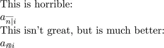
This is horrible:
$a_{\overline{n|}i}$
This isn't great, but is much better:
$a_{\bend{n} i}$
\end{document}
No doubt someone can propose a cleaner way of doing the adjustments, I can update for comments.
Also it will need testing in ConTeXt - I don't use it, though from what I've read it should work.
\urcorneras an accent on a subscript) – Chris H Oct 22 '13 at 10:58a_{\overline{n|}i}. – jub0bs Oct 22 '13 at 12:03\urcorner). – barbara beeton Oct 22 '13 at 12:15a_{\overline{n|}i}will have to do for the time being, will look for a prettier solution and post back, or finally just make the move to latex ... – YoungGrandpa Oct 22 '13 at 13:02\urcornermight not be ideal, but it's the best I can find, certainly better than the broken version provided in other comments. – Chris H Oct 22 '13 at 13:38\urcornercan never be acceptable for more than one letter at a time. i don't have a tex system available to experiment, and won't for several weeks, but i will mark this question for a look when i return home, and if no other good answer has appeared by then, i will try to devise one in plain tex terms. (i don't use context.) – barbara beeton Oct 22 '13 at 16:22