12

Desired Output

I made this diagram in R with ggplot2. enter image description here 
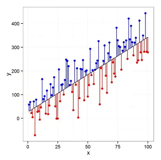
Now I want to reproduce this diagram with Tikz. My MWE is:

\documentclass[tikz]{standalone}
\usepackage{pgfplots}
\usepackage{pgfplotstable}

\begin{document}

\pgfmathsetseed{1138} % set the random seed
\pgfplotstableset{ % Define the equations for x and y
    create on use/x/.style={create col/expr={42+2*\pgfplotstablerow}},
    create on use/y/.style={create col/expr={(0.6*\thisrow{x}+130)+5*rand}}
}
% create a new table with 30 rows and columns x and y:
\pgfplotstablenew[columns={x,y}]{30}\loadedtable


\begin{tikzpicture}
\begin{axis}[
xlabel=Weight (kg), % label x axis
ylabel=Height (cm), % label y axis
axis lines=left, %set the position of the axes
xmin=40, xmax=105, % set the min and max values of the x-axis
ymin=150, ymax=200, % set the min and max values of the y-axis
clip=false
]

\addplot [only marks] table {\loadedtable};
\addplot [no markers, thick, black] table [y={create col/linear regression={y=y}}] {\loadedtable} ;
\end{axis}

\end{tikzpicture}
\end{document}

enter image description here

Any help and hints will be highly appreciated. Thanks

MYaseen208
  • 8,587

2 Answers2

10

If you explicitly create a new column regression containing the values of the regression line (as opposed to using a create on demand style), you can draw the residuals in different colours using the following style:

\pgfplotsset{
    colored residuals/.style 2 args={
        only marks,
        scatter,
        point meta=explicit,
        colormap={redblue}{color=(#1) color=(#2)},
        error bars/y dir=minus,
        error bars/y explicit,
        error bars/draw error bar/.code 2 args={
            \pgfkeys{/pgf/fpu=true}
            \pgfmathtruncatemacro\positiveresidual{\pgfplotspointmeta<0}
            \pgfkeys{/pgf/fpu=false}
            \ifnum\positiveresidual=0
                \draw [#2] ##1 -- ##2;
            \else
                \draw [#1] ##1 -- ##2;
            \fi
        },
        /pgfplots/table/.cd,
            meta expr=(\thisrow{y}-\thisrow{regression})/abs(\thisrow{y}-\thisrow{regression}),
            y error expr=\thisrow{y}-\thisrow{regression}
    },
    colored residuals/.default={red}{blue}
}

You can change the colours that are used for the negative and positive residuals using the optional arguments (colored residuals={cyan}{orange}, for example).

enter image description here


\documentclass[tikz, border=5pt]{standalone}
\usepackage{pgfplots}
\usepackage{pgfplotstable}

\begin{document}

\pgfmathsetseed{1138} % set the random seed
\pgfplotstableset{ % Define the equations for x and y
    create on use/x/.style={create col/expr={42+2*\pgfplotstablerow}},
    create on use/y/.style={create col/expr={(0.6*\thisrow{x}+130)+5*rand}}
}
% create a new table with 30 rows and columns x and y:
\pgfplotstablenew[columns={x,y}]{30}\loadedtable

% Calculate the regression line
\pgfplotstablecreatecol[linear regression]{regression}{\loadedtable}

\pgfplotsset{
    colored residuals/.style 2 args={
        only marks,
        scatter,
        point meta=explicit,
        colormap={redblue}{color=(#1) color=(#2)},
        error bars/y dir=minus,
        error bars/y explicit,
        error bars/draw error bar/.code 2 args={
            \pgfkeys{/pgf/fpu=true}
            \pgfmathtruncatemacro\positiveresidual{\pgfplotspointmeta<0}
            \pgfkeys{/pgf/fpu=false}
            \ifnum\positiveresidual=0
                \draw [#2] ##1 -- ##2;
            \else
                \draw [#1] ##1 -- ##2;
            \fi
        },
        /pgfplots/table/.cd,
            meta expr=(\thisrow{y}-\thisrow{regression})/abs(\thisrow{y}-\thisrow{regression}),
            y error expr=\thisrow{y}-\thisrow{regression}
    },
    colored residuals/.default={red}{blue}
}

\begin{tikzpicture}
\begin{axis}[
xlabel=Weight (kg), % label x axis
ylabel=Height (cm), % label y axis
axis lines=left, %set the position of the axes
xmin=40, xmax=105, % set the min and max values of the x-axis
ymin=150, ymax=200, % set the min and max values of the y-axis
]

\makeatletter
\addplot [colored residuals] table {\loadedtable};
\addplot [
    no markers,
    thick, black
] table [y=regression] {\loadedtable} ;
\end{axis}

\end{tikzpicture}
\end{document}
Jake
  • 232,450
  • Thanks @Jake for excellent answer. On my machine I get the blue color for lines joining the point with negative residuals to line. Wonder why? – MYaseen208 Nov 28 '13 at 14:13
  • @MYaseen208: I've changed the default colours and added an option for specifying your own. – Jake Nov 28 '13 at 14:44
7

It is a little verbose but it does what it has to do. I explain the code with some comments inside it.

EDIT @Jake method is more elegant but I get the same result also with mine so I added the changes in code.

\documentclass[tikz]{standalone}
\usepackage{pgfplots}
\usepackage{pgfplotstable}
\pgfplotsset{compat=1.9}

\begin{document}

\pgfmathsetseed{1138} % set the random seed
\pgfplotstableset{ % Define the equations for x and y
    create on use/x/.style={create col/expr={42+2*\pgfplotstablerow}},
    create on use/y/.style={create col/expr={(0.6*\thisrow{x}+130)+5*rand}}
}

% create a new table with 30 rows and columns x and y:
\pgfplotstablenew[columns={x,y}]{30}\loadedtable

% Determine no. of rows
\pgfplotstablegetrowsof{\loadedtable} 
\pgfmathsetmacro{\rows}{\pgfplotsretval}
\pgfmathsetmacro{\r}{\rows-1}

\begin{tikzpicture}
\begin{axis}[
    xlabel=Weight (kg), % label x axis
    ylabel=Height (cm), % label y axis
    axis lines=left, %set the position of the axes
    xmin=40, xmax=105, % set the min and max values of the x-axis
    ymin=150, ymax=200, % set the min and max values of the y-axis
    clip=false]

    \addplot [only marks] table {\loadedtable};
    \addplot [no markers, thick, black] table [y={create col/linear regression={y=y}}] {\loadedtable};

    % Save the coefficients of the linear regression
    \pgfmathsetmacro{\rega}{\pgfplotstableregressiona}
    \pgfmathsetmacro{\regb}{\pgfplotstableregressionb}

    % loop on the number of rows
    \foreach \i in {0,1,...,\r}{
        % get element x and y of the table
        \pgfplotstablegetelem{\i}{x}\of\loadedtable
        \pgfmathsetmacro{\x}{\pgfplotsretval}
        \pgfplotstablegetelem{\i}{y}\of\loadedtable
        \pgfmathsetmacro{\y}{\pgfplotsretval}
        \pgfmathsetmacro{\reg}{\rega*\x+\regb}
        \pgfmathsetmacro{\dif}{\reg-\y}
        % draw line between points and the linear regression
        % the \edef\temp{\noexpand ... } is for using macro inside \foreach
        \ifdim \dif px > 0px\relax
        \edef\temp{\noexpand\draw[blue, thick] (axis cs:\x,\y)--(axis cs:\x,\reg);}
        \edef\tempp{\noexpand\addplot[mark=*,blue] coordinates {(\x,\y)};}
        \else
        \edef\temp{\noexpand\draw[red, thick] (axis cs:\x,\y)--(axis cs:\x,\reg);}
        \edef\tempp{\noexpand\addplot[mark=*,red] coordinates {(\x,\y)};}
        \fi
        \temp
        \tempp
    }

\end{axis}

\end{tikzpicture}
\end{document}

enter image description here

Red
  • 10,181