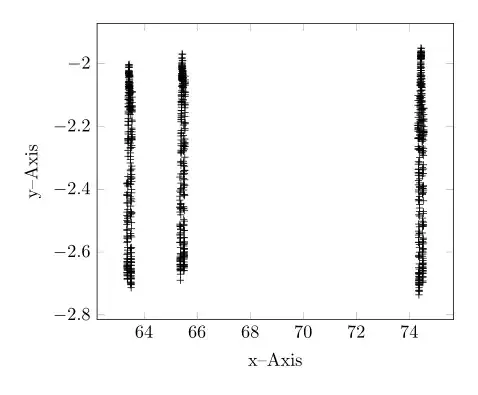
With the help of http://guido.vonrudorff.de/pgfplots-discontinuities/ I managed to solve my problem. This way includes quite a bit of manual labor, but the result is what I wanted.
The idea is to set the min and max range of the plot manually and then shift the ranges to the left so the gaps are closed. Of course, one has to manually set the labels on the x-axis this way.

\documentclass{article}
\usepackage[utf8x]{inputenc}
\usepackage{tikz,pgfplots,color,amsmath,amssymb}
\usetikzlibrary{pgfplots.groupplots}
\pgfplotsset{compat=1.8}
\begin{document}
\begin{tikzpicture}
    \begin{axis}[width=\linewidth,
          height=8cm,
          xmin=63.34,
          xmax=64.05,
          xlabel={x-axis},
          ylabel={y-axis},
          grid=major,
          xticklabels=  {63.35,63.40,63.45,63.50,63.55,65.35,65.40,65.45,65.50,65.55,74.35,74.40,74.45,74.50,74.55},
          xtick=        {63.35,63.40,63.45,63.50,63.55,63.59,63.64,63.69,63.74,63.79,63.84,63.89,63.94,63.99,64.04},
          x tick label style={rotate=45},
          extra x ticks={63.57,63.80},
          extra x tick style={grid=none, tick label style={xshift=0cm,yshift=.30cm, rotate=-45}},
          extra x tick label={\color{black}{/\!\!/}}
          ]
        \addplot[black,only marks,mark=+,restrict x to domain=63.34:63.57] table[x index=0,y expr=\thisrowno{1}] {data.dat};
        %% x expr=\thisrowno{0}-1.76  -> shift to the left so it appears in the plot. Shift labels by the same amount so they fit
        \addplot[black,only marks,mark=+,restrict x to domain=63.58:63.79] table[x expr=\thisrowno{0}-1.76,y expr=\thisrowno{1}] {data.dat};
        \addplot[black,only marks,mark=+,restrict x to domain=63.80:64.05] table[x expr=\thisrowno{0}-10.51,y expr=\thisrowno{1}] {data.dat};
        \draw[black] decorate [decoration={zigzag}] {(axis cs:63.57,-4) -- (axis cs:63.57,0)};
        \draw[black] decorate [decoration={zigzag}] {(axis cs:63.80,-4) -- (axis cs:63.80,0)};
    \end{axis}
  \end{tikzpicture}
\end{document}
 \documentclass[border=5mm]{standalone}
axis x discontinuityoption. See http://tex.stackexchange.com/questions/46422/axis-break-in-pgfplots – Herr K. Dec 09 '13 at 02:21xcoordinate and relabel them. – percusse Dec 09 '13 at 08:42