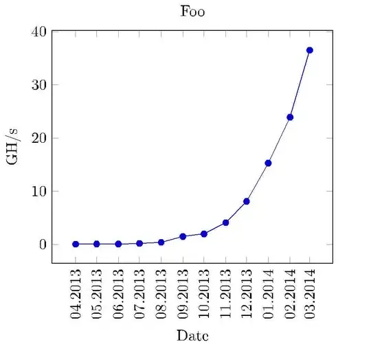
I need to do a really simple line plot and my data is looking like this:
Date    Value
Apr2013 0.06
Mai2013 0.08
Jun2013 0.1
Jul2013 0.2
Aug2013 0.4
Sep2013 1.5
Okt2013 2.0
Nov2013 4.1
Dez2013 8.1
Jan2014 15.3
Feb2014 23.9
Mär2014 36.5
There is a date in the first column and a float value on the second. The plot should look like that on Apr.2013 the value was 0.06 and so on. So the strings on first column should be on x-axis and the values matching to them on y-axis. I tried it with tikz but I don't know how to handle the dates in the first column. What I've tried was something like this, which of course didn't work:
\documentclass{article}
\usepackage{tikz}
\begin{document}
\begin{tikzpicture}
        \begin{axis}[width=0.9\textwidth,height=0.9\textheight,
            title={Foo},
            xtick={0,1,2,3,4,5,6,7,8,9,10},
            x tick label style={/pgf/number format/1000 sep=},
            xlabel={Apr},
            y tick label style={/pgf/number format/1000 sep=},
            extra y tick style={grid=major, tick label style={xshift=-1cm}},
            ylabel={GH/s}]
            \addplot table[y=Value] {chart-data.csv};
        \end{axis}
\end{tikzpicture}
\end{document}