10

I'm having an issue where I would like to plot a series of evenly spaced arrows where the length is dependent on the values from a data file and I'm not particularly sure how to go about it. I would like to be able to use a \foreach loop rather than manually type the arrow \draw commands if possible.

My idea of how the code would work would be similar to this, though simplified:

\begin{tikzpicture}
\begin{axis}
[
 ymin=0,
 ymax=.04,
]

\addplot [mark=none,black,very thick] table[x=T500,y=Y] {Test.dat};

\foreach \y in {0,0.25e-02,...,0.04}
    \draw [->] (axis cs:0,\y) -- (axis cs: [Value From File],\y);

\end{axis}
\end{tikzpicture}

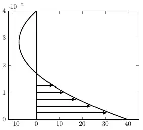
An image of what I'm looking to do (simply hard-coded the arrows in) would be something like the following, but extended for the entire range of the data (in this case 0 to .04). Is there a way that this can be done in a method similar to the one that I mentioned above? I appreciate any help. Thanks!

Example of the Plot

The text file I am plotting as an example is pasted below.

Y       T500
0       40
0.001   36.7099
0.002   33.5354
0.003   30.4769
0.004   27.535
0.005   24.71
0.006   22.0023
0.007   19.4121
0.008   16.9399
0.009   14.5859
0.01    12.3502
0.011   10.2331
0.012   8.23476
0.013   6.35515
0.014   4.59435
0.015   2.95234
0.016   1.42906
0.017   0.0244028
0.018   -1.26176
0.019   -2.42961
0.02    -3.47933
0.021   -4.41114
0.022   -5.22529
0.023   -5.92201
0.024   -6.50156
0.025   -6.9642
0.026   -7.31015
0.027   -7.53968
0.028   -7.65298
0.029   -7.65028
0.03    -7.53175
0.031   -7.29756
0.032   -6.94784
0.033   -6.48271
0.034   -5.90225
0.035   -5.20653
0.036   -4.39559
0.037   -3.46947
0.038   -2.42816
0.039   -1.27168
0.04    0

2 Answers2

10

Here's a possible solution, adapted from Jake's answer here.

The code is well-commented, but the basic idea is to modify the styling of a comb-type plot, which has the correct general form. We need to change the mark, and shift and rotate it so the mark is aligned to the correct portion of the curve.

The sampling may be adjusted using the each nth point=<value> key, as shown in the sample.

Limitation

As seen in this example, the calculation for the direction of the arrow is not well-behaved for zero values.

Code

\documentclass{standalone}

% include the data file all in one place
\usepackage{filecontents}
\begin{filecontents}{Test.dat}
Y       T500
0       40
0.001   36.7099
0.002   33.5354
0.003   30.4769
0.004   27.535
0.005   24.71
0.006   22.0023
0.007   19.4121
0.008   16.9399
0.009   14.5859
0.01    12.3502
0.011   10.2331
0.012   8.23476
0.013   6.35515
0.014   4.59435
0.015   2.95234
0.016   1.42906
0.017   0.0244028
0.018   -1.26176
0.019   -2.42961
0.02    -3.47933
0.021   -4.41114
0.022   -5.22529
0.023   -5.92201
0.024   -6.50156
0.025   -6.9642
0.026   -7.31015
0.027   -7.53968
0.028   -7.65298
0.029   -7.65028
0.03    -7.53175
0.031   -7.29756
0.032   -6.94784
0.033   -6.48271
0.034   -5.90225
0.035   -5.20653
0.036   -4.39559
0.037   -3.46947
0.038   -2.42816
0.039   -1.27168
0.04    0
\end{filecontents}

\usepackage{pgfplots}
\pgfplotsset{%
  compat=1.10,
  mycomb/.style={% adapted from : https://tex.stackexchange.com/a/20350/21344
    mark=triangle*,                    % can be adjusted as needed
    mark options={scale=1,rotate=-90}, % same here; adjust to suit
    xcomb,                             % make it an xcomb plot
    scatter,                           % allow per-point mark adjustments
    visualization depends on={x/abs(x)-1 \as \sign}, % compute arrow direction---not well-behaved at zero!
    scatter/@pre marker code/.code={%
      \scope[rotate=90*\sign,yshift=-2pt]
    }, % adjust each marker (shift fine-tunes placement)
  }
}

\begin{document}
\begin{tikzpicture}
\begin{axis}[%
  ymin=0,
  ymax=.04,
]

\addplot [black,very thick] table[x=T500,y=Y] {Test.dat}; % plot the function
\addplot [mycomb,each nth point=2] table[x=T500,y=Y] {Test.dat}; % plot the comb (adjust sampling as needed)

\end{axis}
\end{tikzpicture}
\end{document}

Output

enter image description here

Paul Gessler
  • 29,607
9

You could use the intersections library to compute the location of the arrow tips:

enter image description here

Notes:

Code:

\documentclass[12pt]{article}
\usepackage{pgfplots}
\usetikzlibrary{intersections}

\usepackage{filecontents} \begin{filecontents}{Test.dat} Y T500 0 40 0.001 36.7099 0.002 33.5354 0.003 30.4769 0.004 27.535 0.005 24.71 0.006 22.0023 0.007 19.4121 0.008 16.9399 0.009 14.5859 0.01 12.3502 0.011 10.2331 0.012 8.23476 0.013 6.35515 0.014 4.59435 0.015 2.95234 0.016 1.42906 0.017 0.0244028 0.018 -1.26176 0.019 -2.42961 0.02 -3.47933 0.021 -4.41114 0.022 -5.22529 0.023 -5.92201 0.024 -6.50156 0.025 -6.9642 0.026 -7.31015 0.027 -7.53968 0.028 -7.65298 0.029 -7.65028 0.03 -7.53175 0.031 -7.29756 0.032 -6.94784 0.033 -6.48271 0.034 -5.90225 0.035 -5.20653 0.036 -4.39559 0.037 -3.46947 0.038 -2.42816 0.039 -1.27168 0.04 0 \end{filecontents}

\newcommand{\yValue}{0.005} \begin{document} \begin{tikzpicture} \begin{axis} [ ymin=0, ymax=.04, xmin=-20, xmax=50, ]

\addplot [mark=none,blue,very thick,name path global=My Graph] table[x=T500,y=Y] {Test.dat};

\foreach \yValue in {0.0000,0.0025,...,0.04} { \edef\tempX{\noexpand\draw [draw=none, name path global=Horizontal Line] (axis cs:-20,\yValue) -- (axis cs:50,\yValue);} \edef\tempY{\noexpand\draw [red,-latex,thick, name intersections={of=My Graph and Horizontal Line}] {(axis cs:0,\yValue) -- (intersection-1)}; } \tempX \tempY }

\draw [gray] (axis cs:0,0) -- (axis cs:0,0.04);

\end{axis} \end{tikzpicture} \end{document}

Peter Grill
  • 223,288