Why do I notice a shift and deformation in the fonts when I use the fontawesome package. The firs image doesnt use the fontawesome package and the font looks thicker and neat, when the package is included its thinner. MWE 1: without fontawesome pack:
\documentclass[10pt]{article}
\RequirePackage[T1]{fontenc}
\usepackage{times}
\usepackage{calc}
\reversemarginpar
%\usepackage[paper=letterpaper,
%%includefoot, % Uncomment to put page number above margin
%marginparwidth=1.2in, % Length of section titles
%marginparsep=.05in, % Space between titles and text
%margin=1in, % 1 inch margins
%includemp]{geometry}
%\setlength{\parindent}{0in}
%%%%%%%%%%%%%%%%%%%%%%%% PDTOOLTIP & FONTAWESOME DECLARE %%%%%%%
\usepackage{pdfcomment}% http://ctan.org/pkg/pdfcomment
\usepackage{amsmath}% http://ctan.org/pkg/amsmath
\usepackage{mathtools}% http://ctan.org/pkg/mathtools
\usepackage{xcolor}
%\usepackage{fontawesome} % add skype, FB and Gtalk symbol. Has a problem.
%\providecommand\faSkype{{\FA\symbol{"F17E}}} % add skype symbol.
%%%%%%%%%%%%%%%%%%%%%%%% End DECLARE %%%%%%%%%%%%%%%%%%%%%%%%%%%
%%%%%%%%%%%%%%%%%%%%%%%%% Begin CV Document %%%%%%%%%%%%%%%%%%%%%%%%%%%%
\begin{document}
%%%%%%%%%%%%%%%%%%%%%%%%%%%%%%%%%%%%%%%%%%%%%%%%%%%%%%%%%%%%%%%%%%%%%%%%%%%%%%%%%%%%%%%%%%%%%%%%%%%%%%%%%%%%%
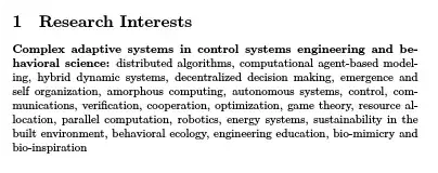
\section{Research Interests}
\textbf{Complex adaptive systems in control systems engineering and
behavioral science:} distributed algorithms, computational agent-based
modeling, hybrid dynamic systems, decentralized decision making,
emergence and self organization, amorphous computing, autonomous
systems, control, communications, verification, cooperation,
optimization, game theory, resource allocation, parallel computation,
robotics, energy systems, sustainability in the built environment,
behavioral ecology, engineering education, bio-mimicry and
bio-inspiration
\end{document}

MWE 2: With fontawesome pack.
\documentclass[10pt]{article}
\RequirePackage[T1]{fontenc}
\usepackage{times}
\usepackage{calc}

\reversemarginpar
%\usepackage[paper=letterpaper,
            %%includefoot, % Uncomment to put page number above margin
            %marginparwidth=1.2in,     % Length of section titles
            %marginparsep=.05in,       % Space between titles and text
            %margin=1in,               % 1 inch margins
            %includemp]{geometry}
%\setlength{\parindent}{0in}
%%%%%%%%%%%%%%%%%%%%%%%% PDTOOLTIP & FONTAWESOME DECLARE %%%%%%%
\usepackage{pdfcomment}% http://ctan.org/pkg/pdfcomment
\usepackage{amsmath}% http://ctan.org/pkg/amsmath
\usepackage{mathtools}% http://ctan.org/pkg/mathtools
\usepackage{xcolor}
\usepackage{fontawesome} % add skype, FB and Gtalk symbol. Has a problem.
\providecommand\faSkype{{\FA\symbol{"F17E}}} % add skype symbol.
%%%%%%%%%%%%%%%%%%%%%%%% End DECLARE %%%%%%%%%%%%%%%%%%%%%%%%%%%

%%%%%%%%%%%%%%%%%%%%%%%%% Begin CV Document %%%%%%%%%%%%%%%%%%%%%%%%%%%%
\begin{document}
%%%%%%%%%%%%%%%%%%%%%%%%%%%%%%%%%%%%%%%%%%%%%%%%%%%%%%%%%%%%%%%%%%%%%%%%%%%%%%%%%%%%%%%%%%%%%%%%%%%%%%%%%%%%%
\section{Research Interests}
\textbf{Complex adaptive systems in control systems engineering and
behavioral science:} distributed algorithms, computational agent-based
modeling, hybrid dynamic systems, decentralized decision making,
emergence and self organization, amorphous computing, autonomous
systems, control, communications, verification, cooperation,
optimization, game theory, resource allocation, parallel computation,
robotics, energy systems, sustainability in the built environment,
behavioral ecology, engineering education, bio-mimicry and
bio-inspiration
\end{document}


fontawesomerequiresfontspecwhich requires Xe/LuaLaTeX. Yet you are loadingfontencandtimes.timesis deprecated anyway and ought not be be used. But neither should its replacement if you are usingfontspec. Moreover, you almost certainly don't wantfontencunless you know exactly what you are doing. Summary: I am not surprised you are getting odd output. You are doing all kinds of strange and mutually contradictory things with fonts in your preamble. – cfr Apr 12 '14 at 02:40fontspec. See my edited answer for an example using TeX-Gyre Termes. Xits is also Times-like. Or you could use a system font e.g. Times, Times New Roman etc. – cfr Apr 12 '14 at 02:57