19

I looked at the LaTeX template for a scientific journal and found that they are using the discouraged

\usepackage{times}

See, for example l2tabuen where it says

times.sty is obsolete (see psnfss2e [10]). It does set \rmdefault to Times, \sfdefault to Helvetica, and \ttdefault to Courier. But it does not use the corresponding mathematical fonts. What's more, Helvetica is not scaled correctly which makes it appear too big in comparison. So if you want to use the combination Times/Helvetica/Courier you should use:

Replace:

\usepackage{times}

by

\usepackage{mathptmx}
\usepackage[scaled=.90]{helvet}
\usepackage{courier}

What are examples of where the ugliness of times is highly visible?

  • I concur on the ugliness of times (see my answer at http://tex.stackexchange.com/questions/166418/put-entire-thesis-on-one-a0-poster/166442#166442). But I also think, when making an argument such as what you propose, it would be likewise good to typeset the identical material in a better font, for a side-by-side comparison. – Steven B. Segletes Jun 03 '14 at 10:52
  • 3
    Simply this: xyz $xyz$ \textit{xyz} Here's a picture – egreg Jun 03 '14 at 10:53
  • @egreg Don't forget \textsf{xyz}. – Steven B. Segletes Jun 03 '14 at 10:56
  • @StevenB.Segletes Awful, but not strictly related to Times. Anybody is free to mix Helvetica with Times, just to be original. ;-) – egreg Jun 03 '14 at 10:59
  • @egreg Thanks for the suggestion! The font change from math to italics is indeed somewhat startling for a typographer. However, I would presume that the average unsuspecting journal editor calls these inconsistencies "minor". – Nico Schlömer Jun 03 '14 at 11:11
  • @egreg True, but the times package does make that ill-suited decision. – Steven B. Segletes Jun 03 '14 at 11:11
  • @Nico A journal that publishes rubbish like that (mixing CM math with Times) should be banned from libraries. The times package has been obsolete and deprecated for several years. – egreg Jun 03 '14 at 12:17
  • Isn't this exactly the kind of subjective question that the Help Center warns against? It's the direct complement to "What's your favourite _____?" – David Richerby Jun 03 '14 at 14:46
  • 1
    Does the journal use times to typeset the published article? I'm asking this because AFAIK some journals use in-house software to transform the LaTeX source to XML or whatever, and only provide LaTeX templates so that your their converter can consume your code. In this case I'd understand why they did not keep the template up to date. – marczellm Jun 03 '14 at 18:07

2 Answers2

8
\documentclass{article}
\usepackage[T1]{fontenc}
\usepackage{times}
\DeclareMathAlphabet{\MATHIT}{OT1}{ptm}{m}{it}%% similiar to mathptmx
\DeclareSymbolFont{Letters}{OML}{ztmcm}{m}{it}%% dito
\DeclareSymbolFontAlphabet{\mathNormal}{Letters}% dito

\begin{document}
Setting it with package \textit{times}:\\
abcdefghijklmnopqrstuvw rmdefault\\\itshape
abcdefghijklmnopqrstuvw itshape\\$
abcdefghijklmnopqrstuvw$ mathnormal\\$\mathit{%
abcdefghijklmnopqrstuvw}$ mathit

\normalfont
Setting it with package \textit{mathptmx}:\\
abcdefghijklmnopqrstuvw rmdefault\\\itshape
abcdefghijklmnopqrstuvw itshape\\$\mathNormal{%
abcdefghijklmnopqrstuvw}$ mathnormal\\$\MATHIT{%
abcdefghijklmnopqrstuvw}$ mathit
\end{document}

enter image description here

5

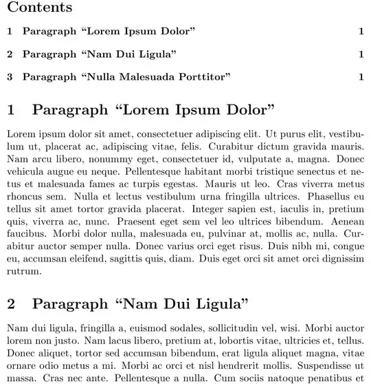
I find sectioning looks particularly bad in Times, perhaps because the bold sticks out like a sore thumb, overwhelming the adjacent text.

Note that this answer speaks to the general ugliness of the Times font, rather than the specific implementation of the times package.

\documentclass{article}
\usepackage{times}
\usepackage{lipsum}
\begin{document}
{\centering \LARGE The \textit{Lipsum} Package\par}

\tableofcontents
\section{Paragraph ``Lorem Ipsum Dolor''}
\lipsum[1]
\section{Paragraph ``Nam Dui Ligula''}
\lipsum[2]
\section{Paragraph ``Nulla Malesuada Porttitor''}
\lipsum[3]
\end{document}

Computer Modern

enter image description here

Times (aka my grandmother's typewriter)

enter image description here

  • 7
    small niggle -- as far as i know, times was never supplied on any typewriter. and whether or not your grandmother had available a typewriter with "proportional" type is highly questionable (and depends on when your grandmother did her typing) -- the ibm "executive" is the first such machine that i know of, and it didn't become available until the late 1950s. furthermore, the increments were much less fine than those for a real metal font -- "m" was 5 increments, "i" and "t" were 2 increments, and the variable spacebars were 2 and 3 increments. you kids are spoiled. – barbara beeton Jun 03 '14 at 12:32
  • 1
    @barbarabeeton I've been busted! Especially since my grandmother's typewriter font would probably have been Schwabacher anyhow. – Steven B. Segletes Jun 03 '14 at 12:33
  • 1
    I have to disagree. First, the default size for section titles in latex is quite big when used with such a heavy bold font. Second, Times is a professionally and -- in the eyes of typographers and mine -- well designed typeface. It is narrow, yes, but for this it is eminently readable and robust. Something that cannot be said about the (forgive me) anorexic Computer/Latin Modern, which looks awful on both computer screens and modern laser printers. It is unfortunately very popular among LaTeX users to bash Times because the font reminds them of Word. – NauC Sep 21 '14 at 21:02
  • @NauC For what it is worth, my preference is Palatino... and pretty much anything designed by Hermann Zapf. – Steven B. Segletes Sep 21 '14 at 21:13