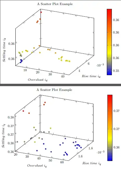
The following is the data I am trying to plot in latex.
Rise_time_id,Overshoot_id,Settling_time_id,Rise_time_iq,Overshoot_iq,Settling_time_iq
0.0075165,1.4333,0.3615,0.0016402,20.752,0.37196
0.0068268,1.5402,0.36127,0.0019044,22.883,0.37232
0.0069268,1.7437,0.36154,0.0018618,23.859,0.37213
0.0076127,1.881,0.36371,0.0015783,18.508,0.37442
0.002738,2.3488,0.35619,0.0017517,20.126,0.36095
0.0026783,3.0763,0.35608,0.0014485,19.109,0.35952
0.0027393,3.351,0.35526,0.0014526,25.055,0.36019
0.0027124,3.7883,0.35386,0.0015778,25.843,0.35961
0.0026115,4.1648,0.35579,0.0017436,21.932,0.35995
0.0027154,4.297,0.35389,0.001576,32.308,0.36033
0.00269,4.3173,0.35522,0.0014321,34.887,0.3616
0.0024777,4.5818,0.35334,0.0015885,24.47,0.35879
0.0026471,4.6632,0.35353,0.0017526,32.969,0.35977
0.0026843,4.7395,0.3536,0.0017647,33.788,0.36178
0.0025304,5.828,0.3569,0.0017561,28.447,0.35918
0.0025415,8.5137,0.35754,0.0016207,32.832,0.35877
0.0023537,9.6478,0.35774,0.0016001,35.075,0.35667
0.002346,10.548,0.35763,0.0014157,37.42,0.35725
0.0023017,14.18,0.35754,0.0014814,42.013,0.35726
0.0024371,15.421,0.359,0.0014167,49.551,0.35796
0.0024647,19.612,0.36,0.0017322,47.928,0.35818
0.0023475,20.421,0.35791,0.0016146,48.62,0.35729
0.0023193,27.033,0.35948,0.0016952,56.535,0.35774
0.002374,28.224,0.35938,0.0016503,49.464,0.35765
0.0022969,33.081,0.35876,0.0017263,57.114,0.35739
0.0022722,35.899,0.35704,0.0014851,59.77,0.35641
0.0023158,37.598,0.35742,0.001705,60.441,0.35653
0.0022752,37.878,0.35674,0.0014539,59.068,0.35636
0.0022275,38.137,0.35673,0.0015112,57.679,0.35636
0.0023252,38.137,0.35778,0.0016713,59.149,0.35674
0.0022927,41.331,0.35672,0.001469,61.127,0.35632
0.0023426,41.784,0.35678,0.0017047,59.439,0.35646
0.0023017,42.47,0.35679,0.0016599,64.571,0.35653
0.0022957,42.491,0.35679,0.0016965,59.586,0.35661
0.0023135,43.91,0.35677,0.0016362,62.211,0.35649
0.0023242,44.205,0.35671,0.0016916,61.87,0.35638
The following is my latex code
%\title{Three_dimensional_plot_copy}
\documentclass{article}
\usepackage{tikz}
\usepackage{pgfplots}
\usepackage{filecontents}
\usepackage[active,tightpage]{preview}
\PreviewEnvironment{tikzpicture}
\setlength\PreviewBorder{4pt}
\pgfplotsset{width=9.75cm,compat=1.3}
\pgfplotsset{every axis legend/.append style={at={(0.45,-0.25)},legend columns=5,anchor=south,font=\small}}
\tikzset{every mark/.append style={scale=0.8}}
\pgfplotsset{compat=1.8}
\usepgfplotslibrary{groupplots} % LATEX and plain TEX
\usepgfplotslibrary[groupplots] % ConTEXt
\usetikzlibrary{pgfplots.groupplots} % LATEX and plain TEX
\usetikzlibrary[pgfplots.groupplots] % ConTEXt
\begin{document}
%----------------------------------------------------------
\begin{tikzpicture}[baseline]
%----------------------------------------------------------
\begin{axis}[xlabel=$Overshoot~i_d$,colorbar,ylabel=$Rise~time~i_d$,colorbar,zlabel={$Settling~time~i_d$},colorbar,
title=A Scatter Plot Example]
\addplot3+[only marks,scatter]table[x=Overshoot_id,y=Rise_time_id,z=Settling_time_id,col sep=comma]
{Overshoot_id_sorted.csv};
\end{axis}
%----------------------------------------------------------
\end{tikzpicture}
%----------------------------------------------------------
%----------------------------------------------------------
\begin{tikzpicture}[baseline]
%----------------------------------------------------------
\begin{axis}[xlabel=$Overshoot~i_q$,colorbar,ylabel=$Rise~time~i_q$,colorbar,zlabel={$Settling~time~i_q$},colorbar,title=A Scatter Plot Example]
\addplot3+[only marks,scatter]table[x=Overshoot_iq,y=Rise_time_iq,z=Settling_time_iq,col sep=comma]{Overshoot_id_sorted.csv};
\end{axis}
%----------------------------------------------------------
\end{tikzpicture}
%----------------------------------------------------------
\end{document}
The following is the result I get.
I want to plot a surface with these data points. I am interested in a plot like this.
I am not a visualization person. I would like to know, if I have to modify the data type in order to get a plot like above. Any help would be appreciated.

