4

I often use the possibility of to annotate my graphs by adding nodes on it based on its relative position. For a linear plot that is rather simple, after after a few guesses I find the right spot, where I want to place my annotation.

But often I work with semilogxaxis plots and it gets really tough to get where on the graph e.g. a third of my (optical) x-axis is reached, as you can see in the MWE.

I know there are ways to place nodes on exact positions on the graph, but that's usually not trivial. I'm just looking for a fast and uncomplicated way to place my nodes - using the pos=... property is unbeatable for that purpose. So I wonder if it may be possible to put a "relative grid" on top of the graph for composition.

MWE

\documentclass{article}
\usepackage{pgfplots}

\begin{document}
\begin{tikzpicture}

\begin{semilogxaxis}[
    width = \linewidth,
    ]

\addplot {x^2}
node[pos=0.3, fill, circle=10pt, pin=135:{ annotation in graph color }] {0.5}
node[pos=0.5, fill, circle=10pt, color=red, text=black] {0.5}
node[pos=0.2, fill, circle=10pt, color=red, text=black] {0.2}
;

\end{semilogxaxis}
\end{tikzpicture}


\end{document}

Of course I could use a loop to plot multiple of the red dots to get an idea of the positions on the graph, but I wonder if there is a neater solution.

enter image description here

2 Answers2

3

You can automatically add nodes at different pos values using a foreach loop, which can then be used for finding the desired position:

\documentclass{article}
\usepackage{pgfplots}

\begin{document}
\newcommand\showpos{
 foreach \pos in {0, 0.1, ..., 1} {node [pos=\pos, pin=\pgfmathprintnumber{\pos}, circle, inner sep=1pt, fill] {} }
}

\begin{tikzpicture}

\begin{semilogxaxis}[
    width = \linewidth,
    ]

\addplot [green!50!blue] {x^2} \showpos node[pos=0.15, fill, circle=10pt, pin=135:{ annotation in graph color }] {0.15};

\end{semilogxaxis}
\end{tikzpicture}


\end{document}
Jake
  • 232,450
2

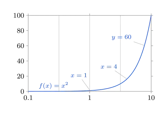
With the datavisualization library you can use the when key to specify when a label or pin has to be placed on your graph. You can use it by calling when=<x|y> is <value> in a pin in data or label in data command.

\documentclass[tikz, border=5mm]{standalone}

\usetikzlibrary{datavisualization.formats.functions}

\begin{document}
  \begin{tikzpicture}
    \datavisualization[scientific axes,
                       x axis={grid={step=.5}, logarithmic},
                       visualize as line=myfunc,
                       every data set label/.append style={
                         text colored, 
                         node style={font=\scriptsize}
                       },
                       style sheet=vary hue,
                       myfunc={
                         label in data={text={$f(x)=x^2$}, when=x is .25},
                         pin in data={text={$x=1$}, when=x is 1},
                         pin in data={text={$x=4$}, when=x is 4},
                         pin in data={text={$y=60$}, when=y is 60},
                    }]
    data [format=function, set=myfunc] {
        var x : interval [0.1:10] samples 250;
        func y = \value x * \value x;
    };
  \end{tikzpicture}
\end{document}

rendered image 1

It is important to use enough sample-steps to have exact datapoints for positioning the pin or label. Otherwise the pin or label will be placed at the next datapoint available to the requested when argument. This doesn't have to be exactly your requested value.

Here the rendered output from above with samples 10 instead of samples 250.

rendered image 2

If you use style={mark=*} in your myfunc={...} you can mark every available datapoint. This exhibits the problem of insufficient samples even better:

renderd image2.1

UPDATE: You can also add circle-nodes to your graph. See the following code for an example (the second label in data):

\documentclass[tikz, border=5mm]{standalone}

\usetikzlibrary{datavisualization.formats.functions}

\begin{document}
  \begin{tikzpicture}
    \datavisualization[scientific axes,
                   x axis={grid={step=.5}, logarithmic},
                   visualize as line=myfunc,
                   every data set label/.append style={
                     text colored, 
                     node style={font=\scriptsize}
                   },
                   style sheet=vary hue,
                   myfunc={
                     label in data={text={$f(x)=x^2$}, when=x is .25},
                     pin in data={text={$x=1$}, when=x is 1},
                     pin in data={text={$x=4$}, when=x is 4},
                     pin in data={text={$y=60$}, when=y is 60},
                     label in data={text=$5$ , when=x is 5, node style={fill=red, circle, anchor=center}},
                }]
data [format=function, set=myfunc] {
    var x : interval [0.1:10] samples 250;
    func y = \value x * \value x;
    };
  \end{tikzpicture}
\end{document}

rendered image 3

moospit
  • 4,456
  • This library seems to offer some essential features pgfplots is missing. However I'm limited to pgfplots as I couldn't use the pgfplots-based libraries provided at my institute. Thanks for the introduction! Also I think this answer is better suited here. – Robert Seifert Dec 03 '15 at 10:31