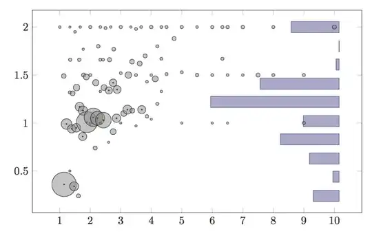
EDIT: I found a much cleaner solution, just use two different axis environments inside the same tikzpicture. It doesn't even require to change the histogram source. The only detail to take care of is setting the same y range and tweak xmin in the xbar interval plot to shrink it to the right side. The trick uses x expr to make all the values in the bar plot negative, and display them right to left.

\documentclass[border=5mm]{standalone}
\usepackage{pgfplots}
\pgfplotsset{compat=newest}
\begin{document}
\begin{tikzpicture}
    \pgfplotsset{width=12cm, height=8cm}

    \begin{axis}[
      xbar interval,
      axis y line*=right, % Put everything on the right, in case you want markers
      axis x line=none, % No x axis
      grid=none, % No disturbing gridlines
      ticks=none, % No ticks, it's just rough visualisation
      ymin=0, ymax=2, % MANUALLY SET SAME RANGE
      xmin=-2 % MANUALLY SHRINK THE GRAPH
    ]
      % Inverx coordinate
      \addplot+ table [x=score, y=key, x expr=-\thisrow{score}] {
     score         key
    0.8174         2
    0.8174       1.6
    0.3967       1.2
         0       0.8
    0.4894       0.4
    0.6977         0
      };
    \end{axis}
    \begin{axis}[
      axis y line*=left,
      xmin=0, xmax=15,
      ymin=0, ymax=2 % MANUALLY SET SAME Y-RANGE
    ]
      \addplot+[
        scatter,
        only marks,
        point meta=explicit,
        scatter/use mapped color={fill=gray, fill opacity=0.5, draw=black},
        % Changed the size of the marker to respect ``meta == c * area of the circle''
        scatter/@pre marker code/.append style={/tikz/mark size=1+sqrt(\pgfplotspointmetatransformed/pi)/2},
        scatter/@post marker code/.code={
          \ifdim\pgfplotspointmetatransformed pt> 200pt
            \node[draw=black, fill=black, inner sep=0, shape=circle, minimum size=1] at (0pt,0pt) {};
          \fi
          \endscope
        }
      ] table [x=x, y=y, meta=n] {
         x         y         n
     1.424    0.7382     328.7
     2.659     1.065     348.3
     4.082     1.174       142
     5.452     1.438     19.01
         6       0.5 0.0005244
     6.539      1.55        11
      7.55     1.771         5
     8.889     1.816         6
     10.75     1.905         4
     12.75     1.854         4
     45.22    0.7315         2
     47.13    0.4375         1
     50.11     1.222         1
     60.61    0.6087         1
     86.86     1.143         1
      };
    \end{axis}
  \end{tikzpicture}
\end{document}
EDIT: Old clumsy solution. I managed to do it in a very dirty way; I hope that someone can come out with a better trick than this. PGFPlots is awesome in many ways, but this seems not to be one.
So, using the options x filter and x expr in any plot among histogram, xbar, xbar interval was breaking the layout of the scatter plot. I had to use the library fillbetween and edit the coordinates manually. Using it directly with const plot is impossible because const plot plots a function of x, and I didn't manage to rotate the plots without creating a new axis.
Having control on the source data, I made the program output the coordinates of the points of the histogram, meaning (in "pseudopython"):
# assume that the distribution is normalized.
# histogram_intervals is the list of bins and size as tuple (min, max, score)
# and it's sorted by min ascending.
print(1.0, histogram_intervals[-1][1])
for rg_min, rg_max, score in reverse(histogram_intervals):
     print(1.0 - score, interval_max)
     print(1.0 - score, interval_min)
print(1.0, histogram_intervals[-1][0])
The points must be in order from top to bottom, because the fillbetween library will not read them correctly otherwise and will "twist" the filling in the middle (see last figure).
Now, drawing these coordinates as a scatter plot, will give you the actual histogram, with the bars from left to right, in the rectangle (0, min) rectangle (1, max). The idea is then to shift this to the right with xshift (possibly scaling it with xscale), and then fill in the region between that graph and a vertical line on the right side of the graph. This presumes that you manually set the x-domain of the graph.
Fully working example:

\documentclass[border=5mm]{standalone}
\usepackage{pgfplots}
\usepgfplotslibrary{fillbetween}
\pgfplotsset{compat=newest}
\begin{document}
\begin{tikzpicture}
    \pgfplotsset{width=12cm, height=8cm}
    \begin{axis}[xmin=0, xmax=15]
      \addplot+[
        scatter,
        only marks,
        point meta=explicit,
        scatter/use mapped color={fill=gray, fill opacity=0.5, draw=black},
        % Changed the size of the marker to respect ``meta == c * area of the circle''
        scatter/@pre marker code/.append style={/tikz/mark size=1+sqrt(\pgfplotspointmetatransformed/pi)/2},
        scatter/@post marker code/.code={
          \ifdim\pgfplotspointmetatransformed pt> 200pt
            \node[draw=black, fill=black, inner sep=0, shape=circle, minimum size=1] at (0pt,0pt) {};
          \fi
          \endscope
        }
      ] table [x=x, y=y, meta=n] {
         x         y         n
     1.424    0.7382     328.7
     2.659     1.065     348.3
     4.082     1.174       142
     5.452     1.438     19.01
         6       0.5 0.0005244
     6.539      1.55        11
      7.55     1.771         5
     8.889     1.816         6
     10.75     1.905         4
     12.75     1.854         4
     45.22    0.7315         2
     47.13    0.4375         1
     50.11     1.222         1
     60.61    0.6087         1
     86.86     1.143         1
      };
      % Add the histogram plot, with no drawing and no filling
      \addplot+[
        name path global=myhistogram,
        xscale=2,    % MANUAL TWEAK SCALE
        xshift=40mm, % MANUAL TWEAK SHIFT
        draw=none, no marks, fill=none
      ] table [x=x, y=y] {
         x         y
         1         2
    0.8174         2
    0.8174       1.6
    0.3967       1.6
    0.3967       1.2
         0       1.2
         0       0.8
    0.4894       0.8
    0.4894       0.4
    0.6977       0.4
    0.6977         0
         1         0
      };
      % Pick a vertical line at the right of the plot
      % NOTE: MANUALLY PICK AXIS COORDINATES
      \path[name path=myaxis] (axis cs: 14, 0) -- (axis cs:14, 2);
      % Draw the region.
      \addplot+ [draw=red, fill=red!50] fill between[of=myaxis and myhistogram];
    \end{axis}
  \end{tikzpicture}
\end{document}
And this is what happens if you export your data bottom-to-top:


