4

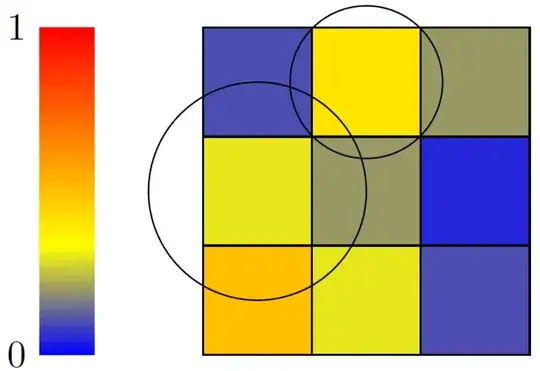
I have a predefined set of coordinates, \where, and a corresponding value, \value. Each coordinate covers an rectangle. I like to choose the color of the fill=...option based on the value. The result is a heatmap - but plot outside of pgfplot.

I've seen that pgfplot can plot heatmaps, however, I need to plot the map over an existing figure. Although, the colormap/jet of pgfplot plot seams really nice. Thus if possible, I like to have a function that picks a color colormap/jet. I will also need a bar (color , corresponding value).

enter image description here

\documentclass[border=5mm]{standalone}
\usepackage{tikz}
\usetikzlibrary{calc}

\begin{document}
  \begin{tikzpicture}
  %existing figure
    \draw (0,1) circle (1);
    \draw (1,2) circle (.7);
  %heatmap
    \foreach \where/\value in
    { (0,0)/0.5,(1,0)/0.3,(2,0)/0.1, %coordinates and values between 0 and 1
      (0,1)/0.3,(1,1)/0.2,(2,1)/0.05,
      (0,2)/0.1,(1,2)/0.4,(2,2)/0.2%
    }
    { \path [overlay] \where coordinate (A);
      \draw [fill=orange, , opacity=0.2] ($(A)-(.5,.5)$) rectangle ($(A)+(.5,.5)$); } %fill with the correct color
    %add a color bar
  \end{tikzpicture}
\end{document}
dani
  • 729

3 Answers3

3

With the xcolor package yo can use the syntax

<color>!<percent>

to obtain a shade of the color:

enter image description here

Code:

\documentclass[border=5mm]{standalone}
\usepackage{tikz}
\usetikzlibrary{calc}

\begin{document} \begin{tikzpicture} %existing figure \draw (0,1) circle (1); \draw (1,2) circle (.7); %heatmap \foreach \where/\value in { (0,0)/50,(1,0)/30,(2,0)/10, %coordinates and values between 0 and 100 (0,1)/30,(1,1)/20,(2,1)/5, (0,2)/10,(1,2)/40,(2,2)/20% } { \path [overlay] \where coordinate (A); \draw [fill=red!\value, opacity=0.2] ($(A)-(.5,.5)$) rectangle ($(A)+(.5,.5)$); } %fill with the correct color %add a color bar \end{tikzpicture} \end{document}

Peter Grill
  • 223,288
3

You could calculate the rgb values and colour your squares accordingly.

\documentclass[border=5mm]{standalone}
\usepackage{tikz}
\usepackage{ifthen}
\usepackage{xcolor}
\usetikzlibrary{calc}

\begin{document}
    \begin{tikzpicture}

        %heatmap
            \foreach \where/\value in { 
                (0,0)/0.5,(1,0)/0.3,(2,0)/0.1, %coordinates and values between 0 and 1
                (0,1)/0.3,(1,1)/0.2,(2,1)/0.05,
                (0,2)/0.1,(1,2)/0.4,(2,2)/0.2%
            }{ 
                \path [overlay] \where coordinate (A);

                \pgfmathsetmacro \v \value
                \ifthenelse{\lengthtest{\v pt>0.333pt}}{
                    \pgfmathsetmacro \r {1}
                    \pgfmathsetmacro \g {1-(\value-.333)/.667}
                    \pgfmathsetmacro \b {0}
                }{
                    \pgfmathsetmacro \r {\value/.333}
                    \pgfmathsetmacro \g {\value/.333}
                    \pgfmathsetmacro \b {1-\value/.333}
                }
                \definecolor{temp}{rgb}{\r, \g, \b}

                \draw [fill=temp] ($(A)-(.5,.5)$) rectangle ($(A)+(.5,.5)$);
            }

        %colour bar
            \fill[top color=red, bottom color=yellow] (-1.5,.5) rectangle (-2,2.5) node[left] {1};
            \fill[top color=yellow, bottom color=blue] (-2,-.5) node[left] {0} rectangle (-1.5,.5);

        %existing figure
            \draw (0,1) circle (1);
            \draw (1,2) circle (.7);
  \end{tikzpicture}
\end{document}

enter image description here

\documentclass[border=5mm]{standalone}
\usepackage{tikz}
\usepackage{ifthen}
\usepackage{xcolor}
\usetikzlibrary{calc}

\begin{document}
    \begin{tikzpicture}

        %heatmap
            \foreach \where/\value in { (0,0)/0.0,(1,0)/0.1,(2,0)/0.2, (0,1)/0.3,(1,1)/0.4,(2,1)/0.5, (0,2)/0.6,(1,2)/0.7,(2,2)/0.8, (0,3)/0.9,(1,3)/1.0 } { 
                \path [overlay] \where coordinate (A);

                \pgfmathsetmacro \v \value
                \ifthenelse{\lengthtest{\v pt>0.333pt}}{
                    \pgfmathsetmacro \r {1}
                    \pgfmathsetmacro \g {1-(\value-.333)/.667}
                    \pgfmathsetmacro \b {0}
                }{
                    \pgfmathsetmacro \r {\value/.333}
                    \pgfmathsetmacro \g {\value/.333}
                    \pgfmathsetmacro \b {1-\value/.333}
                }
                \definecolor{temp}{rgb}{\r, \g, \b}

                \draw [fill=temp] ($(A)-(.5,.5)$) rectangle ($(A)+(.5,.5)$);
            }

        %colour bar
            \fill[top color=red, bottom color=yellow] (-1.5,1) rectangle (-2,3) node[left] {1};
            \fill[top color=yellow, bottom color=blue] (-2,0) node[left] {0} rectangle (-1.5,1);

        %existing figure
            \draw (0,1) circle (1);
            \draw (1,2) circle (.7);
  \end{tikzpicture}
\end{document}

enter image description here

0

For the shown example I am not convinced that you need to draw the "existing figure" outside the PGFPlots axis environment. But even if it should really be the case, you can match the PGFPlots coordinate system to the one of tikz and then use all of the possibilities PGFPlots offers to draw the heatmap.

I also want to mention, that I would draw it the other way round. So first draw the heatmap and then your "existing figure" on top. Then the colors really match the colors in the colorbar, which don't have any transparency. (I don't think there is an easy way to only make the colorbar -- without the frame, ticks and labels -- transparent, so it would match the plot. If I am wrong, I'd be happy to here about it.)

Please have a look at the comments in the code for more details.

\documentclass[border=1mm]{standalone}
\usepackage{tikz}
\usepackage{pgfplots}
    \pgfplotsset{compat=1.11}
\begin{document}
    \begin{tikzpicture}

        % if you really need to draw the figure outside the axis environment
        % of the PGFPlots package ...
        % -----------------------
        % existing figure
        \begin{scope}[
            thick,
            red,
        ]
            \draw (0,1) circle (1);
            \draw (1,2) circle (.7);
        \end{scope}
        % -----------------------

        \begin{axis}[
            % -----------------------------------------------------------------
            % in case you really want matching coordinate systems between
            % `tikz' and `pgfplots'
            % (taken from PGFPlots manual v1.13 section 4.26)
            % -----------------------------------------------------------------
            % tell pgfplots to "grab" the axis at its
            % internal (0,0) coord:
            anchor=origin,
            % tell pgfplots to place its anchor at (0,0):
            % (This is actually the default and can
            % be omitted)
            at={(0pt,0pt)},
            % tell pgfplots to use the "natural" dimensions:
            disabledatascaling,
            % tell pgfplots to use the same unit vectors
            % as tikz:
            x=1cm,y=1cm,
% -----
% not needed here, because the axes themselves are not needed (see below)
%            % range... try it out.
%            xmin=-1,xmax=3,
%            ymin=-1,ymax=3,
% -----
            % -----------------------------------------------------------------
            %
            % choose a colormap that fits your need and draw the colorbar
            % (to change position and style of the colorbar please have a look
            % at the PGFPlots manual section 4.9.13 (in v1.13))
            colormap/viridis,
            colorbar,
            %
            % set min and max vales for `meta' values (and therefore the colorbar)
            point meta min=0,
            point meta max=0.5,   % <-- here a lower value to better show the
                                  %     the differences of the given values
            %
            % use opacity, if you really want to draw the other figure below
            % the "heat map"
            matrix plot*/.append style={
                opacity=0.5,
            },
            % because the axes are not needed -> hide them
            hide axis,
            % and because without drawing the axes we do not need to specify
            % axis limits. But to ensure that all "non-\addplot" stuff is fully
            % drawn, disable clipping
            clip=false,
        ]

            % I think it is not a problem to draw your figure also inside
            % of the axis environment
            % -----------------------
            % existing figure
            \draw (0,1) circle (1);
            \draw (1,2) circle (.7);
            % -----------------------

            \addplot [
                matrix plot*,
                point meta=explicit,
%                draw=black,     % <-- change me, if the default doesn't fit your needs
            ]
            table [x=x,y=y,meta=z] {
                x   y   z
                0   0   0.5
                1   0   0.3
                2   0   0.1

                0   1   0.3
                1   1   0.2
                2   1   0.05

                0   2   0.1
                1   2   0.4
                2   2   0.2
            };
        \end{axis}
    \end{tikzpicture}
\end{document}

image showing the result of above code

Stefan Pinnow
  • 29,535