3

I have a sample with countries and data. I would like to have a "comb" graph to show the years covered in the sample for each country.

My data is like this :

    #########################################################
    country,year
    AUT,1998
    AUT,1999
    AUT,2000
    GER,1999
    GER,2000
    GER,2001
    GER,2002
    FRA,2000
    FRA,2001
    FRA,2002
    FRA,2003
    #########################################################

I would like to get something like :

AUT ---------------
FRA           -------------------
GER      --------------------
    1998|1999|2000|2001|2002|2003    

Data is coming from another software and I can manipulate it before passing it on to LaTeX. For instance:

  • I can order countries, years, etc. before passing it on to LaTeX.
  • Currently some country-years are duplicated in the data but I can compress it to unique occurrences of country-years
  • I could also create a new dataset of the form [country,minyear,maxyear] if that's easier to manipulate with pgfplots.

I tried a MWE but of course the addplot command is bogus and yields an error:

\documentclass{minimal}
\usepackage{filecontents}
\usepackage{tikz}
\usepackage{pgfplots}
\pgfplotsset{compat=1.7}
\usepackage{pgfplotstable}

\begin{filecontents}{CountryYears.csv}
    #########################################################
    country,year
    AUT,1998
    AUT,1999
    AUT,2000
    GER,1999
    GER,2000
    GER,2001
    GER,2002
    FRA,2000
    FRA,2001
    FRA,2002
    FRA,2003
    #########################################################
\end{filecontents}

\begin{document}

    \begin{tikzpicture}
        \begin{axis}
             \pgfplotstableread[col sep=comma]{CountryYears.csv}\loadeddata
             \addplot  table[y=year,x=country,ybar] {\loadeddata}; % Plotting the data
        \end{axis}
    \end{tikzpicture}   
\end{document}
Peutch
  • 2,182

1 Answers1

1

This should get you started.

\documentclass{standalone}
\usepackage{filecontents}
\usepackage{tikz}
\usepackage{pgfplots}
\pgfplotsset{compat=1.7}
\usepackage{pgfplotstable}

\begin{filecontents}{CountryYears.csv}
    #########################################################
    country,year
    AUT,1998
    AUT,1999
    AUT,2000
    GER,1999
    GER,2000
    GER,2001
    GER,2002
    FRA,2000
    FRA,2001
    FRA,2002
    FRA,2003
    #########################################################
\end{filecontents}

\begin{document}
\pgfplotstableset{columns/country/.style={string type}}
\pgfplotstableread[col sep=comma]{CountryYears.csv}\loadeddata

\begin{tikzpicture}
\begin{axis}[symbolic y coords={AUT,GER,FRA},ytick=data,
  x tick label style={/pgf/number format/.cd,%
  scaled x ticks = false,
  set thousands separator={},
  fixed},]
\addplot[only marks] table[x=year,y=country] \loadeddata;
\end{axis}
\end{tikzpicture}

\end{document}
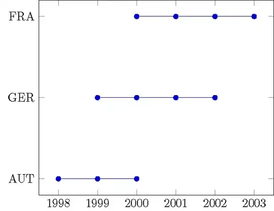
demo

If you want to connect the dots, you can add a blank line between data points to cause gaps. However, \pgfplotstableread ignores blank lines.

\documentclass{standalone}
\usepackage{filecontents}
\usepackage{tikz}
\usepackage{pgfplots}
\pgfplotsset{compat=1.4}
\usepackage{pgfplotstable}

\begin{filecontents}{CountryYears.csv}
    #########################################################
    country,year
    AUT,1998
    AUT,1999
    AUT,2000

    GER,1999
    GER,2000
    GER,2001
    GER,2002

    FRA,2000
    FRA,2001
    FRA,2002
    FRA,2003
    #########################################################
\end{filecontents}

\begin{document}
\pgfplotstableset{columns/country/.style={string type},col sep=comma}

\begin{tikzpicture}
\begin{axis}[symbolic y coords={AUT,GER,FRA},ytick=data,
  x tick label style={/pgf/number format/.cd,%
  scaled x ticks = false,
  set thousands separator={},
  fixed}]
\addplot table[x=year,y=country] {CountryYears.csv};
\end{axis}
\end{tikzpicture}

\end{document}

connect the dots

John Kormylo
  • 79,712
  • 3
  • 50
  • 120
  • Thank you! Do you know if there's a way to generate the list of countries dynamically, or do I have to input them by hand? – Peutch Jun 03 '16 at 13:21
  • Yes, it is possible, but not easy. Is it really that difficult to type in a list in the order you want them displayed? – John Kormylo Jun 03 '16 at 14:11
  • John, I haven't been able to connect the dots. The solution you suggest of adding blank lines in the data does not work (i.e. the line are still connected). – Peutch Jun 07 '16 at 17:12