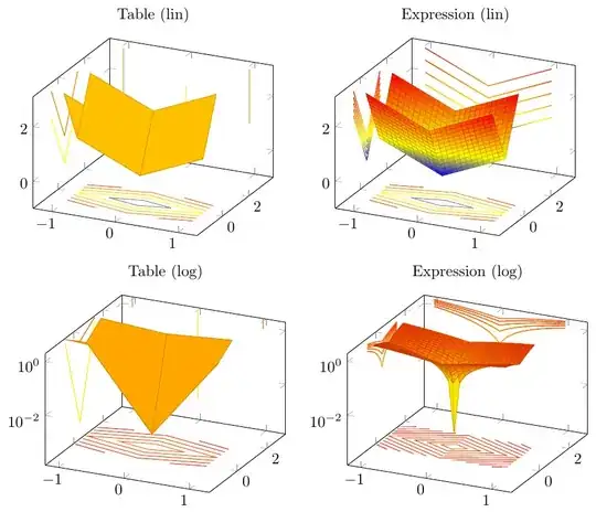
After asking question pgfplot makes wrong projection for tabular data, I made a new MWE (see below) and test data, and I think it is better to start a new thread. I wanted to display the same test surface with projections, from expression and table; in linear and logarithmic mode. The expression was \newcommand\expr[2]{abs(#1) + abs(#2)+.001}, the corresponding tabular data are given in the MWE.
The result is here:
It looks like the two cases are handled differently. It seems to me that
- The linear table view shows X projection only as vertical lines; it should be V shapes like the Y projection.
The table view is rotated with respect to the expression view (I see the sample program uses
(y,x,{\expr{y}{x}});but I cannot find out an analogous way for 'table'. I think these two issues are related.)Although I use 'samples', no intermediate values are interpolated in the table view.
The Z projection in the case of table seems to be the same as in the case of the expression, although the surface itself is rotated.
The table linear Z projection is colored, but the surface not.
The table logaritmic Z projection is the same as in the case of the linear projection, but this time not colored.
The table logaritmic Z projection contour levels are calculated linearly, rather than logaritmically, although the projections are.
The expression logaritmic view suffers from the same problems: the Z projection deviates from all the rests, and here the X and Y projections are scaled in such a way that they do not seem to be the projections of the surface. The Z projection has a texture different from tall other cases, and no coloring takes place.
Do I basically misunderstand something?
\documentclass[border=10pt]{standalone}
\usepackage{pgfplots}
\pgfplotsset{width=7cm,compat=1.8}
\pgfplotstableset{%
    col sep=semicolon,
    x index=0,
    y index=1,
    z index=2,
    header=false
}%
\begin{filecontents*}{XYZ.csv}
  -1; -1; 3.001;
  -1;  0; 1.001;
  -1;  1; 3.001;

   0; -1; 2.001;
   0;  0; 0.001;
   0;  1; 2.001;

   1; -1; 3.001;
   1;  0; 1.001;
   1;  1; 3.001;
\end{filecontents*}

\begin{document}
\begin{tabular}{cc}
\begin{tikzpicture}
  \begin{axis}[
    domain=-1:1,
    domain y=-1:1,
    title = Table (lin),
        xmin=-1.3, xmax=1.3,% x scale
        ymin=-1.9, ymax=3.9, % y scale
        zmin=-1, zmax=3.1, % z scale
  ]

    \addplot3[
        contour gnuplot={
            output point meta=rawz,
            number=10,
            labels=false,
        },
        samples=41,
        z filter/.code=\def\pgfmathresult{-1},
    ]
        table {XYZ.csv};

    \addplot3[
        samples=41,
        samples y=10,
    domain=-1:1,
    domain y=-1:1,
         mesh, patch type=line,
        x filter/.code=\def\pgfmathresult{-1.2},
    ]
        table {XYZ.csv};

    \addplot3[
        samples=41,
        samples y=10,
        mesh, patch type=line,
        y filter/.code=\def\pgfmathresult{3.5},
    ]
        table {XYZ.csv};

    \addplot3[surf,samples=25]
        table {XYZ.csv};

\end{axis}
\end{tikzpicture}
&
\begin{tikzpicture}
  \begin{axis}[
    domain=-1:1,
    domain y=-1:1,
    title = Expression (lin),
        xmin=-1.3, xmax=1.3,% x scale
        ymin=-1.9, ymax=3.9, % y scale
        zmin=-1, zmax=3.1, % z scale
  ]

    \newcommand\expr[2]{abs(#1) + 2*abs(#2)}

    \addplot3[
        contour gnuplot={
            % cdata should not be affected by z filter:
            output point meta=rawz,
            number=10,
            labels=false,
        },
        samples=41,
        z filter/.code=\def\pgfmathresult{-1},
    ]
        {\expr{x}{y}};

    \addplot3[
        samples=41,
        samples y=10,
    domain=-1:1,
    domain y=-1:1,
        % we want 1d (!) individually colored mesh segments:
        mesh, patch type=line,
        x filter/.code=\def\pgfmathresult{-1.2},
    ]
        (y,x,{\expr{y}{x}});

    \addplot3[
        samples=41,
        samples y=10,
        % we want 1d (!) individually colored mesh segments:
        mesh, patch type=line,
        y filter/.code=\def\pgfmathresult{3.5},
    ]
        {\expr{x}{y}};

    \addplot3[surf,samples=25]
        {\expr{x}{y}};

\end{axis}
\end{tikzpicture}
\\
\begin{tikzpicture}
  \begin{axis}[
    domain=-1:1,
    domain y=-1:1,
    title = Table (log),
        zmode=log,
        xmin=-1.2, xmax=1.3,% x scale
        ymin=-1.9, ymax=3.3, % y scale
        zmin=-3, zmax=2, % z scale
  ]

    \addplot3[
        contour gnuplot={
            % cdata should not be affected by z filter:
            output point meta=rawz,
            number=10,
            labels=false,
        },
        samples=41,
        z filter/.code=\def\pgfmathresult{-8},
    ]
        table {XYZ.csv};

    \addplot3[
        samples=41,
        samples y=10,
    domain=-1:1,
    domain y=-1:1,
        % we want 1d (!) individually colored mesh segments:
        mesh, patch type=line,
        x filter/.code=\def\pgfmathresult{-1.1},
    ]
        table {XYZ.csv};

    \addplot3[
        samples=41,
        samples y=10,
        mesh, patch type=line,
        y filter/.code=\def\pgfmathresult{3.1},
    ]
        table {XYZ.csv};

    \addplot3[surf,samples=25]
        table {XYZ.csv};

\end{axis}
\end{tikzpicture}
&
\begin{tikzpicture}
  \begin{axis}[
    domain=-1:1,
    domain y=-1:1,
    title = Expression (log),
        zmode=log,
        xmin=-1.2, xmax=1.3,% x scale
        ymin=-1.9, ymax=3.3, % y scale
        zmin=-3, zmax=2, % z scale
    ]

    \newcommand\expr[2]{abs(#1) + abs(#2)+.001}

    \addplot3[
        contour gnuplot={
            % cdata should not be affected by z filter:
            output point meta=rawz,
            number=10,
            labels=false,
        },
        samples=41,
        z filter/.code=\def\pgfmathresult{-8},
    ]
        {\expr{x}{y}};

    \addplot3[
        samples=41,
        samples y=10,
    domain=-1:1,
    domain y=-1:1,
        % we want 1d (!) individually colored mesh segments:
        mesh, patch type=line,
        x filter/.code=\def\pgfmathresult{-1.1},
     ]
        (y,x,{\expr{y}{x}});

    \addplot3[
        samples=41,
        samples y=10,
        mesh, patch type=line,
        y filter/.code=\def\pgfmathresult{3.1},
    ]
        {\expr{x}{y}};

    \addplot3[surf,samples=25,
    ]
        {\expr{x}{y}};

\end{axis}
\end{tikzpicture}
\\
\end{tabular}
\end{document}

\addplot3 [surf, z buffer=sort] .... 3. PGFPlots doesn't interpolate tabulated data. See http://tex.stackexchange.com/questions/118131/how-to-plot-a-surface-from-a-set-of-data for options of smoothing tabulated data.