3

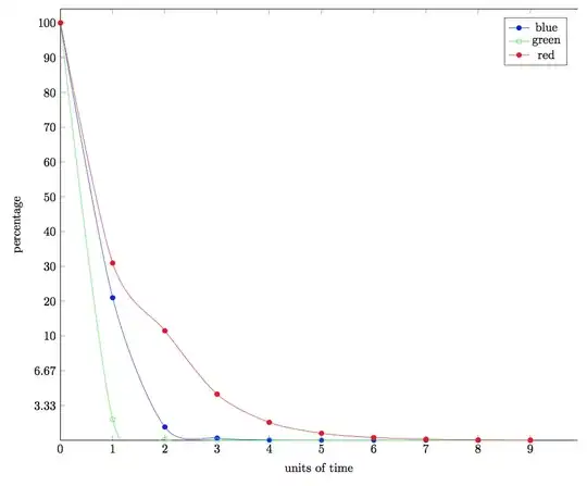
I've got a tikz diagram that has 6 plot lines on 2 axis. The plot lines all trend from 100 toward 0 on the y-axis, with ticks at 90, 80, ..., 10.

Everything looks okay, however the most interesting part of the data is the part between 10 and 0. It is very difficult to properly make out the data in this part because it is too small, the diagram would be much more informative/readable if this part could be larger than the rest of the diagram.

I could make the whole y-axis logarithmic but this isn't really ideal either for the dataset in question.

Is there a way to have a part of the diagram/plot stretch by more than the rest of the diagram. So i.e. 100-90 will be 1 cm, 90-80 will be 1 cm and so on, but 10-0 will be 3cm.

Note this is not a bar chart, so gluing two separated plots together as in the 'Focusing certain parts of a chart in latex' question would not help here at all. Nor does that question/solution allow for making a part of the plot to scale differently, all it allows for is leaving out a peice in the middle of the plot - I'm not at all sure why it is being suggested that this is a duplicate of a completely different question...

Further explanation via diagram. enter image description here

I want to stretch the part in the red box as shown by the arrows, while leaving the rest unchanged.

Sample diagram markup as requested.

\begin{tikzpicture}[fill=gray]

%Prevent double labelling at origin
\pgfplotsset{ignore zero/.style={%
  #1ticklabel={\ifdim\tick pt=0pt \else\pgfmathprintnumber{\tick}\fi}
}}

\begin{axis}[
  axis y line*=left,
  ymin=0,
  ymax=104,
  xmin=0,
  xmax=9.9,
  xlabel=units of time,
  ylabel=percentage,
  y=1.5cm/15,
  x=1.5cm,
  ignore zero=y,
  ]

\addplot[smooth,mark=*,blue]
  coordinates{
    (0 , 100.000000000000)
    (1 , 21)
    (2 , 1.28)
    (3 , 0.21)
    (4 , 0.03)
    (5 , 0.004)
    (6 , 0.0005)
    (7 , 0.00005)
    (8 , 0.000007)
    (9 , 0.0000008)
  };
\addlegendentry{blue} 

\addplot[smooth,mark=o,green]
  coordinates{
    (0 , 100.000000000000)
    (1 , 2.004965950432)
    (2 , 0.050130282209)
    (3 , 0.001303231721)
    (4 , 0.000034413136)
    (5 , 0.000000916142)
    (6 , 0.000000024509)
    (7 , 0.000000000658)
    (8 , 0.000000000018)
    (9 , 0.000000000000)  
  };
\addlegendentry{green} 

\addplot[smooth,mark=*,red]
  coordinates{
    (0 , 100.000000000000)
    (1 , 30.969834976929)
    (2 , 11.504103027913)
    (3 , 4.422780528370)
    (4 , 1.725299638737)
    (5 , 0.678378118320)
    (6 , 0.268047163678)
    (7 , 0.106264332554)
    (8 , 0.042226956059)
    (9 , 0.016809562633)  
  };
\addlegendentry{red} 

\end{axis}

\end{tikzpicture}
  • I'd say make two axes next to each other, one with ymin=0,ymax=10, the other with ymin=10,ymax=100, but can you make an example so that we don't have to start from scratch to make a testable code? We don't necessarily need (all) your data, make a dummy plot or two with some similar functions, e.g. e^-x, or 1/x, or similar. – Torbjørn T. Mar 22 '17 at 18:54
  • Sample added, any help appreciated.

    I really don't understand why this has been marked as a duplicate of a question that is not a duplicate, the other question/answer that is a supposed duplicate does not answer my question at all.

    – Malcolm MacLeod Mar 22 '17 at 20:49
  • 2
    I'd say, don't do it. Who in this world shall read this plot and understand it intuitively? My advice is a semi-logarithmic plot, it comes pretty close to what you want and can actually be understood by people. – bers Mar 22 '17 at 21:17
  • semi-log plot makes the data points towards the top of the data range difficult to distinguish or view properly. In this case both the data at the top and bottom are the most interesting and the data isn't really logarithmic.

    I really don't see why anyone would struggle to understand this intuitively - this is exactly what the labelled ticks on the axis are for, anyone capable of reading should not have a problem.

    – Malcolm MacLeod Mar 22 '17 at 21:30
  • I would nevertheless give the comment from @bers a thought. I also (I am an engineer) find it awkward. I would at least mark clearly the transition, with a background shade for example, or better use a zoom (like the one from the spy package). – Rmano Mar 22 '17 at 22:58
  • @MalcolmMacLeod "anyone capable of reading should not have a problem" reading a text whether each letter is a different color, size, and font, either. But it takes additional time because we are are not used to reading texts like this, so it's a pain for the reader. Same with broken or otherwise inconsistently stretched axes. – bers Mar 23 '17 at 06:08
  • Thinking about this, I have remembered a blog entry about panel charts, which were proposed as an alternative to broken axes. The result might look like this, http://peltiertech.com/images/2016-10/DoOver_Panel11.png, and you can read it at http://peltiertech.com/broken-y-axis-in-excel-chart/ – bers Mar 23 '17 at 06:11
  • I do appreciate the concerns, and in many other cases I would agree with you, but in this case for this specific data set I really do think this is going to be the most clear and easy way for people to visualise and understand the data. I will of course test the chart out on some people and see how it goes. – Malcolm MacLeod Mar 23 '17 at 07:57

2 Answers2

3

Yes. See the manual page 379

\pgfplotsset{
    y coord trafo/.code={
        \pgfmathparse{
            #1>10?
                #1+20
            :
                #1*3
        }
    },
    y coord inv trafo/.code={
        \pgfmathparse{
            #1>30?
                #1-20
            :
                #1/3
        }
    }
}

Symbol 1
  • 36,855
  • Fantastic, that does the job perfectly, thanks. – Malcolm MacLeod Mar 22 '17 at 21:39
  • You might want to add a visual indicator at "10". Otherwise, it is not at all clear that the scaling changes at that value, instead of at any other value between 10 and 6.67. – bers Mar 23 '17 at 06:15
  • This is nice, but I am quite surprised by the smooth transition at 10. Shouldn't the change of scale be visible as a change in the first derivative like in the other answer? – Rmano Mar 23 '17 at 06:45
  • 1
    My intention is to put a dotted line across at 10 and then shade below it in a different colour, I just didn't want to complicate the question with unnecessary details. – Malcolm MacLeod Mar 23 '17 at 07:54
  • Ah, nice. Because otherwise it can be really confusing... try \addplot [purple, domain=0:8] {10*x}; \addlegendentry{straight} to visualize it. It's a straight line but it's completely misleading. I would really also break the plot lines (maybe with a thick, white horizontal line superposing?). Overall, it's a nice trick, will use it for Arrhenius plots! Thanks! – Rmano Mar 23 '17 at 08:29
2

I'm not sure how helpful this is, it certainly isn't perfect, though I think it is roughly what you asked for. The problem is in the transition between the two axes. Even though the lines meet, they don't join perfectly (zoom in to see).

This method also entails plotting everything twice, which isn't ideal, I suppose.

enter image description here

\documentclass[border=5mm]{standalone}
\usepackage{pgfplots}
\pgfplotsset{compat=1.14}
\usepgfplotslibrary{groupplots}
\begin{document}
\begin{tikzpicture}[fill=gray]

%Prevent double labelling at origin
\pgfplotsset{ignore zero/.style={%
  #1ticklabel={\ifdim\tick pt=0pt \else\pgfmathprintnumber{\tick}\fi}
}}

\begin{groupplot}[
  axis y line*=left,
  xmin=0,
  xmax=9.9,
  xlabel=units of time,
%  y=1.5cm/15,
%  x=1.5cm,
  width=12cm,
  height=5cm,
  ignore zero=y,
  group style={
    group size=1 by 2,
    group name=G,
    vertical sep=0pt,
    x descriptions at=edge bottom
  }
  ]


\nextgroupplot[axis x line=none,ymin=10,ymax=104]
\addplot[smooth,mark=*,blue]
  coordinates{
    (0 , 100.000000000000)
    (1 , 21)
    (2 , 1.28)
    (3 , 0.21)
    (4 , 0.03)
    (5 , 0.004)
    (6 , 0.0005)
    (7 , 0.00005)
    (8 , 0.000007)
    (9 , 0.0000008)
  };
\addlegendentry{blue} 

\addplot[smooth,mark=o,green]
  coordinates{
    (0 , 100.000000000000)
    (1 , 2.004965950432)
    (2 , 0.050130282209)
    (3 , 0.001303231721)
    (4 , 0.000034413136)
    (5 , 0.000000916142)
    (6 , 0.000000024509)
    (7 , 0.000000000658)
    (8 , 0.000000000018)
    (9 , 0.000000000000)  
  };
\addlegendentry{green} 

\addplot[smooth,mark=*,red]
  coordinates{
    (0 , 100.000000000000)
    (1 , 30.969834976929)
    (2 , 11.504103027913)
    (3 , 4.422780528370)
    (4 , 1.725299638737)
    (5 , 0.678378118320)
    (6 , 0.268047163678)
    (7 , 0.106264332554)
    (8 , 0.042226956059)
    (9 , 0.016809562633)  
  };
\addlegendentry{red} 

\nextgroupplot[ymin=0,ymax=10,axis x line=left]
\addplot[smooth,mark=*,blue]
  coordinates{
    (0 , 100.000000000000)
    (1 , 21)
    (2 , 1.28)
    (3 , 0.21)
    (4 , 0.03)
    (5 , 0.004)
    (6 , 0.0005)
    (7 , 0.00005)
    (8 , 0.000007)
    (9 , 0.0000008)
  };


\addplot[smooth,mark=o,green]
  coordinates{
    (0 , 100.000000000000)
    (1 , 2.004965950432)
    (2 , 0.050130282209)
    (3 , 0.001303231721)
    (4 , 0.000034413136)
    (5 , 0.000000916142)
    (6 , 0.000000024509)
    (7 , 0.000000000658)
    (8 , 0.000000000018)
    (9 , 0.000000000000)  
  };


\addplot[smooth,mark=*,red]
  coordinates{
    (0 , 100.000000000000)
    (1 , 30.969834976929)
    (2 , 11.504103027913)
    (3 , 4.422780528370)
    (4 , 1.725299638737)
    (5 , 0.678378118320)
    (6 , 0.268047163678)
    (7 , 0.106264332554)
    (8 , 0.042226956059)
    (9 , 0.016809562633)  
  };


\end{groupplot}
\node [left=1cm,anchor=center,rotate=90] at (G c1r1.south west) {percentage};
\end{tikzpicture}
\end{document}
Torbjørn T.
  • 206,688
  • Thanks, that is essentially what I am looking for though as you say it does have several downsides and glitches - I was hoping there might be a less hacky way to do it so that there wouldn't be so many glitches, but if nothing else turns up it's better than nothing! So I might end up using it anyway. – Malcolm MacLeod Mar 22 '17 at 21:33
  • @MalcolmMacLeod No, look at the other answer, much better. – Torbjørn T. Mar 22 '17 at 21:35